
Social Media Marketing

Whether your online business is small, rapidly growing, or quite huge, it needs a couple of high-converting landing pages.
A well-structured landing page is powerful enough to help you grow your business online and raise the number of your conversions.
But how exactly do you make a high-converting and impressive landing page?
The look of your landing page is, of course, important, but there is much more to it than one might think. In this article, we’ll discuss the following topics to help you have a perfect idea about crafting a strong landing page:
Every webpage is created with a certain purpose, and a landing page is not an exception. A landing page is where you direct your visitors to help them see your offers and click on the call-to-action (CTA) button, and this is exactly what 68% of B2B businesses do.
A landing page can be built for many purposes, such as to inform, sell a product, offer a service, explain a concept, create an email list, or lead to a generating page.
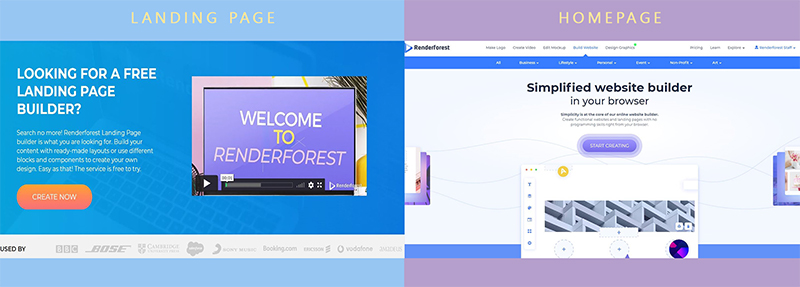
What makes a page a “landing page” is whether or not it’s used as a conversion tool. Unlike a regular website page or a homepage, landing pages don’t have many clickable buttons, they focus on a single objective, and are set to carry out that one “mission”.
Here’s an example for you to picture the difference between a landing page and a homepage more clearly:
Landing pages are usually promoted by the business through Google Ads, social media ads, etc., although optimizing them for search works just fine too.
They are convenient for both the business owners and the people who search for a certain service or product online. They make it easy for Internet users to find exactly what they are looking for and get it with just one click. In short, landing pages work because they lead people to their targeted search query.
So, if you check out a link in one of the ads in Google search results, there’s a chance that you may end up on a landing page with limited CTA’s and clickable buttons.
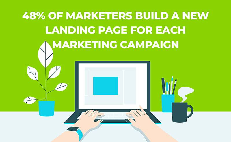
Now, all things considered, is it a must to have a landing page? The answer is no, you don’t have to have it, but you most probably need it. Because every business and campaign has a goal, you need landing pages to help you achieve that goal and move your marketing objective forward.
There are a couple of aspects to consider when crafting a high-converting landing page, but no certain standards or rules. It all depends on the products or services you offer, your audience, and of course the niche you want to address.
You can start with creating a real vision in mind and clarifying the purpose of your landing page. This will help you to easily find a relevant approach for your call-to-action button, as well as be helpful when deciding on the headline and subheadline.
Narrowing down the list of your target audience is another crucial step you should complete before you start building a landing page. If you can’t accommodate their needs within the first few seconds, your landing page will flop. You have only 5-7 seconds to make a strong impression, which means your page should not take long to load either.

Here are a few main features to consider adding when creating your converting landing page. Of course, you don’t have to use all of these for a single landing page, instead, look through our list and consider what makes the most sense for your campaign.
The headline of a landing page should be super striking and informative, to let people know what exactly they are in for, without having to search around. It needs to be short, no more than 20 words, to-the-point, and big in size.
The viewer should know what they can do on the landing page as soon as they open it. If your reason isn’t clear right away, people will close the page without giving it much thought.
To explain your headline you need a well-written, persuasive, and clear subheadline. This way you’ll be able to provide more information or even use it as a CTA.
Unlike your headline, the subheadline is a little longer, and usually right under the headline. It needs to be smaller in size, and give more details about the product or the service you’re offering.
State the benefits of your business through your subheadline, and tell users exactly why they should turn to you.
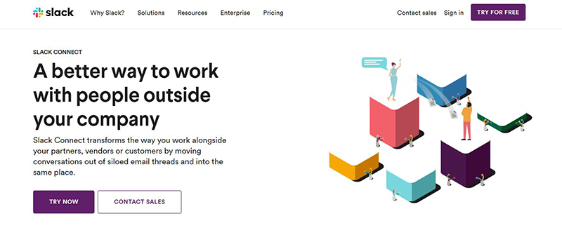
We can all agree that when it comes to landing pages, Slack is one of the best brands out there. Let’s take this landing page as an example, their headline is made up of exactly 10 words, while the subheadline is a little longer, explaining what they stand for and what a person can do on this platform.
Some people are apprehensive to try something new unless they see other people doing it as well. This is more relevant when it comes down to technology, software, and services.
To show people that they can trust your brand and service, as well as to convert, you need to add a helpful and subtle trust mechanism to your page.
Download count, user testimonials, famous partners that have trusted you with that specific business or products, or awards that show your value in the marketplace, all of these have the power to raise visitors’ trust percentage, as well as grow your brand awareness.
This tends to make people feel more comfortable and familiar with your brand, which leads to a higher number of converts. This is why most businesses online use social proof on their landing page, so go ahead and try it yourself.

See this landing page of AskNicely, a customer experience platform. When you enter the page, they have the “BOOK A DEMO” CTA right at the beginning of the page, but as you scroll down a bit, it stays on top of the right side, as a reminder. This way you can see the CTA button, people’s testimonials, and also the live chat all in one frame.
The most effective landing pages are the ones with visually amazing appeals. This is because the human eye catches the visuals faster than a text, so even if you keep your text short, fun, and big, your landing page still needs that media glam.
To make a visually attractive landing page, first, try to match the color of the page with your brand colors. Choosing the same, or close colors, and style of your website for a landing page will give users a feeling of trust and consistency.
Include an image: Many good landing pages use a relevant image to help convey their message, or just increase the overall appeal of the page. A boring page, after all, is unlikely to convert. The image should be large, not to get lost in the flow and, of course, of high quality. It’s best if the image reflects the brand or product, in at least some aspect. You can hire a designer or use image creator tools to get professional images.
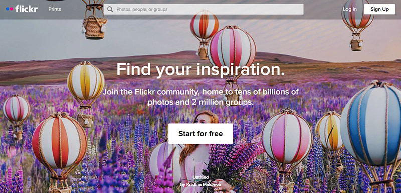
Flickr is an image and video hosting platform, and it’s only natural for it to have a huge image as a background, which, by the way, is changing every few seconds. You don’t have to be a Sherlock, to notice the amazing quality of the background image that absolutely suits their headline.
Include a video: Since landing pages are designed to convert, a video landing page seems like the ultimate powerplay. A short explainer video will give more information about the topic of your landing page, and help to increase the conversion rate. In fact, a recent study shows that video content helps to increase the amount of time people spend on a page, up to 71%! On top of that, Cisco anticipates nearly 82% of all Internet traffic to be video by 2022.

Here’s an example of a marketing course landing page, with a clear CTA and a video explaining what the course covers and how you can make good use out of it.
The purpose of your landing page is to lead people to do what you want them to, that is to convert. This means the most important element on a landing page is your CTA.
So, make sure your call-to-action button is clear and convenient for your visitors.
Don’t make your users feel lost, or scroll and click more than necessary. Hunting for the CTA button will reduce the number of your converts, which, let’s be honest, you absolutely can’t afford. Instead, choose a great position and color for it, paying attention to color psychology.
Set up an eye-catching CTA button, using your brand color and simple, to-the-point text: “Download (the app/the ebook)”, “Request (a demo)”, “Enroll (in a course), “Try for free” and so on.

Let’s take Netflix, for instance. They’ve made their homepage a landing page, where their main purpose is to get their visitors to subscribe. The CTA is staring right back at you, in Netflix’s bright red and white, and it’s hard to resist and not press that button.
The body copy is one of the most “scary” aspects of your landing page. Its function is to keep your audience on your page until they reach the CTA.
And here comes the scary part, the copy can’t be either too long or too short.
You have to decide exactly how many words and details you need to give the info people most probably want to know, before the conversion.
To have an informative and well-presented copy, you need to get to these two points:
Address the Pain: To avoid pain and loss is what every human being is trying to do in life, and it’s only natural. If you smoothly remind them about the pain they’re facing, they will be more eager to get immediate relief from it, and this will result in more conversions.
Promise the Pleasure: Next thing you want to do after reminding them about their “headache”, is to offer them a solution for it, like a first aid kit. Introduce your kind of remedy with words that they can relate to. You can also do the pain and pleasure references with smooth testimonials, or explainer videos.
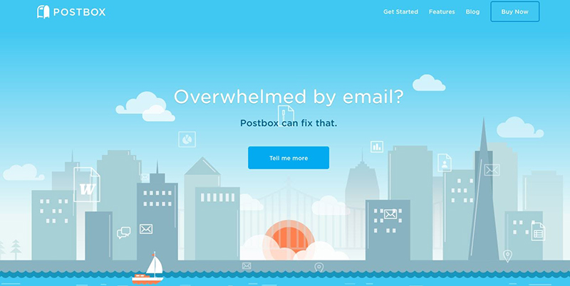
Postbox is an email app that offers convenient features and solutions for big and small businesses, educational institutions, and more. One of their landing pages is addressing an issue most of the people using email face: “Overwhelmed by email?”. And then they are offering you a solution and an immediate CTA. Fast, easy, and effective, right?
How trustworthy and authentic is your business? Give a positive first impression to your visitors by including some contact information.
Adding your email address, a phone number, the company address, or any other ways of contact to your landing page, will let them know that your business is legit and responsible.
If necessary, have a small space for live chat software or a popup window for a question form. To have a FAQ space is possible too, but let’s be honest, people just skip those, so the live chats and short forms are more reliable in this case. This way people can ask whatever question they have and get an answer within seconds.
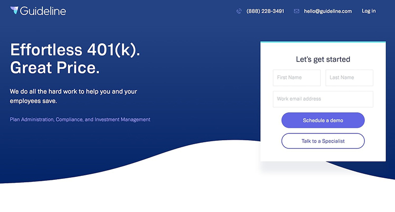
Guideline is a 401k company that has a nicely built landing page with its email address and phone number displayed on top of the page. It’s easy for people to notice it and think of it as a more trustworthy brand.
All things considered, creating a landing page doesn’t really take a lot of time and effort.
Once you find the right software or the online tools suitable for you, creating it will become a joyful hobby.
With Renderforest, you can choose a template for your landing page and edit it with your content – descriptions, images, videos, testimonials, a CTA button, etc.

There is an option for you to view the landing page and see how it’d look on a PC, mobile, and tablet, before attaching your domain and sharing it with the world.
Excited to get to work yet? Let’s start creating your landing page right now!
Creating a high-converting landing page can sometimes be a real challenge, however, once you set your landing page priorities right, you can create a nice-looking and effective landing page for your brand. All the elements above have the potential to be a part of your landing page and make it one of the bases of your income.
Article by
Dive into our Forestblog of exclusive interviews, handy tutorials and interesting articles published every week!
Read all posts by Renderforest Staff


Create Professional
in Minutes without Technical Skills.
Sign Up Now. It’s Free!