AI
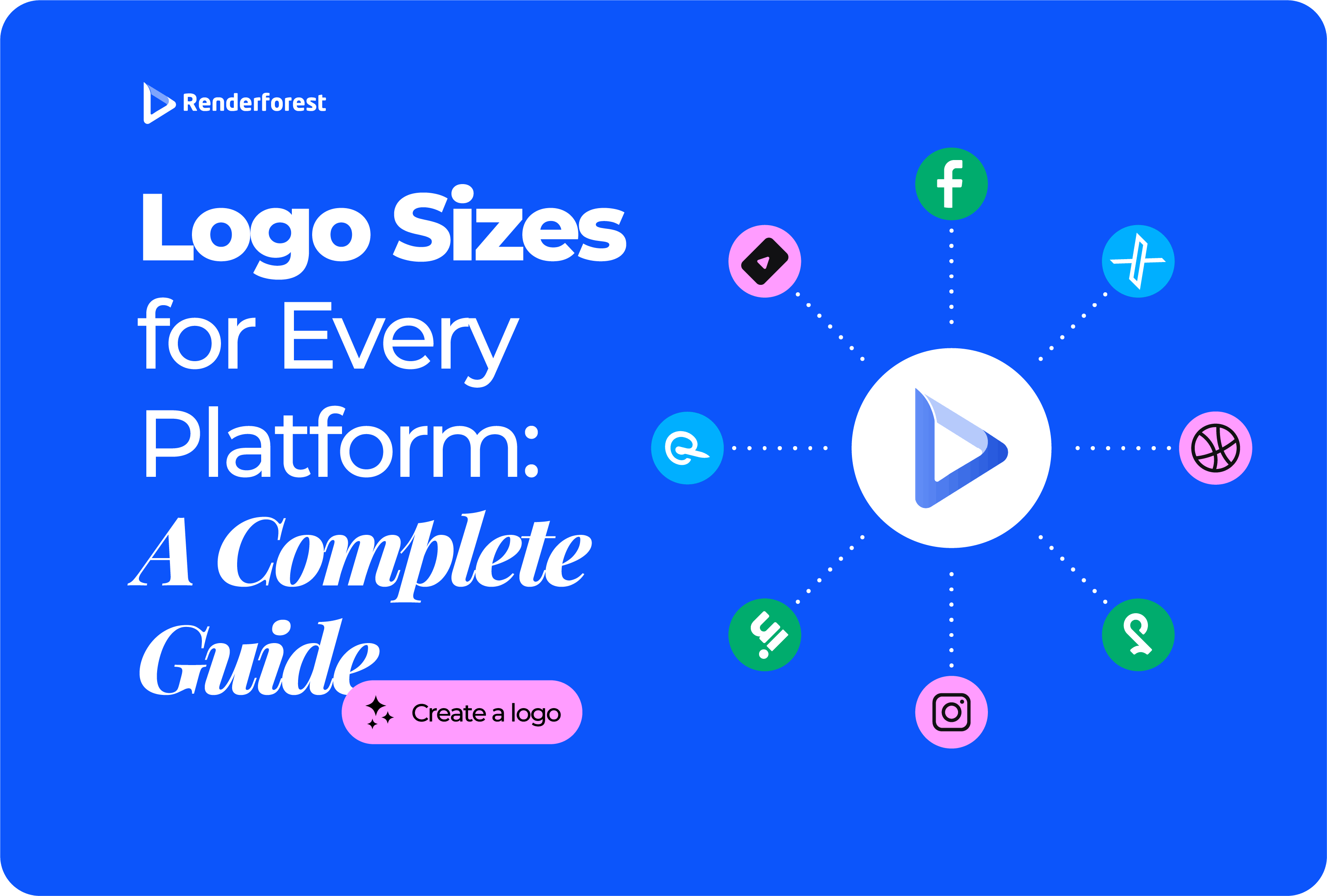
Logo sizes are not universal. A logo that looks sharp in your website header can look blurry in an email signature, cropped on Instagram, unreadable as a favicon, or rejected by a printer.
The fix is not to keep resizing the same file until it “fits.” The fix is to build a small logo size kit: one clean master file, a few layout versions, and platform-specific exports for websites, social media, app stores, marketplaces, email, video, and print.
This guide gives you the practical logo dimensions to use, but it also explains the part most size guides skip: which logo version to use, how much padding to leave, what file format to export, and how to avoid blurry or awkwardly cropped uploads.
If you need a fast starting point, use this table first.
Here is the simplest rule: use SVG for scalable website logos, PNG for transparent digital use, square exports for social profiles, favicon files for browsers and search results, app icon files for mobile platforms, and vector files for print.
Before you worry about Instagram, YouTube, LinkedIn, or email signatures, make sure your logo actually has the right versions. Most sizing problems happen because people try to force one logo layout into every space.
A complete brand does not need 100 files on day one, but it does need these four versions.
This is where many brands make the wrong move. They upload a horizontal wordmark as a favicon, shrink a detailed logo into an app icon, or send a low-resolution social image to a printer.
The right question is not only “What size should my logo be?” It is also “Which version of my logo belongs in this space?”
People use “logo size” to mean several different things. Separating them makes the rest of the guide easier.
Logo dimensions are the width and height of the file, usually measured in pixels. For example, 400 × 400 px for a LinkedIn company logo or 800 × 800 px for a YouTube profile image.
Display size is how large the logo appears after it is uploaded. A website header logo may be uploaded at 1000 px wide but displayed at 180 px wide.
This is normal. Uploading a larger raster logo and displaying it smaller can help it look sharper on high-density screens.
Logo file size is how heavy the file is, usually measured in KB or MB. A huge transparent PNG can slow down a website or make an email signature load slowly.
The format is the file type: SVG, PNG, JPG, PDF, EPS, or AI. Format matters as much as dimensions. A 1000 px JPG with a white background will not solve a transparency problem. A small PNG will not solve a print scaling problem.
A website usually needs a horizontal header logo, a compact mobile logo, and a favicon. Some brands also need a footer logo, white logo version, and icon-only version.
For the website header, SVG is usually the cleanest choice because it can scale without losing sharpness. If your website builder does not support SVG uploads, use a transparent PNG exported at two or three times the visible display size.
For example, if your logo displays at 180 px wide in the header, export a PNG around 500–600 px wide. That gives the browser enough image data to keep the logo sharp.
A favicon is the small icon that appears in browser tabs, bookmarks, and sometimes Google Search results. The biggest mistake is using the full horizontal logo. At favicon size, words usually disappear.
Use the icon-only version of your logo and export these sizes:
Google’s favicon documentation says the favicon must be square and at least 8 × 8 px, but recommends using a favicon larger than 48 × 48 px so it looks better across surfaces. Source: Google Search Central favicon guidelines.
The practical move: create a simple 512 × 512 px icon master, then export smaller favicon sizes from it.
Most social profile logos are uploaded as square images but displayed as circles. That one detail causes many logo problems.
Do not fill the whole square. Keep your logo centered and leave padding around it. A mark that touches the edges may look big in your design file but get cut off after upload.
Current social dimensions can change, so check the platform or a current image-size reference before a major rebrand. For a regularly updated overview, see Hootsuite’s social media image sizes guide.
Use a 320 × 320 px square logo for Instagram. The profile image displays as a circle, so the real design challenge is not the size. It is the crop.
Best practice:
A full company name may look professional in the upload preview and still be unreadable in Reels, comments, search results, and story previews.
Use a 320 × 320 px or larger square profile logo. For a page cover image, use an 851 × 315 px layout as a common working size.
For Facebook pages, your profile image appears in small contexts across posts and comments. A simple icon usually performs better than a full wordmark. For the cover image, keep important content away from the edges and from areas that may be covered by the profile image on some layouts.
For LinkedIn company pages, use a 400 × 400 px square company logo. The company logo should look serious, clean, and readable at small size.
If your brand’s main logo is a long horizontal wordmark, create a separate square version for LinkedIn. This can be a symbol, monogram, or stacked lockup.
For LinkedIn cover images, use the cover as a brand context area, not a giant logo. A clean tagline, product screenshot, team image, or value proposition usually works better than repeating the logo at massive size.
Use a 400 × 400 px profile logo for X. Header images commonly use 1500 × 500 px.
The profile image displays as a circle, so leave enough padding. For the header, keep text and logos centered because different screens may crop the edges.
Use at least a 200 × 200 px square logo for TikTok, but upload a higher-resolution version when possible. TikTok is a small-screen platform, so use the simplest brand mark you have.
Avoid long names, taglines, thin lines, and detailed illustrations. A strong monogram or symbol is usually better.
Use at least a 280 × 280 px square profile logo. Pinterest is highly visual, so your profile logo should support your content rather than compete with it.
If you place a logo on Pins, treat it as a small watermark or brand signature. The Pin itself should still lead with the useful visual, product, idea, or tutorial.
YouTube has three common logo-related placements: profile image, channel banner, and video watermark or overlay.
YouTube’s channel branding guidance recommends a banner image with a minimum upload size of 2048 × 1152 px and a 16:9 aspect ratio, with 2560 × 1440 px recommended for best results across devices. It also gives a minimum safe area for text and logos. Source: YouTube Help: manage channel branding.
For YouTube profile images, use the icon-only or stacked version of the logo. For channel banners, use the logo only as part of a broader brand layout. Add enough empty space so the design works on mobile, desktop, and TV.
For videos, use transparent PNG logos unless your editor supports SVG cleanly. Never pull the logo from your YouTube profile image and place it into a 4K video. It will likely blur.
App icons are not normal logos. They are small, square, often rounded by the operating system, and surrounded by other icons. A full wordmark almost never works.
Google Play requires a 512 × 512 px final icon, 32-bit PNG, sRGB color space, and a maximum file size of 1024 KB. Google also applies corner radius and shadows dynamically, so do not bake rounded corners or shadows into the final icon. Source: Google Play icon design specifications.
Apple’s app icon guidance explains that app icons appear across the system and should be unique, memorable, and recognizable at a glance. Source: Apple Developer app icon guidance.
For app icons, simplify. Use a symbol, monogram, or distinctive shape. If your brand logo only works as a wordmark, create an app-specific icon version.
Marketplaces and business profiles often have stricter requirements because logos appear in seller profiles, product pages, checkout experiences, and search surfaces.
Amazon Seller Central lists the seller logo requirement as JPG/JPEG or GIF, 120 px wide by 30 px tall, no animation, and a maximum file size of 20,000 bytes. Source: Amazon Seller Central business profile guidance.
For marketplaces, preview everything after upload. A logo can meet the pixel requirement and still look poor if the version is wrong. A long wordmark forced into a narrow 120 × 30 px Amazon seller logo may need a simplified horizontal version.
Email signatures need lightweight logos. A beautiful 3000 px transparent PNG is overkill and may load slowly or display oddly.
If your email signature displays the logo at 200 px wide, upload a 400 px wide file and set the display width in the signature editor. This keeps the logo sharper on high-density screens.
Avoid SVG in email signatures unless your email platform specifically supports it. PNG is usually safer across email clients.
Also avoid white transparent logos unless the signature background is dark. Many email clients use white backgrounds, so a white logo can disappear.
Documents are more forgiving than social platforms, but they still need the right export.
In presentations, the logo should not dominate every slide. Use a small corner mark on regular slides and save the larger logo for title, divider, and closing slides.
For invoices and proposals, keep the logo clean, high-contrast, and aligned with the document layout. If the document may be printed, use a high-resolution PNG or vector source.
For print, logo “size” is less about pixels and more about file type. A logo may need to appear on a business card, brochure, T-shirt, label, package, sticker, trade show banner, storefront sign, or vehicle wrap.
For print, vector is safest.
A 1000 px PNG may work for a website and fail for a storefront sign. A vector logo can scale cleanly because it is built from shapes and paths, not fixed pixels.
If a printer asks for PNG or JPG, ask for the exact dimensions and resolution they need. Do not send a small logo copied from your website.
The most common logo sizing problem is cropping. A square file does not mean the full square will be visible.
Use this safe-zone rule:
Padding is not wasted space. Padding is what keeps your logo readable after platforms crop, mask, compress, and resize it.
This is the section to check when the size looks “right” but the logo still looks wrong.
The fix is rarely “make it bigger” by dragging the corner of the same file. Start from the vector master or the highest-quality source, choose the right layout version, then export a fresh file for that placement.
Use this workflow when preparing logo files for your brand.
Keep an editable source file or vector master. This is the file you should return to whenever you need a new size.
Export at least:
Use SVG for scalable website headers, icons, and interface placements when supported.
Use PNG for social graphics, presentations, email signatures, documents, and video overlays.
Create separate exports for Instagram, LinkedIn, X, YouTube, TikTok, Facebook, Pinterest, and any other active platform.
Use icon-only artwork. Do not shrink the full wordmark.
Keep vector PDF, EPS, SVG, or AI files for vendors and printers.
Upload the logo to the actual platform and preview it on desktop and mobile. A file can be technically correct and still look wrong in the live interface.
Renderforest’s Logo Maker can help you create and customize a logo online. Renderforest also notes that users can download vector files through its logo creation process, which is useful when you need a logo that stays sharp instead of pixelating. If you are still exploring the concept before creating final exports, the AI Logo Generator can help generate logo directions from a short description.
A small business does not need every possible file on day one. Start with this kit.
This kit covers most real-world use cases without creating a messy folder of random exports.
Good file names prevent mistakes. Bad file names create them.
Avoid names like:
logo.pnglogo-final.pnglogo-final-final.pngnew-logo-use-this-one.jpgtransparent-maybe.pngUse names that explain what the file is:
brand-logo-horizontal-full-color.svgbrand-logo-horizontal-full-color-1000px.pngbrand-logo-icon-instagram-320x320.pngbrand-logo-icon-linkedin-400x400.pngbrand-logo-youtube-profile-800x800.pngbrand-logo-youtube-banner-2560x1440.pngbrand-logo-favicon-48x48.pngbrand-logo-app-store-1024x1024.pngbrand-logo-google-play-512x512.pngbrand-logo-email-signature-600px.pngbrand-logo-print-vector.pdfUse this folder structure:
A teammate should be able to find the right logo without opening every file.
Before you upload or send a logo, check this list:
If the answer is no, fix the export before publishing. It is easier to correct the logo file now than to replace it across every platform later.
There is no single best logo size. For websites, a 500–1000 px wide header logo is a practical export, or use SVG. For social profiles, use square PNGs such as 320 × 320 px, 400 × 400 px, or 800 × 800 px depending on the platform. For print, use vector files instead of fixed pixel sizes.
A website header logo usually displays around 120–220 px wide, but you should upload a larger file, often 500–1000 px wide, or use SVG. Also create a favicon at 48 × 48 px or larger for better appearance in Google Search.
Use a 320 × 320 px square logo for Instagram. Keep the mark centered and leave padding because Instagram displays profile images as circles.
For LinkedIn company pages, use a 400 × 400 px square logo. Use a simple icon or stacked version if your main logo is a long horizontal wordmark.
Use an 800 × 800 px profile image and a 2560 × 1440 px channel banner. Keep important banner content in the center because YouTube displays banners differently across desktop, mobile, and TV.
Create favicons at 16 × 16 px, 32 × 32 px, and 48 × 48 px. Google recommends using a square favicon larger than 48 × 48 px for better appearance in Search.
For Apple platforms, create a 1024 × 1024 px app icon master. For Google Play, create a 512 × 512 px 32-bit PNG icon that follows Google Play’s icon specifications.
Use SVG for websites and scalable digital use when supported. Use PNG when you need a transparent image for social media, documents, presentations, email signatures, or video overlays.
Your logo may be too small, compressed too heavily, or uploaded in the wrong format. Use SVG when possible, or export PNG files at two or three times the visible display size.
Most social profile images are uploaded as squares but displayed as circles. Keep the important part of the logo inside the center 70% of the square.
Send a vector logo, such as PDF, SVG, EPS, or AI. If the printer asks for PNG or JPG, ask for the exact dimensions and resolution they need.
Use a PNG logo around 300–600 px wide. Keep the file lightweight, ideally under 100 KB, and set the visible display width in your email signature tool.
Start with a 1000 px wide website logo, an 800 × 800 px social profile logo, a 48 × 48 px favicon, a 600 px wide email logo, a transparent video watermark, and vector files for print.
Logo sizes only make sense when you connect them to the platform, crop shape, file format, and use case. A website header, Instagram profile image, YouTube banner, app icon, email signature, and print file do not need the same logo export.
Start with a clean master file. Create horizontal, stacked, icon-only, black, white, and full-color versions. Use SVG for scaling, PNG for transparent digital use, square exports for social profiles, favicon files for browsers and search, app icon files for mobile platforms, and vector files for print.
A logo does not need one perfect size. It needs a practical size kit that helps your brand look sharp everywhere.
Share this
Article by: Liana Ziroyan
Liana is a marketing professional with 11 years of experience in digital marketing, content, and product communication. She has a strong eye for visual storytelling and loves turning ideas into engaging campaigns that connect with audiences. With her experience across branding, creative content, and user-focused messaging, Liana enjoys finding simple, effective ways to make products feel clear, useful, and exciting.
Read all posts by Liana Ziroyan