
Video Editing
Pastel colors can be used for way more than color-coding children’s clothing lines. Their application spans multiple industries, including interior design, fashion, cosmetics, confectioneries, entertainment, and many more. As tender as they are, pastels can be equally powerful in branding when used well.
This blog post is all about pastel colors, their impact, combinations, and best practices. So if you’re looking for an attractive yet peaceful color palette for your brand website, Instagram profile, or room decor, this article will be a great guide for you.
Ready to sail through the ethereal world of pastel color palettes? Because we certainly are!
Before we get into the specifics of pastel colors, let’s clarify what they are. Pastel colors are light shades of vibrant hues blended with white. They combine high value with low saturation, producing a soft, toned-down, and soothing look.
Pastels were popularized by 50s interior design and 80s fashion, yet they’re just as prominent in today’s digital era. Some of the most famous companies channeling pastel shades are Victoria’s Secret with its iconic soft pink, Tiffany & Co. with its trademarked Tiffany blue, Post-it with pastel yellow, and so on.

Pastel colors come in varying hues and shades, allowing you a broad selection and ample room for creativity when working with this color palette. The main pastel hues are blue, pink, yellow, green, purple, and orange. Naturally, each color comes with its own spectrum of variations, depending on the level of lightness.
To integrate into the pastel family, let’s get to know its most famous and celebrated members one by one.
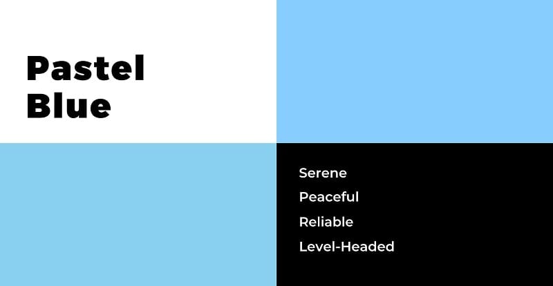
We can all admit it: The first scenario that jumps off when we think about baby blue is gender reveal. However, the beautiful, serene pastel color can be perfect for many other circumstances and projects as well.
Due to their unshakable similarity to the sky, lighter shades of blue have a strong soothing presence, while the darker shades give off a professional, level-headed feel. Blue is extensively utilized in boy’s apparel brands, social media, financial and corporate industries. To get more insights into the psychology and usage of blue, we recommend you check out our article on blue logos.
Pastel pink is associated with warmth, passion, femininity, and softness. Being the color of roses, pink is often used to add a pinch of romanticism and tenderness to a design. The unison of this unobtrusive hue and bolder, darker colors creates a pleasing palette for the eye.
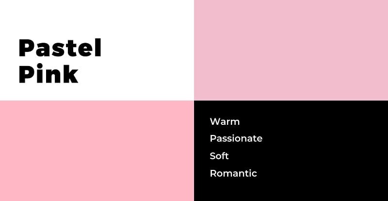
The most widespread shades of pastel pink include cotton candy, orchid pink, rose gold, cherry blossom, flamingo, lavender-pink, and many more. You often spot pink logos in cosmetic and fashion brands, especially ones intended for women or children.
This by no means suggests that pastel pink isn’t fitting for products or designs aimed at a male audience — Adidas proved the point well.

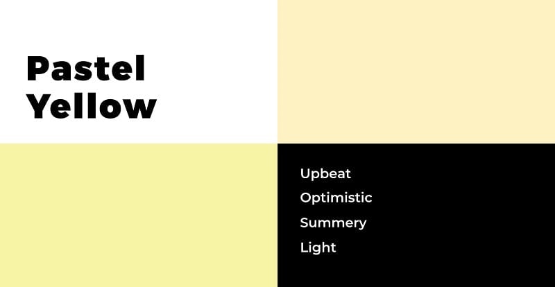
As opposed to bright yellow that exudes liveliness, optimism, and enthusiasm, pastel yellow is a bit quieter. Even in its lighter forms, the color looks upbeat and inviting in designs. It serves as an excellent tool to add a pop of color to neutral or dark-themed backgrounds but can be just as competent on its own.
Canary yellow, daffodil, banana, creamy corn are a few examples of pastel shades often used by businesses. Thanks to its relation to the Sun and summer, this color is the go-to for travel agencies, tourism businesses, and organic brands.
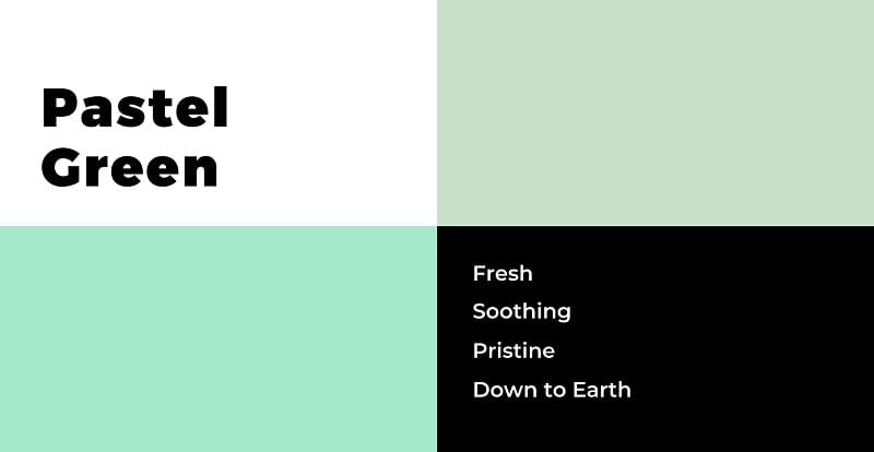
Soothing, refreshing, and down-to-earth, green in its pastel variants balances and cools any design. It signifies spring, nature, growth, and fresh beginnings, so it’ll be a suitable pick for your brand if these words resonate with you.
Mint green outruns other shades with its popularity but is not your only choice. You can go for pistachio, seafoam, light emerald, teal, or tea green. It’s not a surprise that a great number of eco-friendly businesses and environmental organizations employ this pastel hue in their assets.
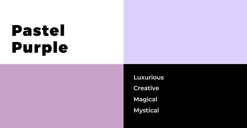
Pastel purple owes its unique charm to its ability to combine the calming, stabilizing energy of blue with the friendly warmth of red. It’s thus the perfect option if you want to have the best of both worlds in your designs.
Its rich appearance has made the color synonymous with wealth, nobility, royalty, but depending on the context, purple can also represent wisdom and creativity. This pastel offers numerous pleasant tints, some of which are mauve, lavender, lilac, etc. Purple is widely used by luxury fashion brands, creative agencies, and the beauty industry.
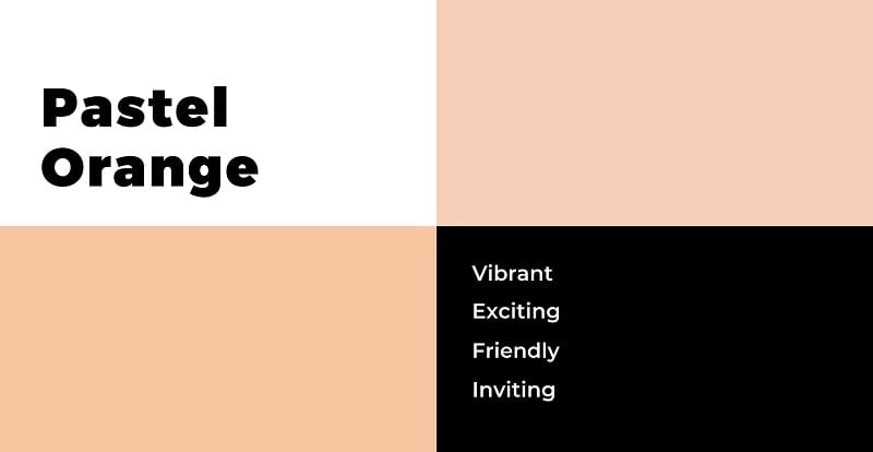
For those looking for a muted shade that also caries a pop of vibrancy and excitement, pastel orange is an ideal fit. It elicits images of spring blossoms, sunsets, and bonfires and is often used to give a welcoming look to a brand or its assets.
The best-known undertones of pastel orange include but are not limited to peach, salmon, cantaloupe, and more. Paler tones of orange look especially attractive when partnered with colder colors, as the visual contrast adds more interest to the design.
Now that we have discussed the main constituents of the pastel color palette, it’s time to get experimental and examine how these shades can intertwine with one another and team up with other color families.
Here are a few gorgeous pastel color palettes that you can use in a wide array of projects. Enjoy!
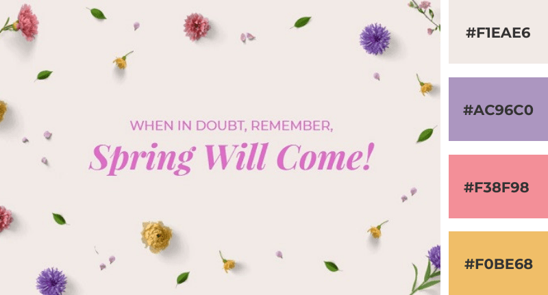
The design above makes use of more than one pastel hues — all of which remind us of spring. The milky off-white background creates a neutral setting for the brighter colors to shine. This delicate palette of pinks, purples, greens, and yellows can be perfect for gardening businesses, flower shops, websites, Easter designs, etc.

The contrast between the dark background and brighter colors immediately strikes the eye, proving once again that pastel looks ravishing next to black. The smooth gradient switching from peach yellow to mauve gives the design a sense of movement. This high-contrast color palette can work for any purpose — from a website color scheme to product packaging design.

Spring colors have come together again, this time, to create a subtle, almost pale design. This color palette can work wonders for companies that value minimalism and elegance. Skincare brands, wellness centers, and spas are among the many businesses that can benefit from such a soothing and gentle color scheme.
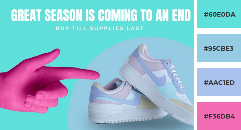
The dynamic mix of piercing turquoise and neon pink matched with paler pastels produces a lively yet balanced scheme that can be perfect for social media graphics, sales announcements, event promos, pitch decks, and a lot more. The energetic neons instantly grab the viewer’s attention, while the softer shades simmer the design down to avoid overburdening the eye.
Before you’re ready to go ahead and apply pastel colors to your campaigns, we want to give you some tips and tricks to ensure you end up with professional, shiny designs that convey the right message to your audience.
The number one rule of working with colors — whether pastel or not — is to align them with your brand identity. Colors are one of the most powerful visual tools to connect with an audience and be deliberate about the impression you leave.
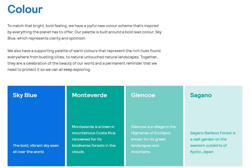
Here’s an example of how Skyscanner, the world-famous travel company, chooses and presents its brand colors:
If your company stands for vigor, drive, and intensity, then pastel colors might not be the best advocates for your values. Your choice of color will have not only a visual but also a psychological impact on your target audience, which brings us to our next point.
In addition to its aesthetic value, color possesses the ability to trigger specific emotions and memories. Be mindful of how people subconsciously perceive pastels. For most of them, these lighter tones indicate spring, softness, freshness, new beginnings, babies, and all things sweet and innocent.
Each hue can create a specific mood and stir up particular associations. To make the best of the colors you use, consider what emotions they’re generally linked to and use them to reinforce your message.
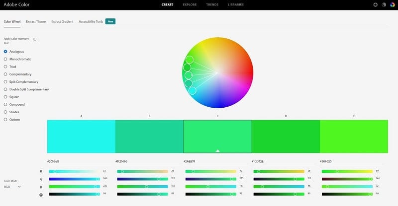
Just one pastel is probably not going to satisfy all your design needs, which means you’ll eventually have to face the challenge of finding flattering color combinations. You can either go with one of the pastel color palettes we discussed above or use tools like Adobe Color to elect pastels for your palette.
Keep in mind that pairing pastels with bolder or neutral colors can enhance your designs dramatically, thanks to the principle of contrast. Avoiding a color palette that’s too passive is as simple as adding one or two stronger, non-pastel shades that will serve as accent colors.
The same technique works the opposite way — pastels can work really well as accent colors in dark color palettes, bringing more balance and lightness to the mix.
Even though pastel color combinations look gorgeous, be careful not to overdo them and make your designs pale and unattractive.
Pastels are blends of primary or secondary colors with white. Due to low saturation, this color family looks calm, light, and airy and brings those qualities to any design it partakes in. This versatile color pack includes popular shades like baby pink and blue, green, lavender, peach, and many more.
Pastels are very common in health, beauty, fashion, ice cream, bakery, entertainment, and other similar industries. However, they can be a great complement to brands in any field as long as their sentiment aligns with the company’s core message and values.
Ready to put pastel colors into play and create stunning graphics for your next project? Click the button below to find a whole library of graphic design templates you can customize in a few clicks!
Share this
Article by: Renderforest Staff
Dive into our Forestblog of exclusive interviews, handy tutorials and interesting articles published every week!
Read all posts by Renderforest Staff