AI
Animated logo vs static logo is not a question of which one is better. A static logo is your brand’s source of truth. An animated logo is how that same identity behaves in motion.
Most brands need both, but they do not need both everywhere. Static logos work best when clarity, consistency, small-size recognition, print use, or accessibility matters most. Animated logos work best in motion-first moments like video intros, social clips, presentations, app screens, digital ads, and product launches.
The real decision is not “static or animated?” It is “which version belongs in this specific context?”
A static logo is the fixed brand mark used for recognition across websites, packaging, documents, app icons, print materials, social profiles, and small placements. An animated logo is a motion version of that mark, used when movement can improve attention, introduce the brand, or add personality in digital formats.
The best setup is a logo system: the static logo as the master identity, plus animated versions for specific digital use cases. If the animated logo does not resolve into a recognizable static mark, it is not strengthening the identity. It is becoming a separate asset.
A useful way to compare the two is this:
A static logo answers, “Who is this brand?”
An animated logo answers, “How does this brand move?”
That difference matters. Your static logo carries the identity. It has to work without sound, timing, transitions, effects, or a viewer’s patience. It appears in places where motion is impossible or unnecessary: invoices, product labels, contracts, favicons, storefronts, email signatures, business cards, packaging, and profile images.
Your animated logo adds behavior. It can show speed, calm, precision, playfulness, energy, transformation, or craft. But it should always come back to the original mark. Animation should extend the logo, not rewrite it.
This is the mistake many brands make: they treat motion as a visual upgrade before checking whether the static mark is strong enough. If your logo is hard to read, poorly spaced, low contrast, or generic as a still image, animation will not hide that. It will make the problem move.
A static logo is the version people need to recognize instantly. It may be a wordmark, symbol, monogram, mascot, emblem, or combination mark. It does not depend on sequence. A viewer should understand it whether they see it for five seconds or half a second.
A strong static logo works in practical conditions:
Static logos are still essential because the real world is not fully animated. A restaurant menu, invoice, shipping label, sponsorship banner, app icon, LinkedIn profile image, and product package all need a mark that sits still and remains clear.
Static also gives your brand control. It is easier to define spacing, color, size, and placement rules for a fixed mark. That matters when partners, employees, contractors, or franchisees use your brand assets.
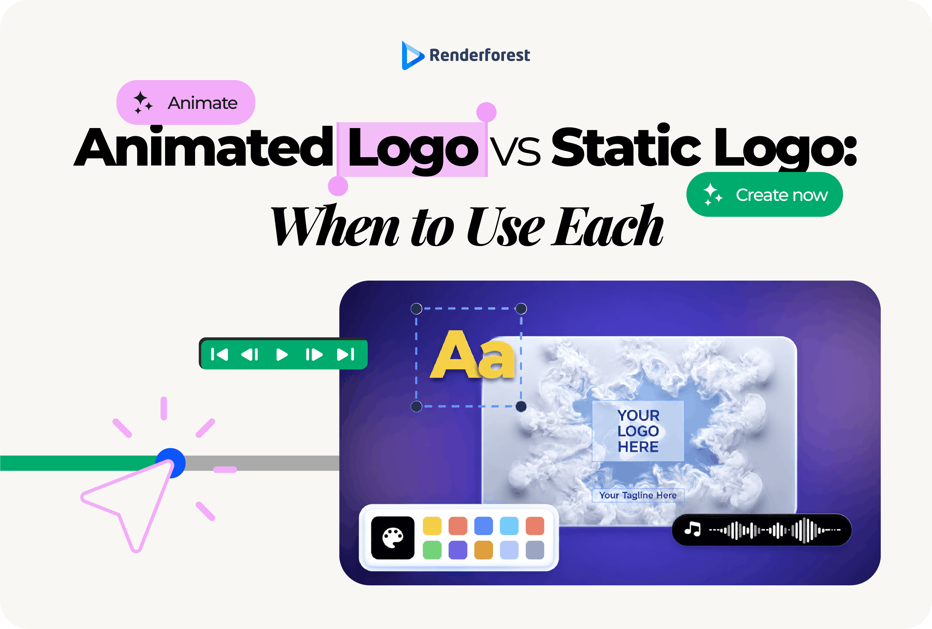
An animated logo is a motion version of a static logo. It can be as simple as a line drawing into place or as expressive as a full 3D reveal with sound. The goal is not to move the logo for decoration. The goal is to make the brand feel clearer, more memorable, or more natural in a moving environment.
Animated logos work especially well in:
Motion should have a purpose. Nielsen Norman Group’s UX guidance says animation works best when it is brief, subtle, unobtrusive, and used for feedback, state changes, navigation cues, or signifiers. The same principle applies to animated logos: the movement should support recognition or context, not delay the viewer.
A delivery brand might animate a route line. A cybersecurity brand might use a precise lock-in movement. A bakery might use a soft rise or steam-like reveal. A fitness brand might use a fast kinetic mark. In each case, the animation says something about the brand instead of applying a random effect.
The strongest brands do not treat these as competitors. They use the static logo as the identity anchor and the animated logo as one expression of that identity.
A static logo is the better choice when the viewer needs fast recognition, not a brand moment.
Animation cannot help on business cards, product packaging, invoices, delivery boxes, stickers, storefront signs, event badges, uniforms, or brochures. Those placements need a clear fixed mark.
This is why the static version must stand on its own. If the logo only looks impressive when animated, the identity is not ready for everyday use.
Favicons, app icons, watermarks, social profile photos, email headers, and mobile interface elements do not give you much room. Small placements punish thin lines, complex shapes, and long wordmarks.
Even if you use animation elsewhere, the small static version may be the logo people see most often.
Contracts, proposals, invoices, receipts, internal documents, compliance materials, and email signatures should feel stable. Motion would add friction or incompatibility.
A static logo works because it does not ask for attention. It confirms identity and lets the document do its job.
Static logos are safer in contexts where animation could distract, create discomfort, or fail to load. They also avoid issues with email clients, old devices, low-bandwidth environments, and reduced-motion preferences.
If you are unsure whether animation helps the user, the static logo is usually the safer default.
An animated logo is the better choice when the brand appears inside a moving experience and a static mark would feel flat, abrupt, or easy to miss.
Video is the most natural home for logo animation. A short reveal can introduce a YouTube video, tutorial, product demo, webinar, course module, brand film, or event recap.
Keep the viewer’s intent in mind. If the audience came to watch the content, the animation should be short. A complete reveal may work for a brand film. A fast sting is better for repeated YouTube episodes.
On TikTok, Reels, Shorts, LinkedIn, and paid social, your brand often gets only a second or two. A short animated logo can help the mark feel native to the format.
But the brand should appear early or resolve quickly. Saving the logo for the last frame can fail if people scroll away before the ending.
Presentations, product launches, webinars, trade show screens, and conference openers give you more room for a polished reveal. The audience expects a short introduction, so animation can help set the tone.
This is one of the safest contexts for a fuller logo animation, as long as it still feels aligned with the brand.
A logo can animate during a loading state, product transition, hover interaction, or app splash screen. But the animation should not block access to content.
Google Design’s motion guidance frames motion as meaningful when it supports usability and helps people understand what is happening in an interface. That is a good standard for logo animation in websites and apps: if motion does not clarify, orient, or reinforce the experience, reduce it.
The pattern is simple: static logos anchor the brand. Animated logos introduce or express it when the surrounding format already moves.
Use this matrix before deciding which version to use.
This is the article’s main decision point: animation is not a universal upgrade. It is a context-specific asset.
Have a static logo ready? See how it behaves in motion before you commit to a direction.
Before publishing an animated logo, pause it on the last frame.
If that frame cannot work as your normal logo, the animation is not ready.
The final frame should be:
This test catches a common problem: the animation looks exciting, but the final mark is weak, off-center, distorted, or too dependent on effects. A strong animated logo should end by strengthening recognition, not by asking viewers to decode the brand.
Before animating your logo, check the static version first.
If the static logo fails these tests, fix the logo before animating it. If it passes, motion can become a useful extension.
Every animated logo used on a website, app, or interface should have a still or reduced-motion version.
W3C’s technique for prefers-reduced-motion explains that the media query helps prevent motion animations from displaying for users who experience distraction or nausea from animated content. MDN defines prefers-reduced-motion as a CSS media feature that detects when a user has enabled a device setting to reduce non-essential motion.
For logo animation, that means:
Accessibility is not a reason to avoid animated logos. It is a reason to design them responsibly. The reduced-motion version should be planned from the beginning, not added as an afterthought.
The right logo format depends on where the asset will appear. You do not need to become a motion designer to understand the basics.
The wrong format can make a good animation feel bad. A large video file can slow a page. A tiny GIF can look rough. A horizontal export can get cropped in vertical video. Plan the placement before exporting the logo animation.
A SaaS company might use a static logo for the website header, dashboard, app icon, and invoices, then use an animated logo for product demos, onboarding videos, and webinar openers. The animation should be short and precise, not cinematic.
A YouTube creator might use a static logo for the channel avatar and thumbnails, then use a one-second animated sting for intros, outros, and transitions. The animated version can carry more personality because the channel lives in video.
A local bakery might use a static logo on packaging, storefront signage, stickers, and menus, then use a soft animated version for Instagram Reels or seasonal promos. A steam, rise, or dough-like motion would fit better than a tech-style reveal.
A consulting firm might use a static logo for proposals, LinkedIn, contracts, and presentation templates, then use a restrained animated reveal for webinars, pitch decks, and event screens. The motion should signal confidence, not entertainment.
A fitness coach might use a static logo for merch, profile images, and PDFs, then use an energetic animated logo for workout videos, course modules, and paid ads. The motion can be faster, but the final mark still needs to be readable.
A nonprofit might use a static logo for donation pages, reports, email, and print materials, then use a simple animated version for campaign videos and event openers. Clarity and trust should matter more than effects.
Motion can attract attention, but attention is not the same as recognition. If people remember the effect but not the brand, the animation has failed.
Your animated logo should not replace the static logo. A brand still needs a stable mark for print, legal documents, small placements, profile images, accessibility, and compatibility.
Long reveals may work in event settings. They usually do not work before short social videos, app interactions, or everyday website content. If the animation delays the user, shorten it.
A glitch reveal may fit a gaming channel. It probably does not fit a pediatric clinic. A soft organic morph may fit a skincare brand. It may weaken a cybersecurity brand.
The final frame often becomes a thumbnail, pause state, email asset, or fallback. It should be clean, centered, readable, and aligned with the static logo.
Many social videos autoplay without sound. If your animated logo only works with audio, it is too dependent on the soundtrack.
If the animation appears on a website or app, reduced-motion support is part of responsible design. Do not force movement on every user.
Once the static mark is ready, the safest animation process is simple:
If you already have a static mark and want to test motion directions, a template-based workflow can help you compare styles quickly. Renderforest’s logo animation tool is useful for this stage because it lets you preview logo animation styles, customize colors and music, and export versions for digital placements without starting from a blank timeline.
For a production walkthrough, Renderforest’s guide on how to create a professional logo animation covers the step-by-step process separately. This article’s job is to help you decide when animation belongs in your brand system.
Choose a static logo if you are still building your identity, need print materials, rely on small placements, or want the most flexible master asset.
Choose an animated logo if you already have a solid static mark and your brand appears often in video, social content, ads, presentations, apps, websites, or events.
Choose both if you want a logo system that works across modern channels. That is the right answer for most growing brands.
The hierarchy should look like this:
A static logo gives your brand stability. An animated logo gives it movement when the context calls for it.
Do not treat one as the universal winner. Build the static logo first, then animate it for the moments where motion adds clarity, personality, or polish. The best logo systems make both versions feel connected: one recognizable mark, with different expressions for different places.
Already have a solid static mark? Turn it into an animated version for your video, social, and presentation moments.
Share this
Article by: Liana Ziroyan
Liana is a marketing professional with 11 years of experience in digital marketing, content, and product communication. She has a strong eye for visual storytelling and loves turning ideas into engaging campaigns that connect with audiences. With her experience across branding, creative content, and user-focused messaging, Liana enjoys finding simple, effective ways to make products feel clear, useful, and exciting.
Read all posts by Liana Ziroyan