AI
To animate a logo well, start with a clean transparent PNG or vector file, decide where the animation will appear, choose one motion idea that fits the brand, then build it with a template, AI tool, or motion-design software. Refine the timing, give the finished logo enough time to register, and export the version that fits its final destination.
For most video uses, 2 to 5 seconds is a useful starting range. Short-form ads and social clips often need less. A presentation or brand film may justify more. The goal is not to make your logo move for as long as possible. It is to make the movement feel intentional and leave the viewer with a clear impression of the brand.
If you want the quickest route, a ready-made logo animation maker gives you a professional motion framework without requiring keyframe experience. AI is useful when you want to explore more unusual ideas. Manual animation is the better choice when every curve, timing decision, and brand rule needs precise control.
Choose the method before you choose the effect. That one decision can save you a surprising amount of time.
There is no prize for choosing the most technical method. If you need a two-second YouTube sting tomorrow, spending days building it manually is probably unnecessary. If you are defining a permanent motion identity for a global rebrand, a generic preset probably is not enough.
The software can change. The underlying process does not change much. A strong logo animation usually comes from making six decisions in the right order.
Start with the destination, not the animation.
A five-second reveal that feels elegant at the beginning of a conference presentation can feel painfully slow inside a six-second social ad. A website logo has performance and accessibility requirements that a rendered YouTube intro does not. A logo used over video footage may need a different background treatment from one used on a presentation title slide.
Before you create anything, answer three questions:
For short-form video, question whether you need a traditional intro at all. A Reel, TikTok, or Short may perform better when the content starts immediately and the logo appears as a brief sting, transition, or end card instead.
If your main goal is specifically a channel opener rather than a standalone brand animation, use a dedicated intro maker workflow so the logo, text, music, and opening sequence are designed together.
Source quality sets the ceiling for animation quality. A tiny JPEG copied from a website may look acceptable while static, then reveal every soft edge and compression artifact once it starts moving.
For simple online workflows, a high-resolution transparent PNG is usually the easiest starting point. Renderforest currently recommends a 1000 × 1000 transparent PNG for its logo animation workflow.
For detailed manual animation, editable vector artwork gives you more options because the symbol, wordmark, paths, fills, and other elements can potentially move independently. If you are unsure what you have, Renderforest’s guide to logo file formats explains the practical differences between PNG, SVG, JPG, AI, EPS, and PDF.
Before animating, check that your logo has:
Do not automatically animate every element simply because you can separate it. A tagline that looks fine on a business card may become unreadable in a one-second social sting. Animation usually benefits from simplification.
The most reliable logo animations begin with the logo itself rather than an effects library.
Look at the mark and ask: what movement already feels implied by this design?
Try describing your animation in one sentence before building it:
“The three shapes slide together, lock into the symbol, then the wordmark fades in.”
That is a concept. “Particles, glow, glitch, zoom, and 3D rotation” is a list of effects.
If the logo animation is impressive halfway through but difficult to recognize when it resolves, the effect has won and the brand has lost.
Templates are best when speed and predictability matter. You begin with motion that has already been designed, then adapt the logo, colors, text, background, audio, and other available elements.
AI is best for exploration. It can produce atmospheric reveals, lighting ideas, unusual transformations, environments, and creative concepts very quickly. The tradeoff is accuracy: generative systems can reinterpret a logo rather than simply move it.
Manual motion design is best for precision. It makes sense when the animation will become a permanent part of the brand system, when individual vector elements need exact choreography, or when you need specialized outputs for broadcast, product interfaces, or professional compositing.
For many businesses and creators, a template is the sensible first choice. You can always commission a custom system later if the animated identity becomes important enough to justify it.
Once you know the destination, source file, motion concept, and method, the actual build becomes much easier.
Open the Renderforest logo animation maker and browse the available logo reveals. Do not judge a template only by the demo logo. Look at the underlying movement, pacing, background, and overall mood.
A restrained reveal that fits your identity will usually age better than the most spectacular template in the library.
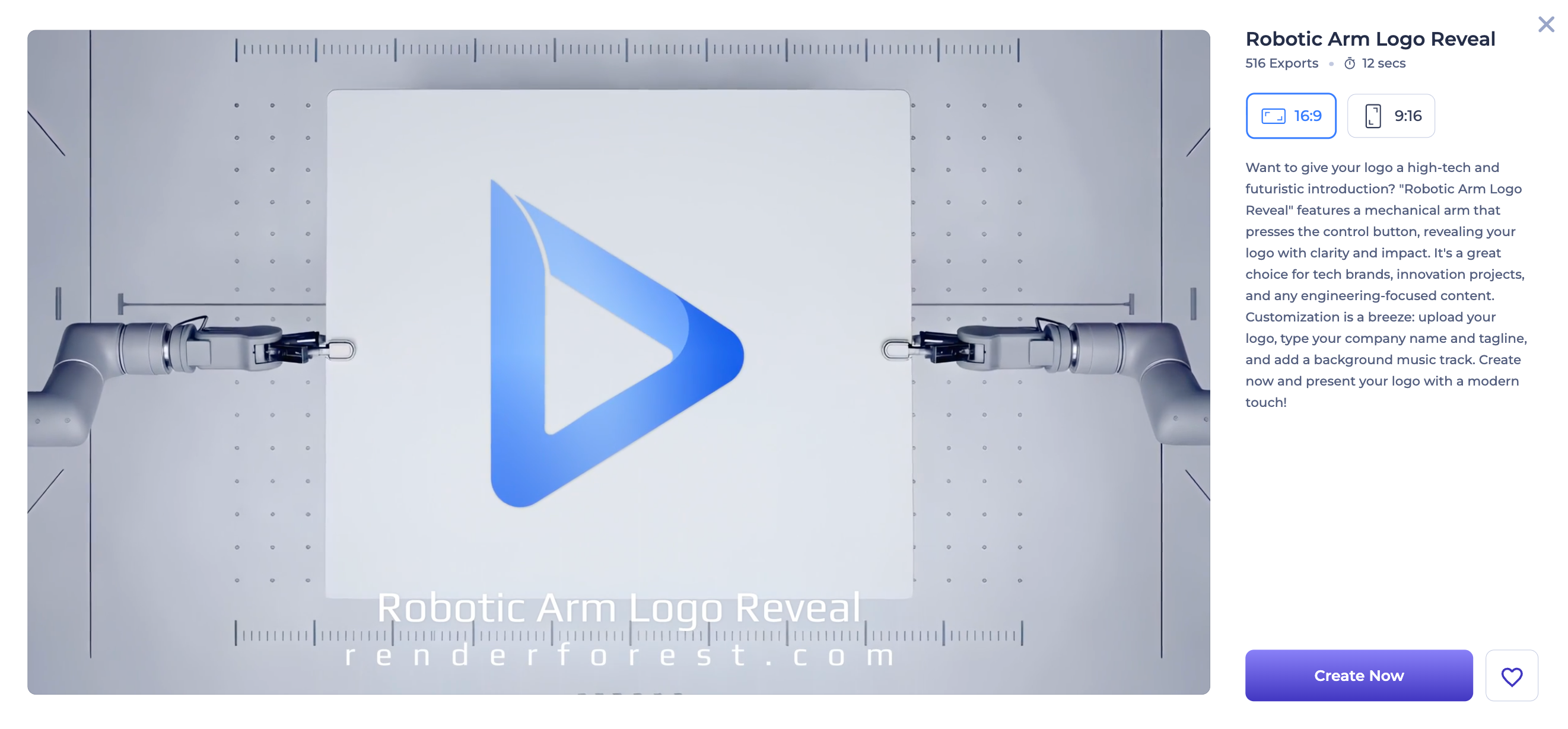
Upload your logo, then customize only the elements that improve the result. Depending on the template, that can include colors, typography, background, visual effects, audio, and other scene settings.
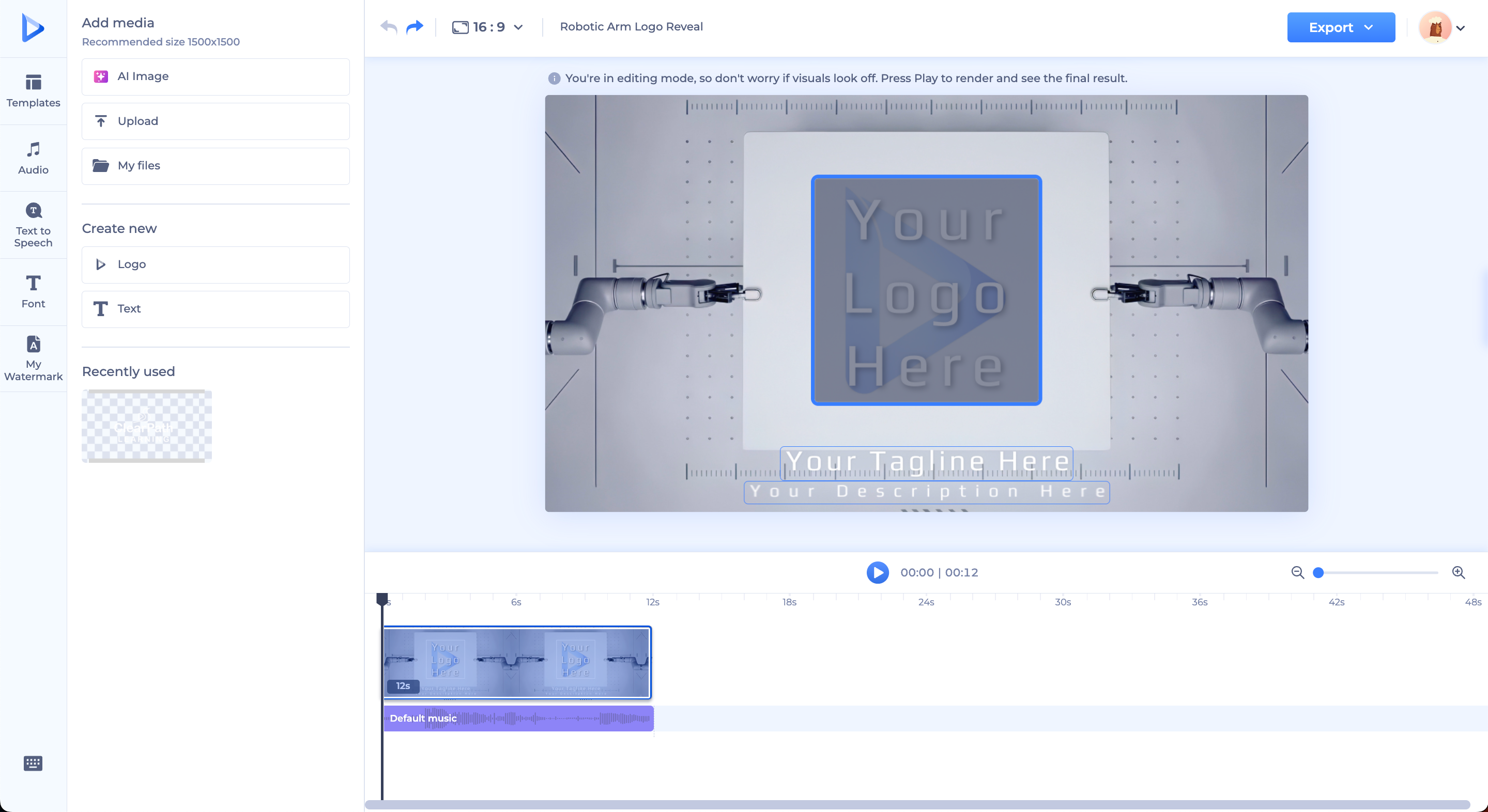
Then preview the animation at full speed. Watch it once normally. Watch it again while looking only at the logo. Finally, shrink the preview until it roughly resembles how somebody may see it on a phone.
That last test catches problems desktop editing screens hide: taglines become unreadable, thin strokes disappear, and elaborate particles turn into noise.
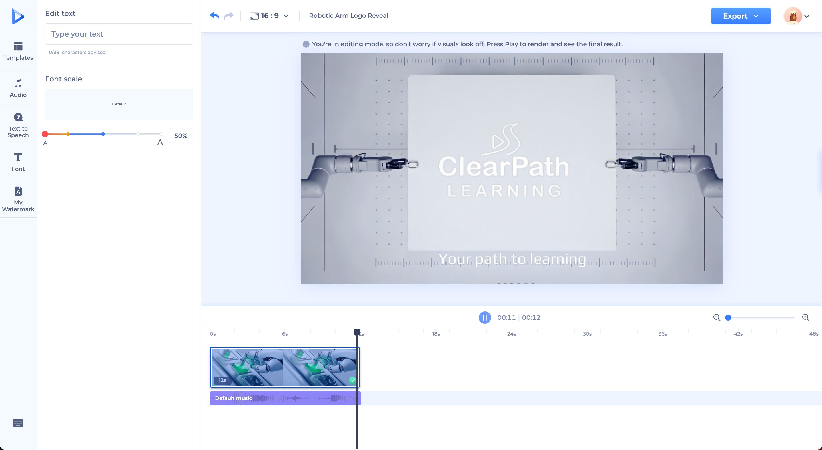
Renderforest’s current logo animation workflow exports MP4, with 360p, HD720, and HD1080 options listed on the product page; availability varies by subscription. Template duration also varies, so choose the animation based on the placement rather than assuming every project should have the same length.
AI logo animation needs a different mindset from conventional motion design. Traditional animation moves known elements. Generative video can reconstruct frames, which means it may also change typography, spacing, geometry, colors, or details that were supposed to remain fixed.
A useful rule is:
Preserve → move → resolve.
For example:
“Preserve the uploaded logo exactly. Create a clean two-second reveal where the geometric symbol assembles from its existing pieces, followed by a subtle wordmark fade. Keep the camera static. Do not alter the text, colors, spacing, shape, or proportions. End on the exact original logo, centered and sharp.”
Renderforest’s AI video generator currently accepts image inputs alongside prompts, which makes it useful for experimenting with motion around an existing brand asset.
Inspect the output frame by frame before treating it as brand-ready. If AI changes one letter, narrows a gap, adds an extra symbol, or subtly reshapes the icon, the animation may be visually attractive but still unusable as an official logo asset.
If you want detailed prompting examples, use Renderforest’s dedicated guide to AI logo animation prompts. Keeping the prompt library there—and the general animation workflow here—makes both resources more useful instead of repeating the same material.
Manual animation gives you the most control, but the basic workflow is not mysterious:
Adobe’s current After Effects SVG documentation explains that recent versions can import SVG artwork as footage or as a composition containing editable shape layers. That makes paths, fills, transforms, and individual elements directly available for animation when the source artwork is suitable.
Do not confuse more control with a need for more movement. A carefully eased scale and fade can look more professional than six technically impressive effects fighting for attention.
Timing is often where a basic animation begins to feel designed.
Think in three parts:
Entrance → settle → hold
The entrance creates movement. The settle removes the remaining energy. The hold gives people enough time to recognize the finished logo.
Beginners often spend nearly the entire duration on the reveal and then cut away as soon as the logo is complete. That is backwards. The completed logo is the part you want viewers to remember.
For many conventional video uses, 2–5 seconds is a sensible starting range rather than a rule. A paid social sting may need only a second or two. A presentation opener may have room for three or four. If the animation still communicates the idea after you remove half a second, keep the shorter cut.
Sound is optional. A precise click when two shapes connect or a restrained tonal hit when the final mark appears can reinforce the motion. A generic explosion, enormous whoosh, or soundtrack that feels bigger than the identity usually does the opposite.
Always mute the animation once before approving it. The visual idea should still make sense without audio.
There is no universal “best” animated logo format. Choose the format according to where the asset will actually live.
One important distinction: a transparent source logo does not automatically produce a transparent final video. You may upload a transparent PNG, then export an ordinary MP4 with a background. If transparency in the final animation is essential, confirm the delivery requirements before you build the project.
Website logo animation deserves slightly different treatment because it becomes part of an interactive experience rather than a self-contained video.
Keep the asset lightweight. MDN’s animation performance guidance notes that web animation can create performance problems through large media files or computationally expensive animation work. A beautiful logo reveal that makes the interface feel sluggish is not an improvement.
Also respect users who prefer less motion. The CSS prefers-reduced-motion feature lets a site detect when a user has requested reduced non-essential motion at the operating-system level.
And avoid turning your navigation logo into an endless distraction. Under WCAG 2.2 guidance for moving content, automatically moving content that continues for more than five seconds alongside other content can require a way to pause, stop, or hide it unless the movement is essential.
For many websites, the best behavior is simple: animate once when appropriate, settle into the static logo, and stay out of the reader’s way.
Particles, flames, glitches, chrome, smoke, and camera spins are treatments. They are not concepts. Start with what the logo should do and why. Add styling afterward.
A logo reveal may look elegant on its own and become irritating when viewers have to watch it before every short video. Judge duration inside the real content, not only in the animation preview.
Stretching a wordmark, changing its proportions, altering the spacing, or allowing AI to regenerate letters undermines the very recognition the animation is meant to reinforce.
A logo rarely needs to rotate, bounce, glow, explode, morph, and zoom in one sequence. Give the viewer one dominant action to follow.
Motion catches attention. The stable final mark creates recognition. Give people a moment to see the logo before cutting away.
Watch the animation at thumbnail size. If the wordmark disappears, the tagline becomes a grey line, or the icon gets lost in an effect, simplify the design.
A useful motion identity is usually a small family of related assets rather than one master file forced everywhere.
Consider keeping:
Before publishing, run the animation through three simple tests.
Pause on the final frame and compare it with the approved static logo. Is the typography correct? Are the proportions, spacing, symbol, and colors intact? Can you recognize it instantly at small size?
Can you explain in one sentence why the logo moves this way? If the answer is only “because the effect looked cool,” the concept probably needs another pass.
Place the animation where people will actually encounter it. Watch the full YouTube intro. Load the page on a phone. Put it inside the presentation. View the social ad at normal scrolling speed.
Animation that works in isolation can fail completely in context.
Yes. A high-resolution transparent PNG works well for many simple logo animations, including fades, movement, scaling, rotation, template-based reveals, and some AI workflows. Because a PNG is flattened raster artwork, however, individual letters or shapes are not automatically available as separate elements.
PNG is convenient for online template tools and simple video workflows. SVG is more useful when you need scalable vector artwork or want to animate individual paths and shapes in compatible software. The better choice depends on how the animation will be built.
For many video uses, around 2–5 seconds is a practical starting point. Social stings and ads may need only 1–2 seconds. Presentations or brand films can use more time when the reveal genuinely benefits from it. The best duration is the shortest one that makes the movement understandable and leaves enough time to see the completed logo.
Yes. Image-to-video AI can create motion from or around a logo, but generative systems may alter text, geometry, spacing, or colors. Give the model strict instructions to preserve the identity, then compare the final frame against the approved logo before publishing it.
Use an online template-based logo animation tool. Upload the logo, choose a motion style, customize the available design settings, preview the result, and export it. This is usually the most efficient approach when you need a professional-looking branded asset without frame-by-frame control.
MP4 is a good default for ordinary video, social media, presentations, and ads. Websites and apps may benefit from other formats or vector-based implementations depending on the design. Professional compositing may require an alpha-capable production format. Choose the format based on the destination rather than trying to create one file for every use.
A strong animated logo does not need to prove how much your software can do. It needs to make the identity feel natural in motion.
Start with a clean source file. Decide where the animation will live. Find one movement already suggested by the logo or brand personality. Choose the simplest method that gives you enough control. Refine the timing. Protect the final mark. Then test the result in the real environment where people will see it.
If you need a fast, controlled starting point, browse Renderforest’s logo animation templates. If you are still building the static identity, create that first with the logo maker and make sure the logo works without motion before you animate it.
The best logo animation is rarely the one viewers describe as having the most effects. It is the one that ends with them remembering the brand.
Share this


Article by: Sara Abrams
Sara is a writer and content manager from Portland, Oregon. With over a decade of experience in writing and editing, she gets excited about exploring new tech and loves breaking down tricky topics to help brands connect with people. If she’s not writing content, poetry, or creative nonfiction, you can probably find her playing with her dogs.
Read all posts by Sara Abrams