AI
Figuring out which are the best fonts used by graphic designers is a confusing process. Not only is there a bewildering number of fonts to choose from, but so many of them look so similar!
With such an abundance of fonts available, you’ll find that most graphic designers will debate endlessly about which font is most professional in appearance.
Renderforest loves saving you time and making the design of your message easy for you. So, we’re sharing 10 of the best fonts for professional-looking designs. Now you, too, can join the debate!
Before we get to the list of best fonts used by professionals, let’s go through some commonly used terms we’ll be using to describe fonts without getting into the nitty gritty of typography.
Keep in mind that good designers try a few fonts to get the right feel for their design, and sometimes they use typography tricks to get the effect they’re seeking. Use the following list to update your designs or as jumping-off points for your next design:
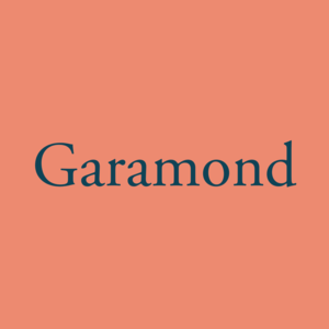 Garamond: With a history going back to the 15th century, it’s almost guaranteed that you’ve seen this font innumerable times in your life. The granddaddy of all serif fonts, Garamond is still extremely versatile for both headers and body text. Perfect for print, this font has transitioned easily into digital and film media by offering bolder weights. An excellent choice for easy reading and to bring a sense of familiarity to your message.
 Bodoni Moda: Derived from another classic font set that’s been around since 1798, Bodoni Moda is a modern set that retains the elegance of the original Bodoni typeface but with a new twist. The changing weight of the lines within the letters makes for an arresting effect most suited to large headings and posters. We do not recommend this font for body text as the thin lines will disappear into the background.

Libre Baskerville: An excellent alternative for body text, Libre Baskerville supports an array of Latin-based languages and many regional languages using Latin-based symbols, such as Greenlandic and Kirundi. For alternatives to Libre Baskerville, try Palatine Linotype and Cambria.
 Montserrat: Created in Buenos Aires to preserve the neighborhood’s distinct style, Montserrat is a modern font available in three variations: Montserrat, Montserrat Alternates, and Montserrat Subrayada (underlined). The font is clean and bold. Suitable for headers, we can also use this font for smaller volumes of the body text on ads, social media images, and posters. It would also suit videos with its bolder weights.
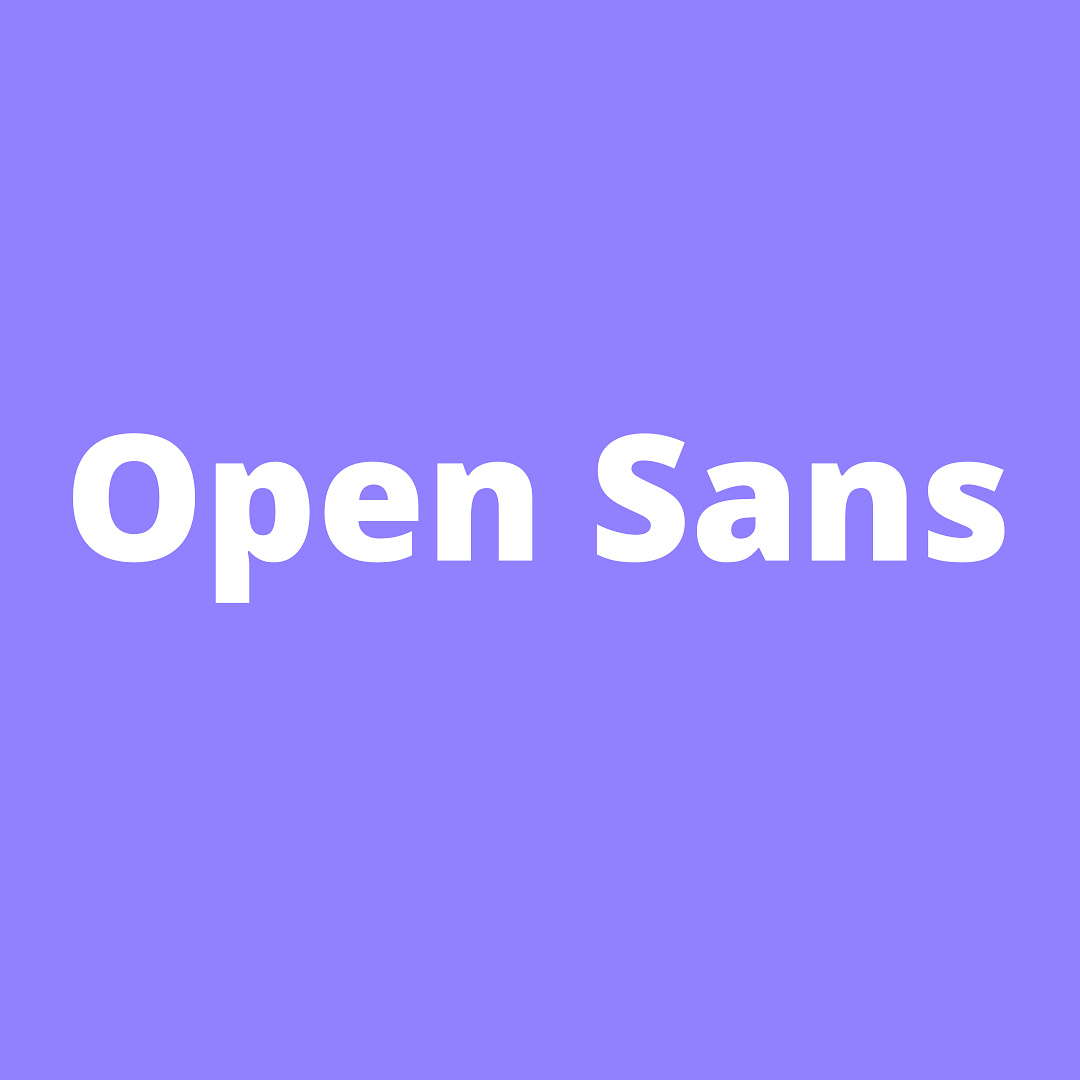 Open Sans: A relatively new addition to the typeface community, Open Sans was derived from Droid Sans for Google projects. Designed specifically for web and screen displays, this font can also be used for print projects. Available in a variety of weights and a few derivatives, Open Sans has a full complement of commonly used glyphs and Unicode support for Latin, Greek, Cyrillic, and Hebrew alphabets. Alternatives to Open Sans include Calibri and Segoe UI.

Poppins: This modern font has geometric letters which make for a clean, balanced look with distinct letters that have equal widths. Poppins includes letters for Sanskrit-based Indian languages. With multiple weights, Poppins is a firm font favorite for many professionals

Bebas Neue: This evolving font has a condensed sans-serif look that is in the style of Helvetica. In addition to optional weights, Bebas Neue displays in All Caps. A Pro version includes lowercase lettering. For an alternative, try TW Cen MT.

Crimson: Another modern font, Crimson draws heavily from Garamond for inspiration and usability. Available in various weights, this serif font is perfect for large blocks of body text. With its classic feel, it imparts a feeling of approachable authority. It also supports several languages, as well as numerical fractions.

Epilogue: Epilogue is another versatile font that can be used for headings and body text. Available in various weights, Epilogue combines the best of classic and modern fonts and can be used for formal and informal communication. Latin-based languages are supported.
 Kanit: Designed for a modern rendering of Thai script, Kanit brings a dynamic feel to its Latin characters as well. Suitable for making a statement or imparting a sense of advancement and the future, Kanit allows for experiments in typography through leading and kerning for added effect. This font also supports a number of indigenous languages.
Avenir is a perennial favorite of professionals, as are Univers, Frutiger, and Futura. Harmony has become more popular in the serif class, while Proxima Nova and Lato gain popularity in the san-serif and display classes.
Fonts are regarded as artwork so they are protected under copyright laws by their creators and design foundries. Many creators choose to offer fonts or font families for free through open-source and creative commons licenses. Others may choose to collect royalties or sell the files with specific licenses. The most common licenses found on free-to-download sites are 100% Free (personal, commercial), Personal Only (no commercial use), and premium (a license based on your intended use of the font: desktop, ebook, corporate, and so forth).
When designing for commercial use (including web ads and sponsored posts), it’s vital to know what license the fonts you use are carrying.
Most famous brands begin with commonly used fonts such as Garamond and Proxima Nova. Designers often add elements or make other design changes to the lettering. The result is then typically used as a custom-made font for that brand, for example, VW. The debate is still out on whether the base font is Futura or Avant Garde. Other brands are more identifiable. Here’s a short list for you.
It’s quite difficult to find a definite answer to this question. While most people agreed on which fonts are aesthetically pleasing, each person would still have their own opinion on which is the ultimate winner. Some fonts may look best in certain designs, but be totally inappropriate for another design.
Generally, san-serif is considered more appealing to the eye, but these fonts are not always the best for larger bodies of text. Time also changes a person’s perception of a font. Rage may be all the rage today, but tomorrow, we may be back to Harmony!
For this reason, it’s crucial to pick versatile fonts that are likely to have a timeless appeal for branding.
Every designer knows their font files need to be safe and clean of internet heebie-jeebies. Furthermore, font files should not be corrupt when downloaded. Professionals also need to have confidence that the font downloaded has the license as advertised in order to avoid legal difficulties, particularly in commercial designs, including eBooks and brochures.
In addition, graphic designers also need to consider budget restraints. There’s a wonderful selection of reputable font distribution sites to choose from. Many are free to use with free downloads while others offer premium fonts with commercial and specific licenses.
Overused and misused fonts are the ones to avoid. Overused fonts include Helvetica, Franklin Gothic, Times New Roman, and Trajan. Misused fonts include Comic Sans, Impact, Curlz MT, and Bradley Hand. Papyrus also seems universally hated, although secretly used! Some display fonts such as Magneto can also be hard to read and can dilute your message. For the same reason, avoid cursive script for major words or sentences.
Try using alternative fonts with the same feel but with a fresher look.
Serif, Script, and extremely blocky fonts with little spacing between letters are all to be avoided if you’d like great accessibility in your design. Choose sans-serif fonts with distinct letter displays, reasonably spaced letters (kerning can help), and no underlining or other effect that may make letters flow into each other.
Recommended fonts include Arial, Calibri, Century Gothic, Verdana, OpenDyslexic, Open Sans, Epilogue, and Poppins. Use Comic Sans with care as, while it’s seen as dyslexia-friendly, it may alienate other groups who judge the font harshly.
Recommended Reading
Now, you have the tools to discover the fonts that will make your design more professional and pleasing to the eye.
Refresh your designs with an updated font or create a more engaging message with your new favorite font using our AI image generator and graphics maker. You’ll be surprised at the results. Click on the button below to start creating your new design using stunning fonts!
Share this
Article by: Renderforest Staff
Dive into our Forestblog of exclusive interviews, handy tutorials and interesting articles published every week!
Read all posts by Renderforest Staff