AI
Contrary to popular belief, you don’t need to be a talented designer to create a successful logo design. With online logo maker tools available, you can easily design a logo that will become your brand identity and convey its message.
But what should a powerful logo look like to stand out and serve its purpose? Let’s find out together!
We’ve collected 16 actionable tips for those who have ventured to create a company logo. From the moment you choose a logo style to when your icon is shining on the billboards, our practical logo design tips will guide you.
So, if you’re ready to take this rewarding process into your own hands, let’s dive right in!
Are you sure you know your brand well enough? You can only create a business logo that ideally represents your brand if you dig deeper into its core values and differentiating features.
Let’s say you are a retailer that sells organic products. You’d like your customers to associate your brand with a healthy lifestyle, sustainability, and trustworthiness. All these qualities should be reflected in your organic brand logo. Thus, keeping them in mind throughout the design can make all the difference between a poor and a good logo design.
![]()
In short, your company logo design should agree with your overall branding strategy. Before you start working on your logo, take the time to define what makes your brand special and helps it stand out from the competition. Answering the following questions will put you on the right track:
Ensure you have your answers before proceeding, as you will refer to them later.
If you already have a base of returning customers, you can ask them what they like about your products, services, or brand. Pay attention to the most frequently mentioned characteristics and make sure to reflect those in your logo design.
Have you created any buyer personas for your business? If so, now’s the time to bring them to the table. Why? Because, among other things, your logo should be tailored to your target audience. In other words, your customers should be the first to find it relevant and attractive.
One way to get this right is to run a preference test. It’s similar to A/B testing in online marketing campaigns, only much simpler. All you need to do is create several logo designs and ask people who fall into your target audience which design they prefer.
![]()
You could include additional questions, like which icon they find most trustworthy, modern, or other characteristic relevant to your brand. Once you have their answers, making the right choice will be easier.
Many tools online can ease your job and help you create a company logo you’re truly proud of. How about exploring some of those?
Renderforest Logo Maker is an online tool that generates customizable logo designs based on your company name and description.
![]()
You can pick a suitable icon from the suggested list or create your logo design project with the help of the tool. You can also go with customizable logo presets available for various categories. The extensive collection of logo templates is constantly updated with new designs — all created by professional logo artists.
The platform has many other interesting features. For one, it enables you to create mockups with your icon, like the one above. There’s even the option to animate logos, making your video intros more professional.
There are many design websites where you can hunt for inspiration. Websites like Logo Gala and Logo Moose are great places to begin. They feature logo designs created by professional artists and can serve as an inspiration when you’re unsure where to start.
If pre-existing logos are too restricting, try expanding your search to Dribbble or Deviant Art. These are websites for artists and designers to showcase their works.
![]()
If you’ve given up on creating a logo yourself by now, you might even find an artist to hire there. However, if you’re not the type to easily give up, let’s keep going!

Wondering “How to animate a logo?”, try Renderforest! Elevate your brand with Renderforest Logo Maker. Explore diverse logo templates and enjoy limitless revisions for a professional, consistent look. Save on design costs and invest in your business growth.
Get Started with Renderforest Logo Maker Now!
Recommended Reading
Having understood how your favorite brands visually communicate their value, you can now work on your own logo design concept. Draft the results of your imagination on paper, considering the descriptive words, symbols, and colors you came up with earlier.
![]()
Remember to keep your sketches. You may have an idea early on that others reject, but later on, this idea may sink in and develop. Plus, working from an existing base is often easier than coming up with something entirely new. Without those prior ideas, you might find yourself in a creative rut later.
A complex design will be hard to work with later on when you need your logo printed on different surfaces or used in various ways. Such a design is also hard to memorize and will require more brand encounters before it becomes recognizable by customers. Thus, do your best to keep things as visually simple as possible.
Also, as tempting as it might be, don’t turn to clip art or similar generic icons. A cliche design will fail to become memorable, as people will have already seen many similar icons. This is hardly what you’re aiming for.
![]()
A logo design should stand out to become imprinted in people’s minds. Creating a simple logo requires you to think outside the box. The process might not be easy, but it’s rewarding.
Utilize the concept of negative space, which refers to the empty areas surrounding the elements and forms within your logo. As previously noted, FedEx employs negative space to create an arrow. Here are several additional instances that demonstrate how negative space can contribute to a captivating and distinct logo design.
![]()
Created with Renderforest Logo Maker, each of the designs above combines two concepts into a single icon — all using negative space.
![]()
This imaginative logo can simultaneously be viewed as a letter mark and a pictorial. The two initials of the brand name are mirrored to form an airplane in the negative space between them.
Here are some other logo designs that creatively employ negative space.
![]()
Use them for inspiration, and feel free to experiment yourself. Working with negative space can be tricky, so don’t give up on your first try.
It may appear contradictory, but the limitation is often said to boost creativity. The same can be true if you want to design a company logo. Limiting your ideas to just one type of logo (or a maximum of two) will enable you to think more deeply within the boundaries of its design.
But to make up your mind, you first need to become familiar with the main types of logos. Hence, one of our next logo design tips is to get a quick look at each type.
![]()
Wordmark logos depict the brand name in its signature font. The main focus of wordmark logos is the typographic style, as it constitutes the logo itself. Through a smart choice of font and color, wordmark logos can convey a wide spectrum of different emotions. Compare the designs of the playful Coca-Cola wordmark and the trust-instilling Visa logo.
![]()
Lettermarks or monogram logos are also based on typography. Instead of the complete brand name, they feature only the initials. For this reason, they are the perfect solution for companies with long names. CNN and IBM logos are two examples of lettermarks.
![]()
An emblem is the oldest and most traditional type of logo. It is composed of an icon that looks like a badge or a seal. Inside the icon, the brand name is written—the Starbucks logo used to be an emblem, slowly evolving into a pictorial logo.
![]()
Pictorial marks are graphic icons that represent a recognizable object. Apple and Twitter logos are perfect examples of such a logo. With pictorials, it’s important to consider what exactly you want your icon to represent.
It could be a visual depiction of your brand name, as the open box of the Dropbox logo. Or it could symbolize your services, like the World Wide Fund for Nature (WWF) panda logo.
![]()
Abstract logos are geometrical shapes that do not have any meaning beyond themselves. The Nike swoosh is one example. Because abstract logos do not mean anything in particular, they are open to interpretation.
On the downside, it means they are easy to misconstrue. However, such icons can be unique than pictorials, as they do not imitate real-life objects.
![]()
A mascot logo represents a cartoonish character who acts as a brand ambassador. The character should be thoroughly integrated into the company’s branding for such logos to be effective.
Mascots infuse brands with a fun and friendly character. Thus, before creating such a logo, ensure these are the traits you want your brand to be associated with.
![]()
Combination marks include both icons and letters. Often, new companies use such logos to make their brand names recognizable. The wordmark is usually dropped if it becomes widely known, and the pictorial or abstract sign remains.
In other combination marks, the brand name is so integrated into the design that separating the two is hard. The Burger King logo is a brilliant example. Remove the wordmark; the two bread buns are left without juicy filling.
Now, you’re armed with knowledge of the seven main logotypes. If you need to, you can further explore their specificities and consider the benefits and downsides of each. Once ready, make an informed choice and narrow your creative focus on that specific type of design.
Having answered the questions in the previous section, you should now better understand what exactly you want your logo to express. But how do you visualize those words, phrases, and sentences? It’s here that symbols come to your help.
According to Cambridge Dictionary, a symbol is a sign or shape that represents something else. We opened this article by saying that a logo can mean a lot while showing little. Such encapsulation of meaning becomes possible precisely due to symbolism.
Did you know, for example, what the Toyota logo stands for? It looks like a “T,” but it also has every other letter of the “Toyota” company name concealed in its design.
![]()
Find a relevant symbol to represent your brand or company name, and you’ll have nailed your task of designing a logo. As an author and professional logo designer, Maggie Macnab notes, “… by combining the intuitive immediacy of symbols and metaphors with strategic thinking, you integrate essential information that helps your logo stand out and be remembered.”
For inspiration, let’s explore famous logos for their hidden (or not-so-hidden) symbolism.
Have you noticed that the “P” in the Pinterest logo looks like a pin? Such a symbolic play of letters is common in lettermark and wordmark logos.
![]()
Amazon and Federal Express’s logotypes use an arrow to describe their services. The smile in Amazon’s logo symbolizes satisfied customers. But it also connects “a” to “z,” implying that virtually any product can be found on the platform.
If you’re wondering about the arrow in the FedEx logo, it’s hidden in the negative space formed by the letters “E” and “x.” A rather creative way to depict their core competence — a progressive delivery service.
![]()
Now, how do you design a company logo around meaningful symbolism? There’s no straightforward answer to that. It’s all about getting creative, putting all your ideas on paper, editing them dozens of times, and listening to your intuition for guidance.
Knowing what to look for, you can draw inspiration from famous and proven designs and get to work.
Color plays a key role in determining customers’ emotional associations with your brand. Companies for which customer trust is imperative often use the color blue in their logo designs. Financial and tech companies are the brightest examples of this.
![]()
Often, specific industries are dominated by a color representing the sector’s values best. For example, healthcare and organic products companies often use green logos. Meanwhile, pink logos are often used in the entertainment and beauty industries.
To understand which colors to use in your logo design, familiarize yourself with the psychology of colors. Pick a color combination that best suits your brand identity. If there is a specific brand color that you consistently use on your website, social media pages, or products, make it the dominant color in your business logo design as well.
You can also experiment with online color wheels to find the best combination of matching colors.

However, remember that this is not merely a creative decision but also a practical and financial one. Logos with many colors are more difficult and costly to print on various surfaces. Plus, they are much easier to get wrong. So, it’s better to stick with two or three colors than later regret your decision.
While creating your logo, it’s better to work in black and white first. This will ensure your logo looks just as impressive in its mono-color version. There can be many technical reasons later on for displaying it in a single color, especially if it has a colorful background. In this case, you can remove the background first, then change the color. Thus, it’s better to take this into account early on.
Aside from color, the shape of your logo also plays a huge role in the associations people make with your brand. Check out the video below to find out more about shape psychology.
When designing a logo, one of the most critical aspects is typography. Pick a font or typography that will complement your brand and make it unique. Apart from the custom typography options, you can use a large selection of fonts for your logo. Here are some of the basic options:
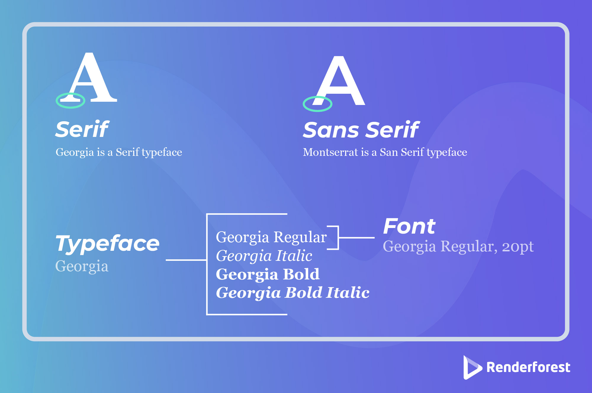
Serif logo fonts are well-loved, which gives logos a classic and a little old-fashioned look. The distinctive feature of Serif fonts is the small decorative “feet” at the ends of each letter.
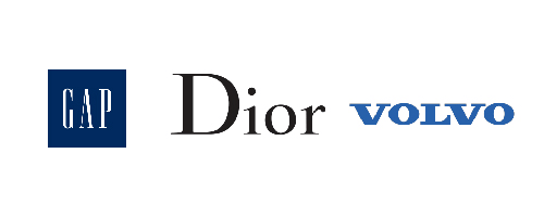
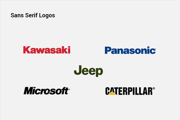
Sans-serif logo fonts are similar to Serif fonts. The main distinction is that they lack the “feet,” which gives them a more modern look.
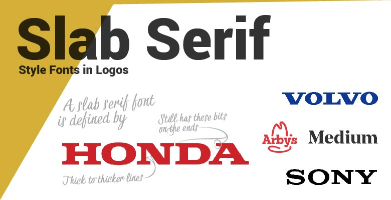
Slab serif logo fonts are dramatic and bold fonts that showcase confidence. These font types are more expressive than other Serif fonts and are designed to catch attention from afar.
Companies typically work across various mediums: web, mobile, print, large and small format. Your logo must effortlessly adapt to all these while maintaining its structure and integrity. The simplicity of design helps, but thorough testing is also important.
Quite often, colors become the problematic aspect of a brand’s logo. This is exactly what happened to Slack. The brand’s logo had 11 colors, which introduced many annoying issues for the company. The logo looked unattractive against any background other than sheer white, and external users often messed up its colors and design.
Eventually, it was decided to redesign the logo and reduce its palette to four primary colors. The new icon turned out much neater and more easily adaptable to different uses.
![]()
Eventually, it was decided to redesign the logo and reduce its palette to four primary colors. The new icon turned out much neater and more easily adaptable to different uses.
![]()
Scalability and responsiveness are two other important factors to consider. When creating your logo, make sure it is suitable for use in different sizes. If the design has many tiny details, they will be lost when the logo is reduced in size.
When designing your logo, consider how it will look on a smaller scale. While a detailed logo with text is a memorable and working option, consider having a version of your logo that is boiled down to a simple icon. This version can be used as part of your social media designs, a favicon, or wherever you need a small but recognizable version of your brandmark.
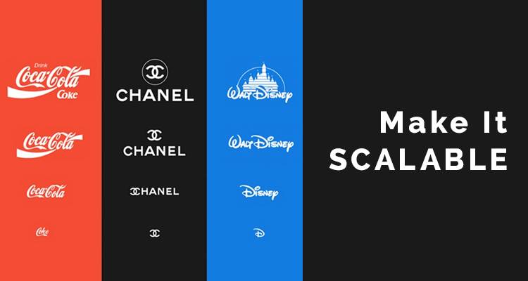
A responsive logo, including the web, can be easily adjusted for different purposes and platforms. To be suitable for the web, your logo should fit within a square (1×1) without compromising its unique character. For example, reducing your logo to 1×1 dimensions is necessary for creating a mobile app icon. But, even if your company has no plans for developing an application, square icons are still indispensable on the web. Just look at the tabs of your browser to get the idea.
Like Slack, most combination logos can be adjusted to square dimensions simply by dropping the wordmark.
![]()
Some logos, though, will need slightly more redesigning. The key is to keep the logo recognizable by maintaining its characteristic features. Google did an excellent job at this by combining the four colors of its wordmark logo in this monogram version.
![]()
Scalability also matters for large-scale printing. In this case, it becomes problematic not the design itself but the format in which the logo file was created and exported. Images in raster file formats (JPG, PNG, etc.) get pixelated when scaled up. To ensure better scalability, it’s important to have your logo as a vector file as well.

Learn more about logo file formats, lossy and lossless compression, logo transparency, and other technical aspects of logo design. This will help you make as informed a decision as possible.
Updating a company logo is a serious consideration and should not be taken lightly. Customers grow used to brand logos and might need help to accept the change. Therefore, altering an established logo might only do good if the new design is significantly better.
Nevertheless, there are times when updating a logo can be beneficial. Take a look at the evolution of the Microsoft Windows logo, for example.
![]()
The relatively recent popularity of the flat design has urged many companies to rethink their iconic logos. And Microsoft is but one example. What’s interesting is that two decades later, the brand returned to its very first logo concept — a sky-blue rectangle with abstract windows. A slight redesign, and the logo is as good as new.
With the rise of the flat style, even the Google logo lost its dimensionality over time. These are both examples of how design trends can initiate logo updates.
![]()
There are certain associations that customers make with brands. Call to mind your favorite pastry shop, and you will most likely feel its warm and cozy atmosphere. If you’re into fitness and regularly visit the gym, you’ll associate the latter with confidence, motivation, and health.
A good business logo design translates all these associations into a concise visual design. Thus, whenever a customer sees a certain brand’s logo, these feelings are recalled.
For example, the famous Nike “swoosh” gives the brand’s devotees a boost of determination and confidence to realize their athletic and life aspirations.
![]()
The iconic Coca-Cola logo design evokes joy and lightheartedness, which customers buy when they reach for that bottle in a store.
Of course, the logo alone would not be able to create such results if an actual positive experience with the brand didn’t back it up. Once the latter is solidified, a logo does an excellent job of reminding customers about that experience.
Now, the question is, how do you infuse your logo with emotion? That’s exactly what we cover next. But, before proceeding, write down the exact feelings you want your logo to evoke.

The next of our logo design tips is understanding what’s so great about famous brand logos. To begin, first, think of your favorite company logos. Then, try to find out what in their designs resonates with you. What makes the logo so descriptive of that particular brand? The following questions will help you in this process:
![]()
Answering these questions can give you insight into the psychology of logo creation. Use your findings to develop a well-thought-out design that communicates the spirit of your brand.
Need more inspiration? Watch the video below to understand the thinking behind some famous brand logos.
Alternatively, there might be internal reasons for a logo change. Because a logo is an integral part of any brand’s identity, significant changes in the latter should also be reflected in the company logo design.
Updating a logo in small ways can be quite refreshing. Thus, don’t be afraid to tweak your icon from time to time subtly. But do be careful not to overdo it.
A good logo can help a company as much as a bad logo can hurt it. Why else would the largest brands spend thousands of dollars on logo design?
Take NYC (2007) and BBC (1997) logos, for example. The two are among the most expensive logo redesigns, with a budget of $16 million and $1.8 million, respectively. These companies have certainly realized the power of a good logo.
![]()
But, not all companies have spent much money on their iconic logos. Let’s take Twitter as an example. What first comes to mind when you think about Twitter? Exactly — the blue bird in their logo design. Did you know the company got their bird logo for $15 through a design website? They had to redesign it later, as the bird couldn’t be used as a business logo.
![]()
Still, the bottom line remains the same: the money spent on a logo still needs to determine its effectiveness. It’s easy to blame your budget for a poor logo design. But the truth is, a smart design process matters far more than the money spent on it.
Designing an outstanding logo is an essential first step in creating your brand identity. Contrary to popular belief, you don’t need to be an expert in design to produce an engaging logo. To turn your vision into reality, try Renderforest, an online platform that offers customizable logo designs created to your company’s unique identity. Renderforest’s extensive collection of templates, including options for animations and mockups, empowers you to create a logo that stands out.
Get started with Renderforest Logo Maker today and set your brand on the path to success.
Share this
Article by: Renderforest Staff
Dive into our Forestblog of exclusive interviews, handy tutorials and interesting articles published every week!
Read all posts by Renderforest Staff