Video Editing
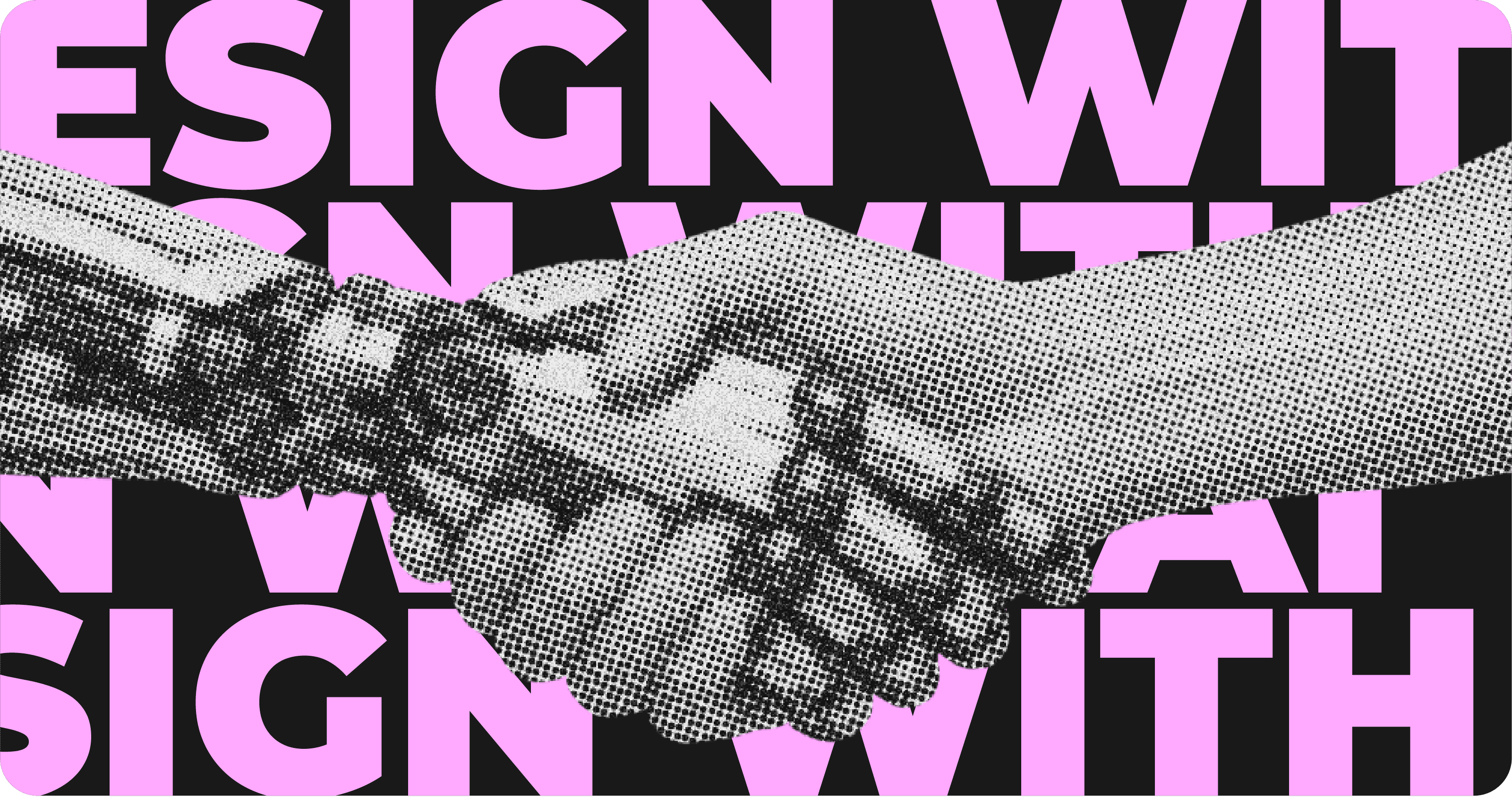
If you’ve ever generated a design, video, or visual with AI and thought, “This works, but it doesn’t feel right,” you’re not alone.
That reaction has become increasingly common. Over the past few years, AI has made it dramatically easier to create content. Drafts appear instantly. Layouts assemble themselves. Ideas arrive faster than ever. Yet despite this speed, much of what we see online feels increasingly similar, polished, efficient, and oddly interchangeable.
The reason is simple. In 2026, the challenge is no longer production. It’s decision-making.
This is where the role of the designer begins to change. Design is no longer entirely manual, but it isn’t fully automated either. Most creators now work alongside AI in hybrid workflows where each side has a clear responsibility. AI accelerates production and generates options. Humans provide context, judgment, and direction.
That balance matters more than ever because speed alone no longer impresses audiences. As content volumes continue to grow, people have become more sensitive to intention. They care less about how quickly something was made and more about whether it feels thoughtful and purposeful. When brands rely too heavily on automation, visuals often start to blend into the background. When human taste shapes the final outcome, the difference is noticeable.
| Area | Why It Feels More Human | Common Use Cases |
|---|---|---|
| Brand Identity | Adds personality and emotional clarity | Logos, brand systems, visual guidelines |
| Marketing Content | Feels intentional instead of mass-produced | Social posts, ads, landing pages |
| Product Design | Builds trust through warmth and clarity | App interfaces, dashboards |
| Motion & Video | Communicates meaning faster than text | Explainers, short-form video |
| Editorial & Media | Creates memorability through character | Blogs, covers, campaigns |
Human-centered design works best when consistency is defined first. Clear visual rules give AI-generated drafts a structure to follow, while still leaving room for human judgment and refinement.
For many designers, AI now supports the most fragile moment of the creative process: the blank page.
Instead of starting from nothing, teams generate early drafts quickly and use them as a foundation. From there, creators focus their energy on refining message, tone, and structure. Speed supports creativity rather than replacing it.
As this approach becomes standard, another priority emerges: consistency. When AI is part of everyday production, brands need clearer visual systems to maintain coherence. Defined colors, typography, and layout rules ensure that even fast-moving content remains recognizable. Over time, this familiarity builds trust. Audiences learn what to expect and feel more confident engaging with the brand.
At the same time, experimentation becomes easier and less risky. Multiple variations can be created, tested, and compared before a final decision is made. This allows brands to explore ideas more freely while still grounding choices in performance and feedback. Creativity becomes informed, but not constrained.
This is where tools like Renderforest support the process. AI-assisted drafts help creators move quickly, while manual refinement inside the editor ensures that visuals, text, pacing, and structure remain intentional. Speed and creative control exist side by side rather than in conflict.
In 2026, the most effective creators are not those who move the fastest, but those who know when to slow down, refine, and shape meaning. In a world where nearly everyone has access to the same tools, differentiation no longer comes from technology itself. It comes from judgment.
Design workflows have changed dramatically, and by 2026 that change is no longer theoretical. It’s fully lived. AI is now a standard part of the creative process, widely used for layout generation, concept exploration, and asset creation. Speed is no longer the differentiator it once was.
What has become more valuable instead is judgment.
AI can generate endless options, but it doesn’t understand context, relevance, or intent. Those decisions still belong to people. As creative tools become more powerful, the gap between what can be made and what should be made continues to widen. This is why design in 2026 feels less about execution and more about direction.
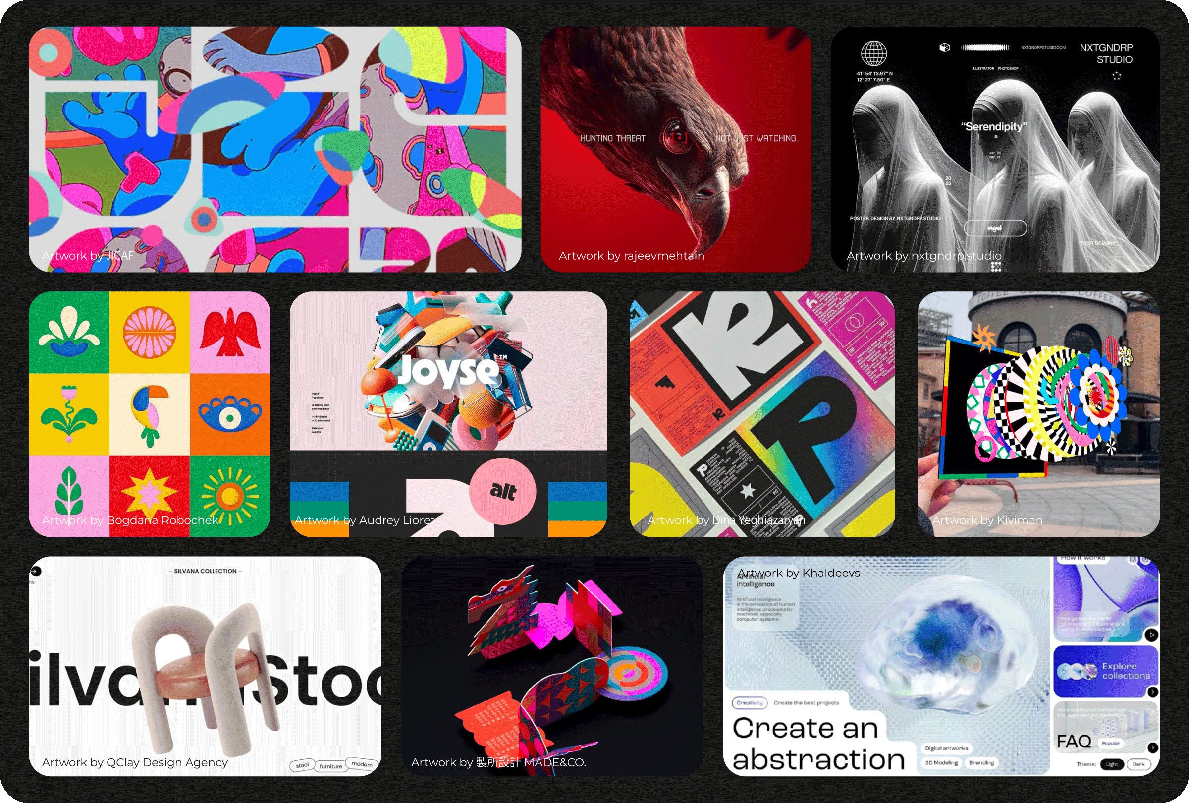
That shift explains why many visual styles are moving away from sterile perfection. Creators are increasingly distancing themselves from ultra-polished minimalism and leaning toward aesthetics that feel warmer, textured, and more personal. Heritage-inspired details, folk influences, and handcrafted elements are not simply stylistic nostalgia. They are signals. They tell audiences that a human point of view shaped the work.
This preference for character over polish reflects a broader cultural response to automation. As feeds become saturated with algorithmically generated visuals, audiences gravitate toward work that feels intentional rather than optimized. Small imperfections, visible texture, and expressive details act as proof of authorship subtle cues that someone made conscious choices along the way.
At the same time, another expectation is quietly becoming the norm: immersion.
Depth, movement, and dimensionality are no longer reserved for experimental projects or high-budget campaigns. They are increasingly embedded in everyday digital experiences. 3D elements and AR/XR interactions are becoming familiar components of modern design, not future concepts. Users now expect interfaces to respond, adapt, and guide them visually.
Design in 2026 is no longer static. It reacts. It moves. It helps people understand what’s happening without requiring explanation.
Once depth and responsiveness become expected, motion stops being optional.
In 2026, movement is often the first layer of meaning users encounter. In fast-paced digital environments, people don’t read, they scan. Motion helps bridge that gap by directing attention and signaling change instantly. It shows where to look, what matters, and what action is possible. Without it, many digital experiences feel flat or unfinished.
This evolution didn’t happen suddenly. It emerged as user behavior, interface design, and content formats evolved together. Static visuals still exist, but they now compete with content that moves and responds in real time. As a result, motion has become one of the clearest ways to communicate efficiently.

The most visible expression of this shift is short-form video. Designed to capture attention within seconds, these formats align naturally with how people scroll and consume content today. Motion allows brands to introduce ideas, showcase products, or tell brief stories quickly, without demanding sustained focus. In crowded feeds, movement creates the pause that static images often can’t.
The same principle applies when brands need to explain something more complex. Animated explainers translate abstract services, processes, or systems into visual sequences that are easier to follow. By showing relationships and progression instead of describing them, motion reduces friction and cognitive load. What feels heavy in text becomes intuitive when it unfolds visually.
As motion becomes familiar across social platforms, expectations rise elsewhere particularly on websites. Movement is no longer confined to hero sections or decorative animations. Subtle transitions now guide navigation, signal interactivity, and help users understand structure. When applied with restraint, motion doesn’t distract. It clarifies.
What connects all of these uses is purpose. Motion in 2026 isn’t about adding energy for its own sake. It’s about making communication clearer and more accessible.
As motion and immersive experiences become more common, another shift begins to stand out not through polish, but through contrast.
In a digital environment where so much content is generated, optimized, and refined by machines, visual perfection is no longer impressive. In fact, it has become predictable. When everything is smooth, balanced, and flawless, nothing feels distinctive. This is why many creators in 2026 are deliberately moving in the opposite direction.
Imperfect and retro-inspired design gains attention precisely because it breaks the pattern.
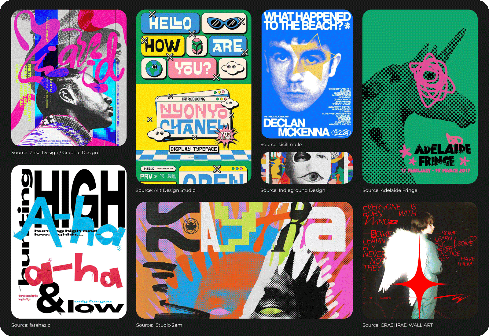
This shift isn’t about rejecting modern tools or going backward. It’s about reintroducing characters into visuals that risk feeling anonymous. Small irregularities, visible textures, and expressive details signal that a human was involved in the process. Audiences may not consciously analyze these choices, but they feel the difference immediately. Imperfection creates warmth. It invites trust.
That desire for authenticity explains the renewed interest in textured visuals. Grain, noise, layered backgrounds, and tactile surfaces add depth and reduce the overly polished look associated with automated design. These elements make visuals feel grounded and approachable, helping them stand out in feeds dominated by smooth gradients and perfect symmetry.
From there, it’s a short step into retro-inspired aesthetics. Designers are increasingly borrowing from familiar visual languages early digital interfaces, printed posters, analog typography, and archival color palettes. When used thoughtfully, these references don’t feel outdated. Instead, they create a sense of continuity and memory.
At its core, this trend is about distinction. People are far more likely to remember brands that feel expressive and slightly imperfect than those that appear perfectly optimized but indistinguishable.
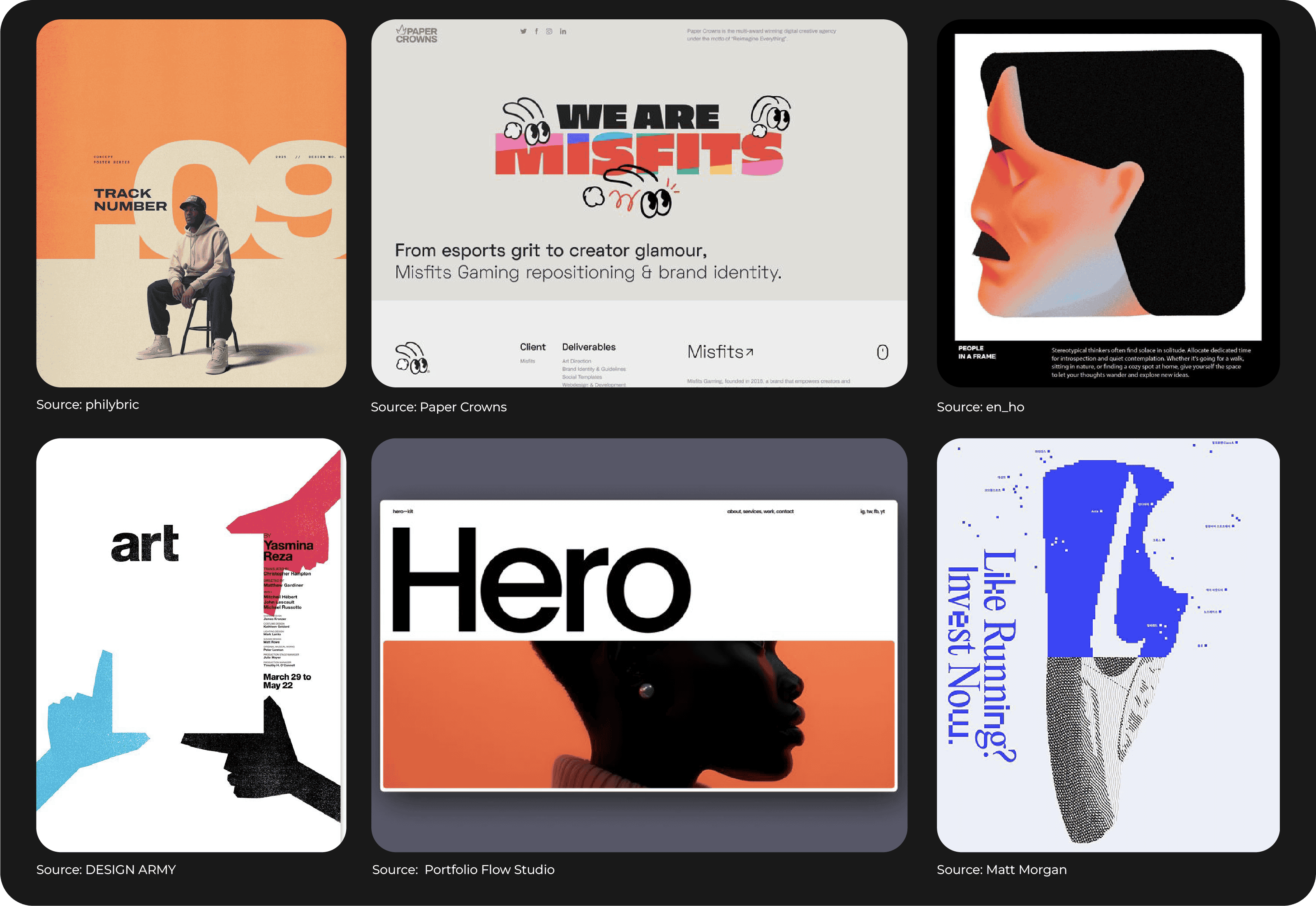
As expressive and imperfect styles gain attention, minimalism doesn’t disappear. Instead, it evolves.
By 2026, minimal design no longer feels sharp, cold, or distant. The rigid, ultra-clean aesthetic that once defined minimalism is giving way to something softer and more inviting. Simplicity remains important, but it’s now paired with warmth and subtle emotion.
This shift reflects how people want to feel when they interact with digital spaces. Overly rigid design can create distance, while warmer minimalism feels approachable and calm. In a world saturated with content and constant motion, clarity combined with comfort becomes a powerful combination.
Color plays a key role in this transformation. Instead of bright neons or extreme contrasts, designers are choosing softer, more natural palettes. These colors are easier on the eyes and help establish a sense of balance and stability. When visuals feel calm rather than demanding, users are more likely to stay, explore, and engage.
From color, attention naturally moves to depth. Gentle gradients introduce visual interest without adding noise. Layouts remain clean but are no longer empty. Small, intentional details, light textures, soft shadows, handcrafted accents add personality without overwhelming the design.
Warm minimalism doesn’t aim to impress through complexity. It creates space for content to breathe while still feeling considered and expressive.
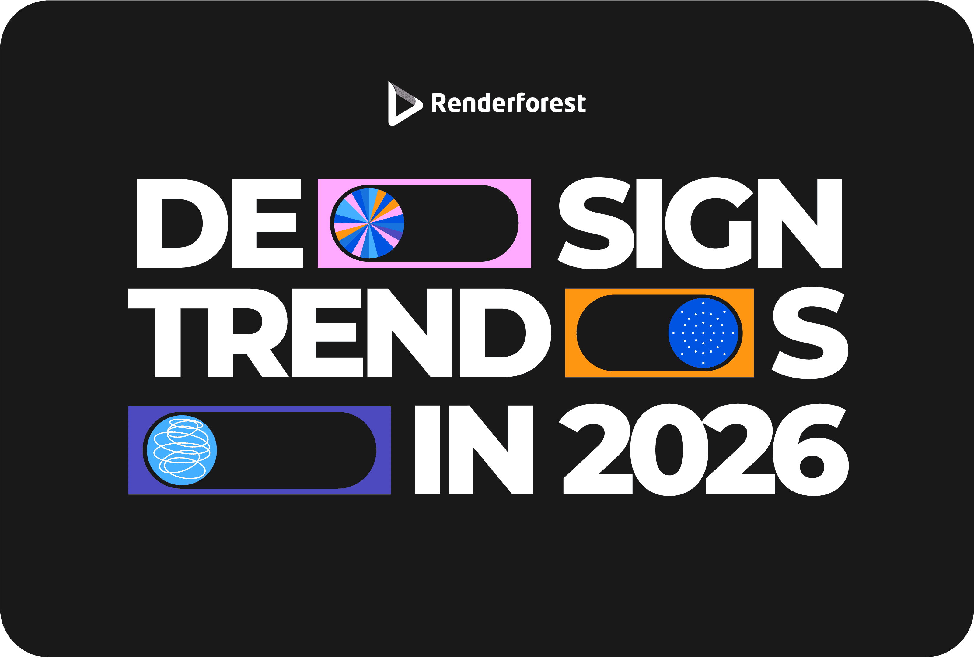
Together, these shifts show how design in 2026 is becoming more human. Motion, imperfection, and warmth are not isolated trends. They are responses to a creative landscape shaped by automation, speed, and saturation.
Design is no longer about doing more. It’s about choosing better.
Share this
Article by: Renderforest Staff
Dive into our Forestblog of exclusive interviews, handy tutorials and interesting articles published every week!
Read all posts by Renderforest Staff