AI
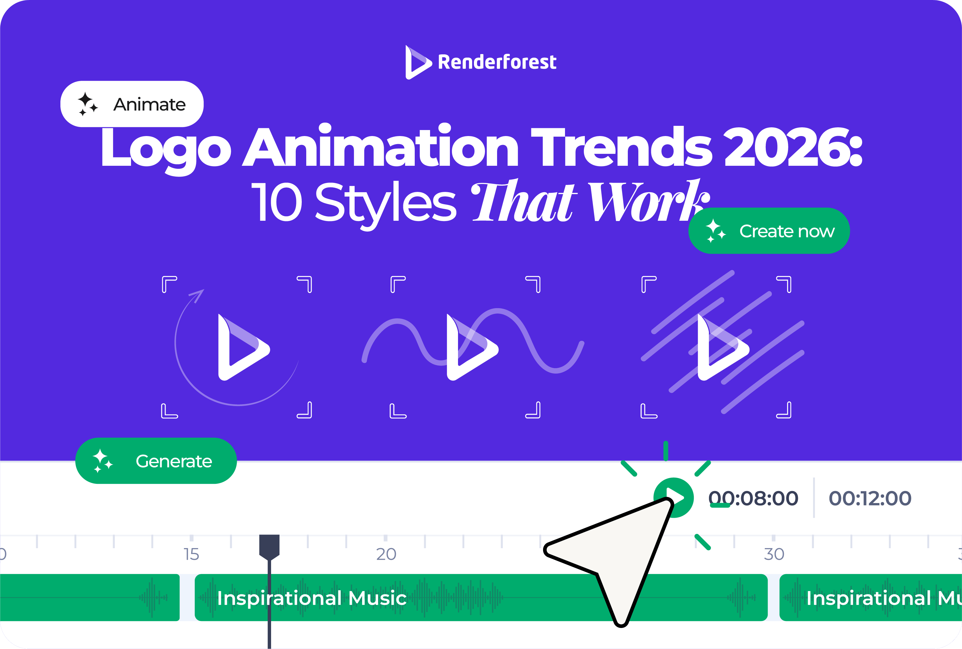
Logo animation trends 2026 are not about adding more effects to a static logo. The real shift is toward motion identity systems: short, flexible logo animations that adapt to websites, social videos, app screens, ads, presentations, and brand intros without losing recognition.
That matters because your logo no longer appears in one predictable place. It may show up as a YouTube intro in the morning, a vertical ad by lunch, a product splash screen in the afternoon, and a pitch deck opener by the end of the day. One dramatic reveal cannot carry all of those jobs.
The biggest logo animation trends in 2026 are responsive motion logo systems, quiet micro-motion, kinetic typography, soft 3D depth, organic morphing, AI-assisted animation concepts, sound-synced logo stingers, template remixing, accessibility-first motion, and platform-native logo variants.
The strongest animated logos in 2026 are not the loudest. They are the ones that feel specific to the brand, resolve quickly, and still work when the animation is reduced, muted, cropped, or paused.
For years, a logo animation usually meant one thing: a logo reveal. The brand mark appeared with a flash, spin, bounce, burst, or cinematic build, then landed on screen.
That is still useful in some contexts. A YouTube channel, event opener, product launch, or presentation intro may need a complete reveal. But in 2026, a single logo animation is rarely enough.
A better way to think about it is a motion identity system. That system includes:
This aligns with the wider design shift toward flexible brand systems. Creative Bloq’s 2026 logo trend research points to responsive logo systems, unfixed identities, and tactile 3D as major directions for modern brands, while Renderforest’s design trend coverage also frames 2026 around adaptive systems, motion-first design, sound-driven identity, and more responsible creative choices.
The useful question is no longer, “How do we animate our logo?” It is, “How should our brand move in different moments?”
Responsive motion is the most important logo animation trend of 2026 because it changes the assignment. Instead of creating one animated logo, you create a family of related logo animations.
A static responsive logo system may include a full wordmark, compact wordmark, icon, favicon, and monochrome version. A responsive motion system follows the same logic.
This is where many brands make the expensive mistake. They create a beautiful landscape animation, then force it into every channel. It gets cropped in vertical video, feels too slow in ads, becomes tiny in social avatars, and blocks users on the website.
A responsive motion system avoids that. It lets the brand feel consistent without making every placement look identical.
Best for: brands that publish content across multiple channels.
Avoid if: you only need a one-time event intro or a single presentation opener.
2026 execution tip: define the final frame first, then build motion versions around it.
Quiet micro-motion is the antidote to overproduced logo animation.
Instead of particles, explosions, long camera moves, and dramatic sound hits, quiet micro-motion uses one small action: a line completes, a dot lands, a symbol aligns, a letter settles, or a shape breathes once.
This works because most brand moments are short. A website visitor does not need a five-second intro before seeing the page. A viewer scrolling through Shorts does not wait for a slow reveal. A customer opening an app wants feedback, not a movie.
Quiet micro-motion is strongest when the movement comes from the logo itself. A delivery brand can use a line that becomes a route. A cybersecurity brand can use a precise lock-in motion. A wellness brand can use a slow expanding circle. A design studio can use a shape that snaps into grid alignment.
The test is simple: if the effect disappeared and only the core movement remained, would the animation still feel like the brand?
Best for: SaaS, finance, health, education, consulting, premium services.
Avoid if: your brand genuinely depends on high energy, spectacle, or entertainment.
2026 execution tip: animate one memorable gesture, not every logo element.
Kinetic typography is one of the most useful trends for brands with wordmark logos. If your logo is mostly type, motion can give it personality without adding unnecessary symbols.
A wordmark can reveal letter by letter, stretch, compress, slide into alignment, expand its tracking, or morph between weights. But readability comes first. If people cannot read the brand name at the end, the animation has failed.
The best kinetic wordmarks have rhythm. A children’s learning brand can bounce. A financial product probably should not. A fashion brand can use slow spacing and restraint. A sports creator can use sharper, faster compression.
Best for: wordmarks, creator brands, media brands, agencies, event brands.
Avoid if: your logo already has complex lettering or poor small-size readability.
2026 execution tip: let the final wordmark sit still long enough to be read.
3D logo animation is not going away. The dated version is the heavy metallic logo flying through smoke. The 2026 version is softer, cleaner, and more intentional.
Soft 3D uses depth, shadow, bevels, lighting, and camera movement to make a logo feel more physical. It can make a product brand feel more premium or help a digital brand feel more tangible. The key is restraint.
Use soft 3D when the brand needs:
Avoid it when the logo is already detailed, the animation will mostly appear at tiny sizes, or the brand needs speed and clarity more than polish.
A useful rule: the logo should still look good when the 3D camera stops moving. If the identity only works because of dramatic lighting, the animation is carrying too much weight.
Best for: product brands, tech, entertainment, luxury, events.
Avoid if: your brand depends on simplicity, accessibility, or fast-loading web moments.
2026 execution tip: use depth to support the logo shape, not hide a weak mark.
Organic morphing uses soft shape changes, liquid movement, hand-drawn transitions, growth patterns, ripples, folds, or natural easing. It makes a logo feel less mechanical and more human.
This trend fits a wider move away from sterile perfection. Renderforest’s 2026 design trend coverage describes a shift toward warmer, more textured, more personal design choices as creative tools make polished visuals easier to produce.
Organic motion works especially well when the movement connects to the brand’s product or material:
The risk is generic softness. A blob that becomes a leaf may look pleasant, but it will not feel ownable unless the movement is tied to the brand.
Best for: wellness, beauty, food, sustainability, handmade products, local brands.
Avoid if: your brand needs technical precision, speed, or sharp authority.
2026 execution tip: base the morph on a real product behavior, not a random liquid preset.
AI is making logo animation easier to explore. That does not mean AI should make the final creative decision.
The value of AI in logo animation is speed. A small team can test different moods, motion directions, background styles, and visual treatments before committing to one path. That is especially useful when the team does not have a motion designer available for early concepting.
Use AI to explore:
Then apply human judgment. Which movement matches the brand? Which one still works without sound? Which one remains readable at small size? Which one feels distinctive rather than prompt-generated?
A practical AI-assisted workflow looks like this:
The danger is sameness. If every prompt asks for a “modern premium cinematic logo reveal,” the results will converge. The creative advantage comes from taste, editing, and brand specificity.
Best for: small teams, creators, marketers, early concepting, fast iteration.
Avoid if: you need a legally precise brand system or complex motion guidelines without human review.
2026 execution tip: use AI to widen the option set, then narrow it with brand rules.
A logo animation often appears in video, which means sound matters. In 2026, more brands are treating short sound cues as part of identity rather than decoration.
A sound-synced logo stinger can be a click, chime, breath, bass hit, page flip, pop, digital pulse, or short melody. It should match the motion, not sit on top of it.
The best logo sounds are short enough to feel natural and distinctive enough to be remembered. They also need a silent version, because social feeds often autoplay without sound.
Best for: YouTube channels, podcasts, ads, product videos, event content.
Avoid if: the animation will mostly live in silent UI moments or professional documents.
2026 execution tip: make the visual timing work first, then add sound to reinforce the final lockup.
Templates are not the problem. Unedited templates are.
For small businesses, creators, and marketers, a logo animation template can be the fastest practical way to get polished motion without building a timeline from scratch. The mistake is uploading a logo, changing nothing else, and exporting the default result.
Template remixing means using the structure of a template while customizing the parts that make the animation feel like your brand:
This is where Renderforest’s logo animation tool fits naturally for non-designers. It gives you logo animation templates, customization options, music, previews, and export formats without requiring motion design software. The important part is not choosing the flashiest template. It is choosing a movement style you can make feel specific.
Best for: small businesses, YouTubers, marketers, educators, freelancers.
Avoid if: you need a fully custom broadcast identity or complex motion guidelines.
2026 execution tip: customize at least color, timing, sound, and final frame before exporting.
Accessibility is one of the most important logo animation trends because it affects whether people can comfortably use the places where your animated logo appears.
If your logo animation appears on a website or app, motion should not block access, create discomfort, or force users through a non-essential sequence. W3C guidance for animation from interactions points to reducing or disabling non-essential motion, and MDN explains that the prefers-reduced-motion media query lets websites respond when users have requested less motion in their system settings.
For animated logos, that means:
Accessibility is not the opposite of creativity. It is a constraint that makes the motion sharper. If the animation only works when users are forced to watch the whole thing, it is not strong enough.
Best for: every brand, especially websites, apps, SaaS, education, healthcare, finance.
Avoid if: there is no good reason. This should not be optional.
2026 execution tip: design the reduced-motion version at the same time as the full-motion version.
Platform-native animation means designing for the format instead of adapting at the last minute.
A horizontal intro may work on YouTube but fail on TikTok. A detailed 3D reveal may look great in a presentation but collapse into noise as a small social avatar. A slow logo build may feel polished on an event screen but waste the first seconds of a paid ad.
The point is not to create endless versions. It is to create the right few. Most brands can start with a full reveal, short sting, square or vertical variant, and static fallback.
Best for: brands publishing across multiple channels.
Avoid if: the animation will only be used once in a fixed format.
2026 execution tip: decide the export formats before choosing the animation style.
Use this matrix before choosing a style. It prevents the most common mistake: copying a trend because it looks current, even when it does not fit the brand.
The best choice is usually a controlled combination. A food brand might use organic morphing plus a short sound cue. A SaaS brand might use quiet micro-motion plus platform-native variants. A creator brand might use kinetic typography plus a one-second vertical sting.
After reviewing current design direction across motion, branding, and logo trend coverage, the strongest animated logos tend to share five traits:
Those traits matter more than the trend name. A simple one-second line draw can feel more current than a complex 3D reveal if it fits the brand and platform better.
Some styles can still work in the right context. But these choices are easier to misuse and often make a brand look behind the curve.
A five-second logo reveal may work at an event. It usually does not belong before a short social video, website page, or product interaction.
Particles can look impressive, but they often say nothing about the brand. If the effect could be used by any company in any category, it is decoration.
Glitch animation still works for gaming, cyberpunk, music, security, or experimental brands. It feels forced when applied to a bakery, school, clinic, or family service business.
Heavy chrome, smoke, sparks, and dramatic camera moves can make a small brand look like it downloaded a dated intro preset. Use 3D only when depth supports the identity.
If the wordmark twists, stretches, bounces, rotates, and morphs before settling, the viewer may remember the movement but not the name.
AI can produce polished concepts quickly. It can also produce motion that looks familiar because many users prompt for the same styles. The final animation still needs taste and specificity.
A single widescreen reveal forced into vertical video, square posts, app screens, and website loaders will look awkward. Create variants.
Start with the brand, not the effect.
Ask five questions before choosing a style:
If the next step is production, use the chosen direction to guide the tool or template. Renderforest’s guide on how to create a professional logo animation covers the actual creation process separately, including template-based workflows and AI-assisted options. Keep that process focused: choose one movement idea, customize it, export the right versions, and test it in real placements.
Logo animation in 2026 is becoming less about effects and more about behavior.
The brands that look current will not be the ones with the loudest reveal. They will be the ones with motion that feels intentional: a full version when there is time, a short sting when attention is limited, a micro-animation when users need feedback, and a static or reduced-motion version when movement gets in the way.
A good animated logo should make the brand easier to recognize, not harder to sit through.
May, T. (2025, December 30). These logo design trends will define 2026. Creative Bloq. https://www.creativebloq.com/design/logos-icons/these-logo-design-trends-will-define-2026
May, T. (2025, December 23). Texture, warmth and tactile rebellion: the big graphic design trends for 2026. Creative Bloq. https://www.creativebloq.com/design/graphic-design/texture-warmth-and-tactile-rebellion-the-big-graphic-design-trends-for-2026
May, T. (2025, December 28). Breaking rules and bringing joy: top typography trends for 2026. Creative Bloq. https://www.creativebloq.com/design/fonts-typography/breaking-rules-and-bringing-joy-top-typography-trends-for-2026
Hilder, R. (2025, December 16). 4 creative trends for 2026, according to Adobe. Creative Bloq. https://www.creativebloq.com/creative-inspiration/4-creative-trends-for-2026-according-to-adobe
Fear, N. (2025, December 28). Canva’s 2026 trend predictions have filled me with hope. Creative Bloq. https://www.creativebloq.com/design/canvas-2026-trend-predictions-have-filled-me-with-hope
World Wide Web Consortium (2026, January 12). Technique C39: Using the CSS prefers-reduced-motion query to prevent motion. W3C Web Accessibility Initiative. https://www.w3.org/WAI/WCAG21/Techniques/css/C39
MDN Contributors (2026, April 20). prefers-reduced-motion CSS media feature. MDN Web Docs. https://developer.mozilla.org/en-US/docs/Web/CSS/Reference/At-rules/@media/prefers-reduced-motion
Share this
Article by: Liana Ziroyan
Liana is a marketing professional with 11 years of experience in digital marketing, content, and product communication. She has a strong eye for visual storytelling and loves turning ideas into engaging campaigns that connect with audiences. With her experience across branding, creative content, and user-focused messaging, Liana enjoys finding simple, effective ways to make products feel clear, useful, and exciting.
Read all posts by Liana Ziroyan