AI
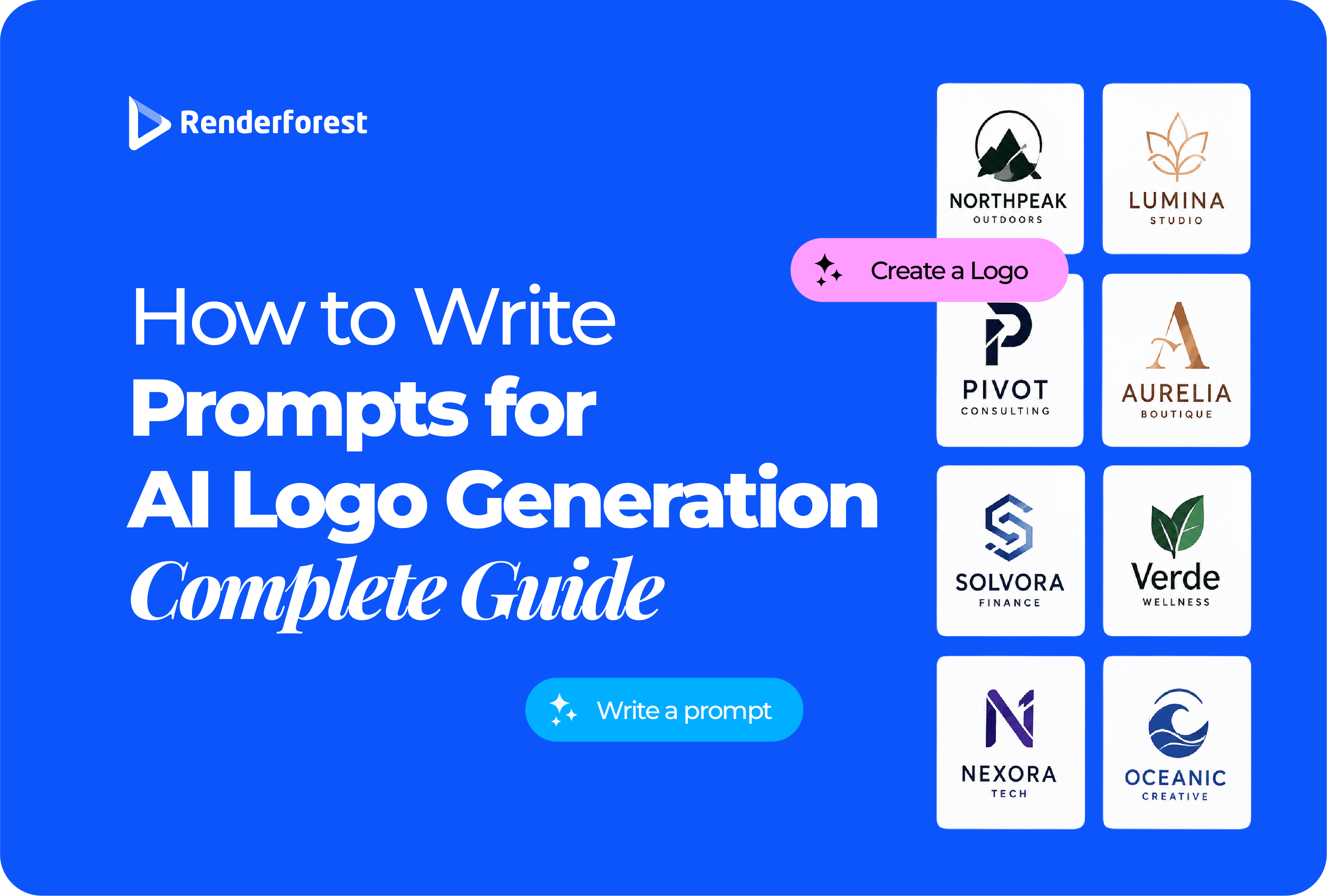
The best AI logo prompts read less like image descriptions and more like short creative briefs. They tell the generator what the brand does, who it serves, what idea the logo should communicate, what visual direction to explore, what clichés to avoid, and where the finished mark actually needs to work.
That difference matters. Ask for a “modern coffee shop logo” and you have already invited the usual cup, bean, steam, brown palette, and handwritten type. Ask for a neighborhood coffee brand built around quiet late-night study sessions, then explicitly rule out cups and beans, and the AI has a much more interesting problem to solve.
If you remember only one rule from this guide, make it this: prompt for the specific brand, not simply the industry.
A good AI logo prompt has six useful parts:
Use this master formula:
Create a [logo type] for “[brand],” a [specific business] for [audience]. The brand should feel [three traits]. Explore a visual idea based on [concept]. Use [style, color, and typography direction]. Avoid [industry clichés and unwanted effects]. Keep the logo simple, recognizable, and suitable for [main uses].
A useful logo prompt does not need to be enormous. OpenAI’s current image-generation guidance similarly recommends clear, descriptive prompting rather than unnecessary length and notes that one to three focused sentences are enough for many image tasks. Constraints should be stated explicitly when they matter. Source: OpenAI image prompting guidance.
Most weak AI logo prompts describe a category instead of a brand.
If your cybersecurity prompt contains “shield,” your sustainability prompt contains “leaf,” and your coffee prompt contains “bean,” the AI is not being unimaginative. It is following your instructions.
A generic shield with fewer lines is still a generic shield.
Instead of asking “What object represents my industry?”, ask “What does this brand help people achieve?” That question usually leads to richer visual territory.
“Minimalist” is a style. “Wordmark” is a logo type. Mixing those ideas is one reason logo prompts become vague.
A wordmark prompt should emphasize letterforms and spacing. A mascot prompt should emphasize character and silhouette. An app icon needs extreme simplicity. A combination logo has to make the symbol and name work together.
If you are unsure which structure fits your business, Renderforest’s guide to the main types of logos compares wordmarks, symbols, combination marks, mascots, emblems, abstract marks, and lettermarks by real-world use.
For many new businesses, a combination logo is a practical starting point: the wordmark introduces the name while the symbol can gradually become recognizable on its own.
Imagine a fictional project-management product called Fieldnote.
Create a modern logo for a project-management app called Fieldnote.
The problem is not that this prompt is short. The problem is that almost every important design decision is still open. “Modern” could mean almost anything, and “project management” points directly toward checkmarks, boxes, calendars, and task icons.
Create a combination logo for “Fieldnote,” a project-management tool for small creative teams that turns scattered client feedback into clear next steps. The brand should feel calm, organized, and human. Explore the idea of scattered notes becoming structure. Avoid checkmarks, calendars, clocks, sticky-note icons, and blue-purple tech gradients.
Now the AI has a visual problem to solve instead of a category to illustrate.
Keep one simple symbol based on scattered elements becoming organized. Use flat geometry, strong negative space, warm neutrals, and clean sans-serif typography. No shadows, 3D, mockup effects, or tiny details. The symbol must remain recognizable at favicon size and work separately from the wordmark.
Notice what changed. We did not keep adding adjectives. We reduced ambiguity.
These prompts are starting points, not finished briefs. Replace the names, audience, positioning, colors, and use cases with your own. More importantly, notice how each prompt solves a different branding problem.
Create a combination logo for “[Brand],” a SaaS platform that helps small teams turn scattered client requests into organized tasks. The brand should feel calm, clear, and efficient. Explore structure emerging from disorder. Use simple geometric forms and clean sans-serif typography. Avoid checkmarks, calendars, dashboards, lightning bolts, gradients, and 3D effects. Make the icon recognizable at favicon size.
Create an abstract logo for “[Brand],” an AI tool that helps marketing teams turn rough ideas into finished campaigns. The brand should feel intelligent, practical, and focused rather than futuristic. Explore transformation, sequencing, or refinement. Avoid brains, robots, circuits, sparkles, magic wands, infinity symbols, and blue-purple AI clichés. Use flat geometry and a restrained palette.
Create an icon plus wordmark for “[Brand],” a neighborhood coffee shop known for quiet mornings, local regulars, and slow-roasted coffee. Make the identity warm, grounded, and understated. Explore morning light, gathering, or neighborhood rhythm. Use earthy colors and clear typography. Avoid cups, beans, steam, latte art, handwritten scripts, and generic vintage badges.
Design a flexible combination logo for “[Brand],” a casual restaurant built around seasonal food and shared plates. The brand should feel generous, lively, and unpretentious. Explore gathering, a shared table, or the rhythm of passing dishes. Use simple shapes and confident typography. Avoid forks, knives, chef hats, cloches, aggressive flames, and overly detailed restaurant badges.
Create a refined logo for “[Brand],” a boutique real estate advisory specializing in restored and character-filled homes. The identity should feel established, local, and calm. Explore architectural details, street grids, or the idea of finding the right place. Avoid rooflines, keys, skyscrapers, generic house outlines, gold monograms, and corporate swooshes.
Create a restrained wordmark and subtle monogram for “[Firm Name],” a boutique law firm advising growing family businesses. The identity should feel experienced, composed, and trustworthy without looking old-fashioned. Use strong typography and one distinctive letter detail. Avoid scales of justice, columns, gavels, shields, ornate crests, fake Latin mottos, and excessive gold.
Create a simple abstract mark and wordmark for “[Brand],” a financial app that helps freelancers understand irregular income and plan ahead. The brand should feel calm, transparent, and dependable. Explore rhythm, balance, or visibility rather than growth arrows. Use high-contrast flat forms. Avoid dollar signs, coins, bank buildings, charts, arrows, shields, and glowing gradients.
Create a clean wordmark with a subtle abstract symbol for “[Brand],” a science-led skincare company focused on sensitive skin and barrier repair. Make the identity gentle, precise, and credible. Explore protection, balance, or layers. Use restrained neutral colors. Avoid faces, leaves, flowers, water drops, eyelashes, spa symbols, cursive lettering, and decorative luxury flourishes.
Create a quiet contemporary logo for “[Brand],” a breathwork and movement studio for busy professionals. The brand should feel grounded, restorative, and human. Explore rhythm, breath, gentle movement, or balanced negative space. Use a simple monoline or flat mark. Avoid lotus flowers, mandalas, yoga poses, chakras, suns, hands, and generic spiritual symbols.
Create a personal-brand logo for “[Name],” a strength and mobility coach helping adults return to training after injury. The identity should feel capable, supportive, and disciplined. Explore controlled movement, rebuilding, or balance. Use a strong wordmark with a small abstract symbol. Avoid dumbbells, flexed arms, flames, lightning, aggressive animals, and bodybuilding imagery.
Create an editorial wordmark for “[Brand],” an independent fashion label focused on timeless everyday pieces and thoughtful materials. The brand should feel confident, understated, and tactile. Use distinctive but highly readable letterforms with generous spacing. Avoid hangers, needles, dress silhouettes, crowns, handwritten scripts, fashion clichés, and unnecessary icons.
Create a versatile combination logo for “[Brand],” an online store selling thoughtfully designed desk accessories for home offices. The identity should feel useful, considered, and optimistic. Explore organization, workspace rhythm, or modularity. Use simple shapes and a friendly wordmark. Avoid shopping carts, boxes, cursors, price tags, generic package icons, and marketplace-style gradients.
Create an approachable combination logo for “[Organization],” a nonprofit connecting neighborhood volunteers with families who need practical support. The identity should feel welcoming, credible, and community-led. Explore connection, openness, or people contributing individual pieces to a whole. Avoid hands holding hearts, globes, generic people circles, charity ribbons, and sentimental clipart.
Create a bold logo for “[Channel],” a YouTube channel that teaches beginner creators how to shoot and edit better videos. It should feel sharp, practical, and encouraging. Explore framing, focus, sequencing, or visual improvement. Design an icon that survives a small circular avatar. Avoid play buttons, cameras, clapperboards, microphones, neon creator gradients, and tiny text.
Create a wordmark for “[Brand].” Focus entirely on readable, custom-feeling typography, balanced spacing, and one subtle distinctive letter detail. The brand should feel [traits]. Present it in one color on a plain background. No icon, no tagline, no mockup, no shadows, no gradients, and no decorative flourishes.
Create a monogram from the letters “[Initials].” Use simple geometry, deliberate negative space, and balanced stroke weight. Make the letters feel integrated rather than merely overlapped. The mark should remain recognizable at small sizes and in one color. Avoid ornamental crests, script initials, unnecessary borders, 3D depth, shadows, and extra text.
Create a combination logo for “[Brand].” Pair a simple symbol inspired by [concept] with a highly readable wordmark. The icon should work independently as a social avatar, while the full horizontal version should suit a website header. Keep both parts visually balanced. Avoid stock-icon styling, tiny details, mockup backgrounds, and unnecessary decoration.
Create a simple logo for “[Brand]” using meaningful negative space to combine [idea A] and [idea B] into one clear symbol. The secondary idea should be discoverable without becoming a visual trick. Use solid flat shapes and strong contrast. Avoid tiny cutouts, complicated optical illusions, gradients, text inside the symbol, and details that disappear when scaled down.
Create a simplified mascot logo for “[Brand],” a [business] for [audience]. The mascot should feel [traits] and remain recognizable from its silhouette alone. Use broad shapes, limited colors, and minimal facial detail. Avoid photorealism, full background scenes, tiny accessories, complicated clothing, excessive shading, and illustration detail that disappears in a small avatar.
Create a compact app-icon mark for “[App],” a product that helps users [outcome]. Build the symbol around [concept]. Use one strong silhouette, high contrast, and very limited detail. It must remain identifiable at small mobile sizes. Avoid words inside the icon, thin lines, miniature interface elements, complicated gradients, and multiple unrelated symbols.
A mediocre first generation does not always mean you need a different tool. Often the prompt has not identified the actual problem yet.
The best revision usually changes one meaningful variable at a time. If the concept works but the symbol is cluttered, simplify the symbol. If the icon works but the wordmark does not, fix the typography. Regenerating everything every time makes it harder to understand what actually improved.
Once you know the brand idea, logo type, visual metaphor, and exclusions, you can put that brief into Renderforest’s AI Logo Generator. The current workflow asks you to describe the logo, select a visual style, and generate directions based on that description.
The current prompt field allows up to 500 characters. That is another reason to prioritize decisions over decoration. You do not need a 1,500-word branding document inside the prompt box.
A compact Renderforest-ready structure is:
[Logo type] for “[Brand],” a [business] for [audience]. Feel [three traits]. Explore [metaphor]. Use [style/color/type]. Avoid [clichés/effects]. Must work for [main placements].
Example:
Combination logo for “Narrowbeam,” an AI workflow tool for small marketing teams. Calm, precise, efficient. Explore focus, alignment, or signal clarity. Minimal flat geometry, deep navy and warm white, clean sans serif. Avoid brains, robots, circuits, sparkles, blue-purple gradients, and 3D. Must work as an app icon and website logo.
Do not try to solve every branding decision in the first generation. Use the prompt to find a strong concept, then refine the promising direction rather than endlessly producing unrelated alternatives.
A polished generation is still a concept until it survives real-world use.
Embossed paper, neon signs, marble walls, metallic foil, and dramatic shadows can make almost any logo look impressive.
Judge the mark once on a plain white background and once in black and white. If the idea disappears when the presentation effects disappear, the logo is relying on decoration rather than form.
Reduce the icon to roughly favicon or social-avatar scale. Fine lines, tiny gaps, miniature lettering, and complicated interior details often disappear.
A logo does not become practical because the prompt contains the word “scalable.” The geometry has to survive scaling.
Image models have become much better at text, but a logo wordmark deserves more scrutiny than ordinary image text. Check spelling, letterforms, kerning, spacing, and whether the typography fits the symbol.
If the icon is strong but the generated type is weak, keep the icon concept and rebuild the wordmark separately. Do not throw away the good idea merely because the lettering needs work.
Adding “flat vector-style logo” to a prompt can encourage clean shapes and discourage photorealism. It does not automatically mean the resulting file is an editable vector.
If the logo will be printed, enlarged for signage, embroidered, cut from vinyl, or handed to another designer, understand which production files you actually need. Renderforest’s guide to logo file formats explains the practical differences between PNG, SVG, JPG, AI, EPS, and PDF.
No. A stronger prompt can reduce predictable output, but it cannot guarantee that a generated logo is exclusive, legally clear, or sufficiently different from existing marks.
Before investing heavily in a logo, search the business name and investigate similar marks in the relevant market. The U.S. Patent and Trademark Office recommends looking for trademarks that may be confusingly similar, including both word and design elements. Its design-search guidance explains how prominent visual features can be searched using design codes. Source: USPTO design search codes.
For a practical branding-focused walkthrough, see Renderforest’s guide to making an AI-generated logo more distinctive and checking originality. If you are specifically considering registration in the U.S., the separate guide on trademarking an AI-generated logo covers that question in much more detail.
Copyright is a different issue from trademark. The U.S. Copyright Office has stated that purely AI-generated material is not protected by copyright where sufficient human authorship is absent, while human-created modifications, arrangements, or other expressive contributions can matter depending on the circumstances. Source: U.S. Copyright Office.
This is general information, not legal advice. For a commercially important identity, professional legal review can be worth the cost before a major launch, filing, packaging run, or signage investment.
The best general structure is: brand context + logo type + visual idea + design direction + exclusions + real-world use. The prompt should describe the specific brand rather than merely naming the industry.
Long enough to remove important ambiguity, but no longer. One focused paragraph is often enough. A longer prompt becomes worse when it starts mixing contradictory styles or burying the main idea under unnecessary adjectives.
Start with the obvious symbols in your industry, then remove presentation effects that can hide weak logo design. Common exclusions include stock-icon styling, mockups, complex gradients, shadows, 3D effects, tiny details, extra text, and category clichés such as shields, roofs, leaves, cups, or lightbulbs when they are not central to the brand idea.
Usually because the prompt describes what the business is but not what makes the brand different. Replace generic category language with a specific audience, customer outcome, brand personality, and visual metaphor. Then explicitly rule out the symbols competitors commonly use.
Potentially, but generation should not be the final approval step. Review the tool’s current commercial-use terms, refine the design, test it at real sizes, verify the typography, check relevant similar marks, and make sure you have the file formats required for your intended use.
AI can give you more logo directions in minutes than most people could sketch in an afternoon. That makes exploration faster. It does not make brand thinking optional.
Start with the business and the audience. Choose the right logo type. Give the AI one meaningful visual idea. Remove the clichés you do not want. Then judge the result in the least glamorous conditions possible: small, flat, black and white, without a mockup.
When you are ready to apply the formula, Renderforest’s AI Logo Generator lets you describe the direction, choose a style, generate alternatives, and continue refining the concept.
A good prompt gets you to a better first draft. A good logo comes from the decisions you make after it.
Share this


Article by: Liana Ziroyan
Liana is a marketing professional with 11 years of experience in digital marketing, content, and product communication. She has a strong eye for visual storytelling and loves turning ideas into engaging campaigns that connect with audiences. With her experience across branding, creative content, and user-focused messaging, Liana enjoys finding simple, effective ways to make products feel clear, useful, and exciting.
Read all posts by Liana Ziroyan