AI
A logo intro maker helps you turn a static logo into a short branded opening for videos, presentations, websites, ads, and social content. But the point is not to make the loudest reveal on the screen. The point is to make people recognize your brand quickly, then let the real video begin.
A good logo intro feels almost simple when it is done right. You upload a clean logo, choose a motion style that fits the brand, protect the logo shape and colors, preview the final frame, and export versions that actually fit the places where the intro will appear.
Start with the logo, not the effect. If the logo is clear, the motion can make it feel polished. If the logo is weak, blurry, or hard to read, animation only makes the problem move.
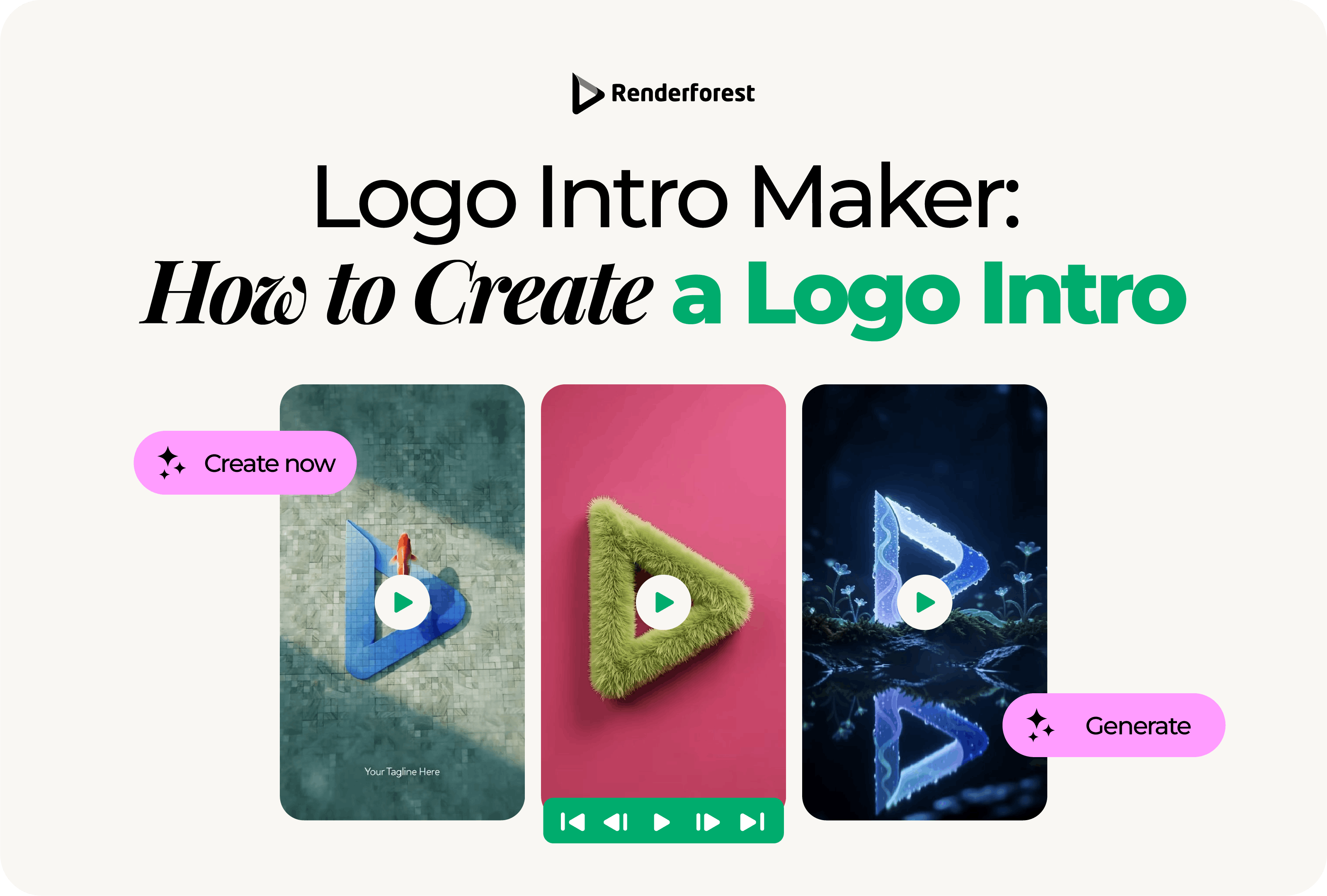
A logo intro is a short video opening that reveals or animates a brand logo before the main content begins. People also call it a logo reveal, animated logo intro, logo opener, logo sting, or logo animation, depending on how and where it is used.
You will usually see logo intros in:
A logo intro is narrower than a full video intro. A full intro can include a hook, host, topic, product scene, voiceover, or episode title. A logo intro has one main job: make the brand recognizable before the video moves on.
That is why clarity matters more than complexity. If viewers remember the smoke, sparks, or glitch effect but not the logo, the intro has failed.
To create a logo intro, follow this process:
Think of the intro as your logo in motion, not as a separate design asset trying to impress people before the content starts.
The quality of the logo file affects the quality of the final animation. A logo intro maker can help with motion, timing, background, and export, but it cannot fully rescue a blurry, low-resolution, badly cropped, or inconsistent logo.
Before you start, prepare these assets if possible:
Use the cleanest version of your logo. Avoid screenshots, compressed images, and files with extra white space around the mark.
For best results in Renderforest, use a clean transparent PNG, ideally 1000×1000, or a sharp vector-style export when available. Renderforest’s logo animation tool recommends a 1000×1000 transparent PNG for the best-looking animated logo, and built-in editing can help when the uploaded logo resolution differs.
If your logo is already difficult to read as a still image, animation will not solve the problem. It will only make the issue more visible.
These terms overlap, but they are not always the same.
If you are making a branded opening for video content, “logo intro” is the practical term. If you are creating a motion version of the logo for many digital moments, “logo animation” is the broader idea.
A strong logo intro follows four rules: preserve, reveal, resolve, and export.
This framework keeps the animation useful. A logo intro should extend the brand identity, not redesign it.
The best logo intro style depends on the brand, platform, and video context. A law firm and a gaming channel should not use the same movement. A SaaS product demo and a music event opener should not have the same pacing.
Use this table as a starting point:
Do not choose a style only because it looks impressive in the preview. Ask whether it fits your brand, whether the logo stays readable, and whether the viewer gets to the real content fast enough.
Most logo intros should be short. A long reveal may look good once, but it can feel slow when viewers see it at the start of every video.
For everyday content, 1–3 seconds is usually enough. Use longer logo intros only when the viewer expects a formal opening, such as an event, keynote, launch video, or brand film.
A logo intro should feel like a natural extension of the brand. Motion can give a logo personality, but the wrong motion can make the brand feel less trustworthy.
Think about what the brand should feel like:
If the animation does not match the brand, reduce it. A simple logo intro that feels right is better than a flashy one that feels borrowed.
Once you choose the style, adjust the details that make the intro feel like your brand.
Use brand colors when possible, but do not force every brand color into the animation. A logo intro often works best with one main background color, one accent color, and the logo itself.
Make sure the logo has enough contrast against the background. If your logo disappears on a dark background, use a white version. If it feels too heavy on a light background, try the full-color or dark version.
Choose a background that supports the logo. It can be:
Avoid backgrounds that compete with the logo. If people notice the background before the brand mark, the logo intro is too busy.
A tagline can help if it adds meaning. It can also clutter the intro.
Use a tagline when:
Skip the tagline when:
A logo intro should not become a full ad. Keep the message tight.
Sound can make a logo intro feel finished, but it can also make it feel cheap if it does not match the brand.
A logo intro sound cue should be short, clean, and aligned with the movement. A soft whoosh can work for a clean reveal. A heavier hit can work for gaming or event content. A warm acoustic cue may fit food, wellness, or lifestyle brands. A subtle electronic tone may fit software or tech products.
Also test the intro without sound. Many social videos autoplay muted, and some viewers watch with sound off. The logo intro should still make sense visually.
Use music and sound effects you have the right to use. Do not use a popular song or branded sound unless you have permission for that specific use.
Before exporting, pause the animation on the final frame. This is one of the most important tests, because the final frame is what many viewers will remember.
The final frame should be:
If the final frame does not work as a clean logo image, the intro is not ready. A strong logo intro should end by strengthening recognition.
A static fallback is the non-animated version that appears when motion is not possible, not supported, or not appropriate.
You need a static fallback when:
The fallback should match the final frame of the logo intro. If the animation resolves into a different-looking mark, the logo intro is weakening the brand system instead of supporting it.
A logo intro is easy to overdesign. Use this comparison before publishing.
The best logo intro usually feels obvious after you see it: simple, readable, and matched to the brand.
One logo intro file will not work everywhere. A widescreen logo intro may crop badly in a vertical video. A slow YouTube opener may feel too long in a social ad. A high-resolution video may be too heavy for a website header.
For YouTube uploads, avoid adding padding or black bars directly into the file. YouTube’s help documentation says padding can interfere with how the player adapts to different screens and devices. Source: YouTube Help
If you publish a logo intro demo video on the page, Google’s VideoObject structured data documentation explains that markup can help Google understand video details such as description, thumbnail URL, upload date, and duration. Source: Google Search Central
Once your logo file and motion direction are ready, you can use Renderforest’s logo animation tool to upload your logo, choose a logo intro style, customize the colors, music, timing, and final look, then export the animation for videos, websites, ads, presentations, or social media.
Renderforest’s logo animation page lets you explore logo animation templates and control the motion, timing, and style of the animated logo, while the broader intro maker includes logo reveals and intro animations for video use.
Upload the best version of your logo. Use a transparent PNG or vector-style file when possible. If you have several logo versions, choose the one that fits the background and format.
For example:
Pick a style that matches the brand. Do not choose the most dramatic animation unless the brand actually needs that energy.
A software company might use a clean geometric reveal. A restaurant might use warm lighting and soft motion. A fitness brand might use fast movement. A consulting firm might use a calm, precise reveal.
Add a tagline only if needed. Keep it short and readable. Match the animation colors to the brand, but leave enough contrast for the logo.
Shorten the animation if it feels slow. For most reusable logo intros, aim for 1–3 seconds. If you are creating a presentation opener, webinar intro, or event opener, a slightly longer version may work.
Choose a sound cue that supports the motion. If the logo intro will be used across many videos, avoid sounds that become annoying after repeated viewing.
Also export or save a silent version if the intro will be used in social videos, paid ads, or presentations where audio may change.
Pause the logo intro at the end. Check the logo size, placement, spacing, contrast, and readability.
The final frame should look like a clean brand mark, not a distorted screenshot from an animation.
Create different versions for different placements:
A logo intro is more useful when it is ready for the places where your brand actually appears. For the broader planning process, the guide on how to make an intro video can help you decide where the logo cue fits inside the full opening.
Start with the logo file. If the logo is blurry, badly cropped, low contrast, or hard to read, the animation will not fix it.
A long logo intro can feel like a delay. For repeated content, keep it short. Viewers usually came for the video, not the logo reveal.
Do not stretch, recolor, warp, over-texturize, or rebuild the logo unless you are intentionally creating a separate campaign asset. The logo should stay recognizable.
Particles, smoke, glitches, lens flares, 3D spins, sparks, and camera shakes can all work in specific contexts. They should not all appear in the same logo intro.
A tagline that cannot be read at full speed adds clutter. Either make it larger and shorter or remove it.
Many people will see your logo intro on a phone. Preview the animation at small size before publishing.
A logo intro should still work muted. Sound can support the reveal, but brand recognition should not depend on audio.
A widescreen intro will not automatically work in a vertical social video. Build or export versions for the actual platform.
Before exporting, check your logo intro against this list:
If the logo intro fails any of the recognition tests, simplify the motion before exporting.
A YouTube logo intro should be short and repeatable. A 1–3 second reveal is usually enough for recurring videos.
Example:
A design channel opens with a quick line-draw logo reveal, the channel name appears for one second, and the video cuts directly into the tutorial.
A product demo logo intro should move quickly into the product. The logo can appear first, but the viewer should not wait too long to see the actual interface or product context.
Example:
A project management app logo fades in, a simple UI card slides behind it, and the first product screen appears immediately after the logo resolves.
A webinar logo intro can be slightly more formal. It can include the brand, session title, and speaker name if the pacing allows.
Example:
The company logo appears with a clean shape animation, followed by the session title and speaker name before the webinar begins.
A social logo sting should be extremely short. In many cases, the hook should come before or alongside the logo.
Example:
A vertical video opens with the hook text, then the brand icon appears as a quick corner animation instead of a full-screen reveal.
An event logo opener can be more cinematic because the audience expects a branded opening.
Example:
A conference logo appears over a fast montage of the venue, speakers, and audience, then resolves into the event title.
A logo intro maker is a tool that helps you create a short animated video intro using your logo. It usually lets you upload a logo, choose an animation style, customize colors and music, preview the result, and export the final video.
To create a logo intro, upload a clean logo file, choose a short animation style, preserve the logo’s shape and colors, customize the background and timing, preview the final logo frame, and export the right version for your platform.
Most logo intros should be 1–3 seconds. Use shorter logo stings for social media and repeated content. Use 3–6 seconds only for presentations, webinars, events, or brand videos where the audience expects an opening.
Use a transparent PNG, SVG, or high-quality logo file when possible. Avoid screenshots, low-resolution images, and files with extra empty space around the logo. For Renderforest, a 1000×1000 transparent PNG is recommended for the best-looking animated logo.
A logo intro can include a tagline if it helps explain the brand or campaign. Keep it short and readable. If the text is too small or the intro is under two seconds, skip the tagline.
Yes. A logo intro maker or template-based animation tool lets you create a logo intro without advanced editing skills. The important part is choosing a style that fits your brand and keeping the logo readable.
A logo intro is usually a short opening used before video content. A logo animation is any motion version of a logo and can be used in videos, websites, apps, presentations, ads, or social media.
A professional logo intro is short, clean, readable, and consistent with the brand. It preserves the logo, uses one clear motion style, ends on a strong final frame, and works with or without sound.
Yes. A logo intro can work well on YouTube, especially for recurring videos, tutorials, brand channels, and product content. Keep it short so it does not delay the main video, and avoid adding black bars or padding directly into the file.
Yes. A 16:9 logo intro works for YouTube, presentations, and webinars. A 9:16 version is better for Reels, TikTok, and Shorts. A shorter logo sting is useful for ads and repeated content.
A logo intro should make your brand easier to recognize, not harder to read.
Start with a clean logo, choose one motion idea, keep the animation short, and make sure the final frame works as a static logo. Once the logo is clear, tools like Renderforest’s logo animation maker can help you turn it into a polished intro for videos, presentations, websites, ads, and social content.
The best logo intro is not the longest or most complex one. It is the one that makes the logo feel intentional in motion and then gets out of the way.
Share this


Article by: Liana Ziroyan
Liana is a marketing professional with 11 years of experience in digital marketing, content, and product communication. She has a strong eye for visual storytelling and loves turning ideas into engaging campaigns that connect with audiences. With her experience across branding, creative content, and user-focused messaging, Liana enjoys finding simple, effective ways to make products feel clear, useful, and exciting.
Read all posts by Liana Ziroyan