
AI
Like many kinds of art, graphic design has its basic principles and elements. The principles of design are the rules a designer follows to have a composition that’s just right. They help you create artwork that’s not only beautiful and eye-catching but also correct in ways professionals can see and viewers feel.
The number of design principles may vary sometimes once you go down that path of discovery. However, there are some design elements and principles that are considered to be the basic and most important ones.
The main principles of graphic design are balance, contrast, emphasis, repetition and pattern, proportion, movement, white space, unity, and variety.
Let’s get to them and see what each of them means:
There might be many variations to this answer, however, in most, you’ll definitely find the design principles below. Let’s see what each of them does for your design.
Any element in your design has a visual weight. Objects, text, their size, and shape, color and texture, all have weight, which is important to distribute on your composition with care and evenly. This is the function of balance.
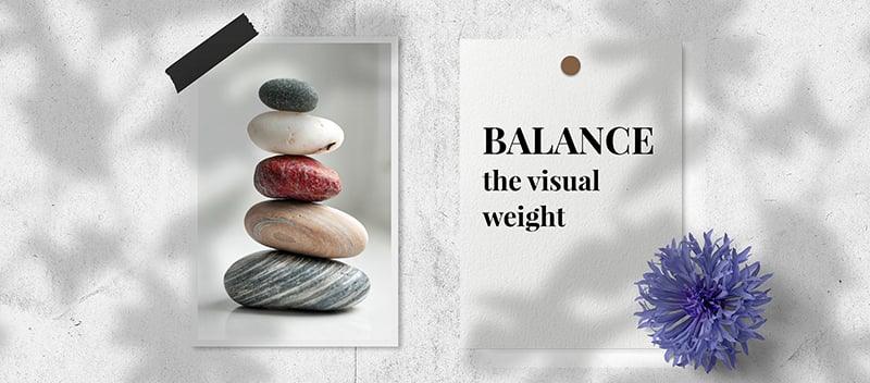
Think of it as a wooden boat on a peaceful lake. Once you start placing all your baggage on one side, it will slowly start to sink because that will be the heavy side of your boat, while the other side will remain weightless.
Your ship should be balanced to move forward with ease, and the same goes for the visual elements of your design. To make your composition stable and engaging for your audience, you should create balance for your elements.
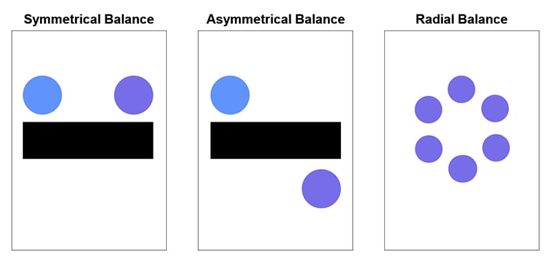
There are three kinds of options when it comes to the balance of a design: symmetrical, asymmetrical, and radial.
Symmetrical balance: the elements on both sides of the centerline have equal weight.
Asymmetrical balance: the sides have opposite weights, but still look balanced.
Radial balance: the elements are arranged around the central point of your design.
Contrast is used to create an obvious difference between the objects of your design and highlight them as a result. On your composition, you can show contrast with contrasting colors, light and dark hues, small and big shapes, thin and thick fonts, and more.
For example, if you’re designing any kind of logo, you can create contrast with a pink background, blue or green elements, and white text.

However, you shouldn’t overdo contrast. Say, you’re working with text, and have chosen more than two or three typefaces and fonts, the entire composition will look all over the place. Your target audience won’t be able to concentrate on the information, and the whole design will turn out to be confusing.
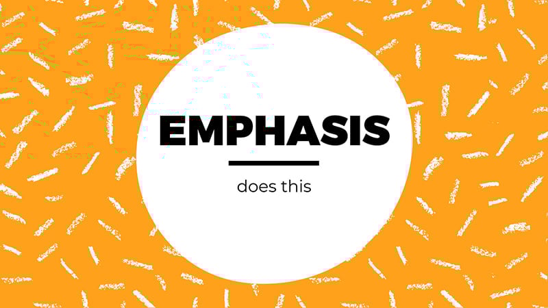
Emphasis highlights the most important element and makes your audience concentrate on the focal point of your design.
Good design with emphasis helps to draw attention to your information and makes it stand out with its shape, size, or color.
To have a perfect emphasis on your design you need to have a clear understanding of what’s important in your composition. Otherwise, your design will be unbalanced and messy, and as a result, it won’t be able to fulfill its purpose.
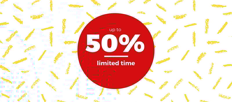
For example, if you’re making a sale announcement for a brand and some products are even 50% off, you can place the “50%” in the middle of your poster and make it bigger and bolder than the rest of the elements.
You can have the word “up to” smaller just above the most important element of your poster, to keep the visual hierarchy. This is the second function of emphasis – reducing the impact of the information, you don’t want to catch the eye of your audience first.
Proportion is the relative size of the design elements compared to each other. It comes organically once you’re done with your contrast and balance.
It shows the important elements and points out the less important ones. So, the larger the element is, the more important it is, and the opposite – the smaller an element is, the less significant it usually is.
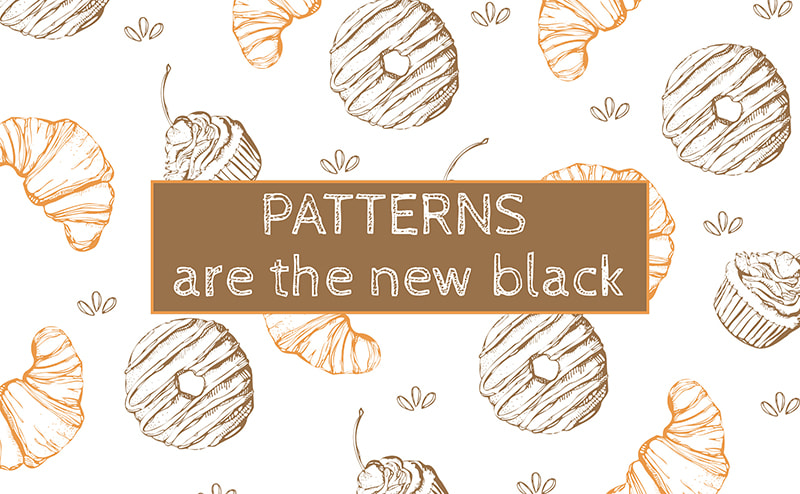
The recurrence of an element, color, shape, or form in design is called repetition. It unifies your design elements and gives them a kind of signature look.
By repeating elements, you create a pattern and strengthen your design. For example, using the same color of your brand logo for the shapes on your announcement poster, will be an indirect shout-out to your brand and help you develop your brand identity.
These days, using patterns and repetition of the same elements is trendy both for print and fashion.
Like every story, a design should have a beginning and an end. The way a viewer’s eye travels over the design, the way they “read” it, is told by movement.
Movement helps you make the most important part of your design the beginning of your composition. Then follows the next important thing, then the next, and so on, until the whole information is consumed by your target audience.
A designer does this by choosing the placement of the design elements, their size, boldness, color, and other features.
And if at one point you’re confused as to what comes next, what should be bolder, bigger, and more expressive, try to create the mental or written outline of your composition, and place different elements from the most important one to the least.
Sometimes, when you’re still a beginner in the world of design, you might think your work is not complete because there is still some room for more – more shapes, colors, typography, and other elements.
However, most of the time you’re wrong. It’s called white space, and any design needs white space.

White space, or negative space, gives your composition room to breathe and helps certain elements stand out. And most of the time, it makes your work more successful by highlighting the important information and your main design element.
Remember, a design that breaths, lives longer.
To create visual interest and hold the viewer’s attention longer, you need variety. Variety is the use of several elements of design to make your art “explorable” and give the viewer a better experience.
However, you don’t have to show variety, just because you need to have it in your design. It should come naturally and make up an aesthetically-pleasing composition.
You can show variety through colors, shapes, images, different typefaces, and other design elements.

Last, but definitely not least principle, visual unity refers to the harmony between all parts of your design. We’ve all seen a design that has a lot of elements, but none of which is compatible with the other.
To have unity in your design, all parts of your composition should be in complete harmony with each other to be visually appealing in the viewer’s eyes. It will make your work of art look complete and organized.
If there is no relationship between your two or more elements, your design will give a messy and unprofessional feel. So, to achieve unity, you should organize all your visual elements and make them work together in a single design composition.
Now that you know the basic principles of design, it’s time to put them into practice.
However, remember that you don’t have to follow all of these principles to have a groundbreaking design.
You can skip one or two (and even more) design principles and elements if you’re confident that the purpose of your design will be fulfilled the best way possible, and your message will reach your target audience.
Here are some quick tips to help you create a beautiful design using some of the principles important for your next composition:

With the right principles, tools, and tips for graphic design, you can create compositions that are unique, catchy, and, of course, right.
Some online graphic makers can also help you do the job faster. With Renderforest Graphic Maker you can browse through the professional templates created by our team of designers, choose the ones you need, and start editing them.
Easy, fast, effective, and based on the basic design principles presented above.

Conclusion
All in all, there are 9 main principles in design.
By using them in your composition you’ll create art pieces that are both creative and effective. However, you don’t have to force all of these principles onto your design. They should come organically and make your design whole.
If you’re a beginner graphic designer or just a brand owner, there are some graphic design software and online tools to help you complete the task more professionally and without extra money. With the right tools and principles, your design will be ready to melt hearts.
Ready to create a design, following these principles? Click the button below to start!
Share this
Article by: Renderforest Staff
Dive into our Forestblog of exclusive interviews, handy tutorials and interesting articles published every week!
Read all posts by Renderforest Staff