Video Editing
Choosing a logo is not only about finding something that looks good. It is about choosing a structure your brand can actually use.
Some logos are built from words. Some are built from symbols. Some use characters, badges, initials, or abstract shapes. The right choice depends on your brand name, audience, industry, recognition level, and where the logo will appear most often.
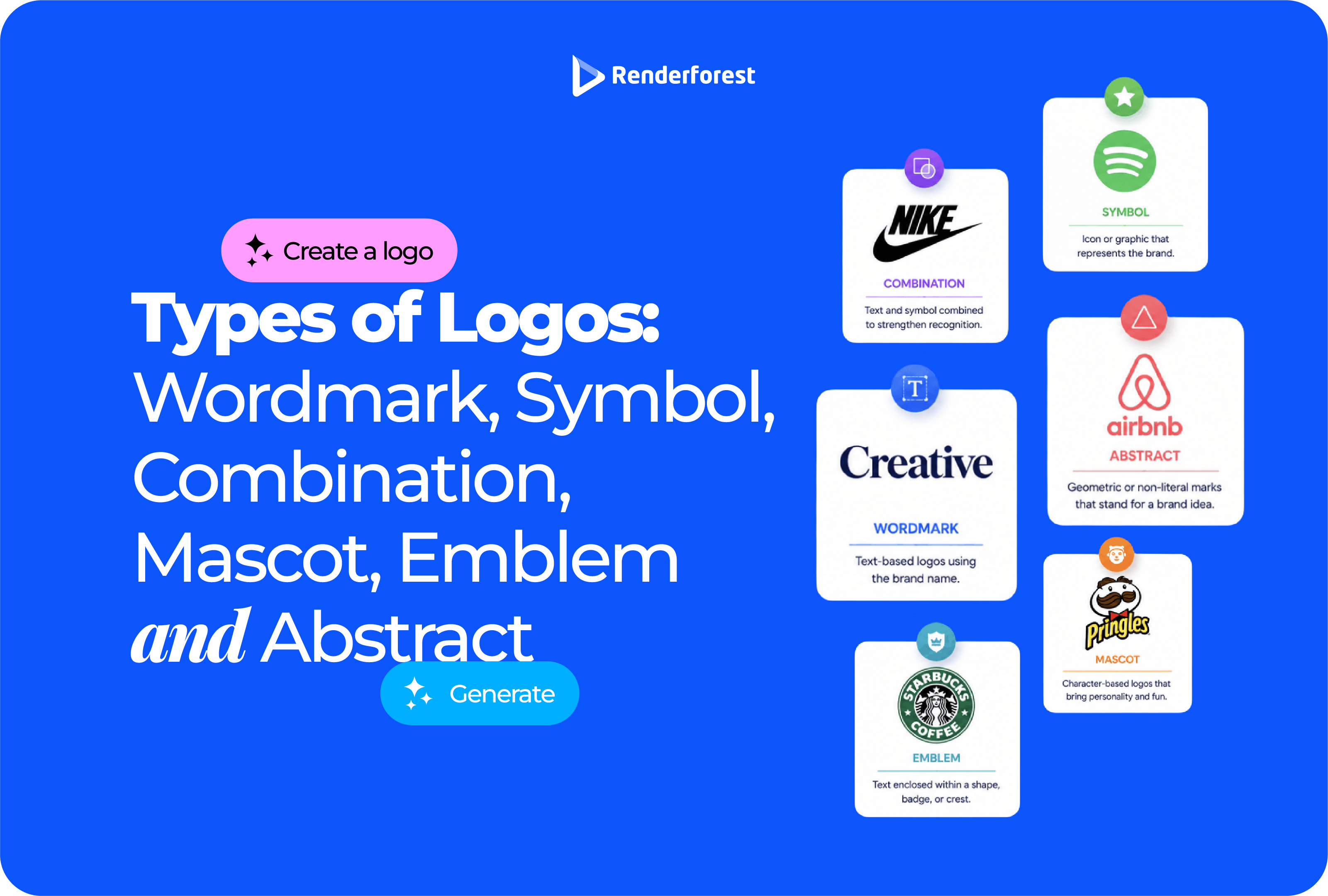
The main types of logos are wordmark, symbol, combination, mascot, emblem, and abstract logos. Lettermark logos are also important, especially for brands with long names or initials.
For most new businesses, a combination logo is usually the safest starting point because it shows both the brand name and a visual mark. A short, memorable name may work well as a wordmark. A mascot can make a brand feel friendly. An emblem can signal tradition. An abstract mark can represent ideas that are hard to show literally.
This guide explains what each logo type is, when to use it, where it can fail, and how to choose a logo structure that can grow into a real brand system.
A logo type is the structure of the logo. It answers a practical question: is the logo built from text, a symbol, a character, a badge, initials, an abstract shape, or a combination of elements?
If you are unsure which logo type to choose, start with a combination logo. It gives you the clearest starting point: people see your name, but you also begin building recognition around a visual mark.
A more established brand can sometimes rely on a symbol, lettermark, or abstract mark because people already know what it stands for. A new brand usually needs clarity before mystery.
A logo type is the structure. A logo style is the visual treatment.
“Wordmark” is a logo type. “Minimal,” “retro,” “luxury,” “playful,” “geometric,” “hand-drawn,” and “bold” are styles.
You can have:
The type tells you what the logo is made of. The style tells you how it feels.
This distinction matters because many logo mistakes happen when people choose a style before choosing the right structure.
A beautiful emblem may still fail as a social avatar. A clean abstract mark may still be confusing if nobody knows the brand name. A mascot may look fun but feel wrong for a serious B2B service. A wordmark may look elegant but fail if the name is long and hard to read.
Choose the structure first. Then choose the style.
One of the biggest beginner mistakes is thinking the logo is a single image.
A real logo has to work in different sizes, layouts, colors, and placements. That usually means you need a logo system.
The logo type you choose should support this system. A detailed emblem may look great on a coffee bag but fail as a favicon. A mascot may work well on packaging but need a simplified head version for social media. A combination logo may need separate icon-only and wordmark-only versions.
The best logo type is not the one that looks best in one large preview. It is the one that still works after being resized, simplified, printed, animated, placed over a photo, or cropped into a circle.
Before choosing a logo type, run it through three practical tests.
A logo does not live only in a design file. It appears on website headers, pitch decks, invoices, product labels, storefront signs, thumbnails, social profiles, mobile screens, packaging, merchandise, and video intros.
Clarity also has an accessibility angle. W3C’s guidance on non-text contrast explains that meaningful graphics should be distinguishable for people with moderately low vision. That principle matters for logos too: if your mark depends on low-contrast colors, thin lines, or tiny details, it may fail in real use. Source: W3C: Understanding Non-text Contrast.
Use the R.R.A. test before you choose a logo type, not after you have fallen in love with a mockup.
A wordmark logo uses the full brand name as the logo. The design focus is typography: letter shapes, spacing, weight, rhythm, proportions, and sometimes small custom details.
Famous wordmark examples include Google, Coca-Cola, FedEx, Sony, Visa, and Disney. In these logos, the name is the identity.
A wordmark works best when the brand name is short, distinctive, and easy to remember. It is a good option when the name itself is one of the strongest brand assets.
A wordmark may be the right choice if:
For a new business, a wordmark can be practical because it puts the name front and center. People do not have to decode a symbol before they know who you are.
A wordmark is only as strong as its typography. If the font is generic, poorly spaced, or mismatched with the brand personality, the logo can feel unfinished.
Watch out for:
A long horizontal name may look fine on a website header but fail as a social profile image. If you choose a wordmark, think about whether you also need an initial, monogram, or simplified icon for small spaces.
Best-fit verdict: Choose a wordmark if the name is one of your strongest brand assets. Avoid relying on a wordmark alone if the name is long, hard to read, or needs a compact symbol for digital placements.
A lettermark logo uses initials or a monogram instead of the full brand name.
Think IBM, NASA, CNN, HBO, HP, or BBC. These logos are built from letters, but they work differently from wordmarks. A wordmark spells the full name. A lettermark compresses the name into initials.
A lettermark may be useful when:
Lettermarks are common for media companies, government agencies, technology brands, law firms, consultancies, and organizations with formal names.
A lettermark can feel cold or unclear when the initials mean nothing to the audience.
Watch out for initials that are hard to pronounce, letter combinations that look generic, monograms that resemble other brands, and initials that do not help people remember the full name.
Best-fit verdict: Use a lettermark when the initials are stronger, shorter, or more practical than the full name. For a new brand, consider pairing the lettermark with the full name until people learn the abbreviation.
A symbol logo, also called a pictorial mark or brandmark, uses a recognizable icon without the full brand name. The symbol may be literal, like an apple, shell, bird, or target. It may also be simplified into a visual mark that people learn to associate with the brand over time.
Symbol logos are powerful because they can become instantly recognizable. They are also risky because a symbol alone may not communicate much until people already know the brand.
A symbol logo can work well when:
Symbols are useful for app icons, favicons, social avatars, product marks, and mobile interfaces because they are compact and fast to recognize.
A standalone symbol can be confusing for a new brand. If people see the mark but do not know the name, the logo is not doing enough.
Watch out for:
A symbol should be simple enough to remember and specific enough to own.
The goal is not to avoid every familiar symbol. The goal is to avoid the first obvious answer unless it is executed in a distinctive way.
Best-fit verdict: Choose a symbol logo when the visual idea is strong and the brand has enough context to support it. If the business is new, pair the symbol with the brand name first.
A combination logo uses both text and a symbol. The symbol may sit above, beside, or inside the wordmark. This is one of the most useful logo types because it gives you flexibility.
A combination logo can include:
For many small businesses, startups, creators, and local brands, a combination logo is the safest starting point.
Combination logos solve two problems at once. The wordmark tells people the name. The symbol gives the brand a visual anchor.
That matters because most new brands do not have enough recognition to use a symbol alone. The symbol can become more useful over time as people learn the brand.
This is why a combination logo often becomes a full logo system. You can use the full lockup on your website, the icon for social profiles, the wordmark for documents, and a one-color version for print.
Use a combination logo if:
A combination logo is especially useful for small businesses because it does not force you to choose between name recognition and icon flexibility.
A combination mark can become cluttered if the symbol and text compete.
Watch out for symbols that are too detailed, text that is too small beside the icon, awkward vertical or horizontal balance, too many colors, or a layout that only works in one orientation.
A good combination logo should break apart cleanly. The text should work alone. The icon should work alone. Together, they should feel stronger than either piece by itself.
Best-fit verdict: Choose a combination logo if you want the most practical starting point. It is usually the best first logo type for a new business because it gives you both the name and the mark.
A mascot logo uses a character to represent the brand. The character may be a person, animal, creature, object, or illustrated figure.
Mascots can make a brand feel approachable, memorable, and expressive. They work especially well when the brand needs personality, friendliness, humor, or storytelling.
Mascot logos are strong for:
A mascot gives the brand a face. That can be useful in social content, packaging, stickers, merchandise, video intros, and campaigns.
A mascot can also make a brand easier to talk to. The character gives the brand a voice, not just a look.
Mascots are harder to maintain than simple marks. A character can look outdated, overly childish, or difficult to reproduce.
Watch out for:
A mascot should be designed as a system, not just one drawing.
If you only have one detailed mascot illustration, you may not have a flexible logo yet.
Best-fit verdict: Choose a mascot logo when personality is central to the brand. Avoid it if the business needs to feel restrained, technical, institutional, or highly premium.
An emblem logo places text inside a contained shape, badge, crest, seal, or shield. It often feels established, official, traditional, or community-based.
Emblems are common in schools, universities, sports teams, government-style organizations, breweries, coffee shops, clubs, automotive brands, and heritage businesses.
Use an emblem if you want the brand to feel:
An emblem can work well for physical applications such as packaging, labels, patches, stickers, signage, uniforms, and merchandise.
For a local coffee shop, brewery, restaurant, or club, an emblem can make the brand feel like it belongs somewhere. It can give the logo a sense of place, history, and community.
Emblems can fail in small digital placements because they often include too much detail.
Watch out for:
If the emblem becomes unreadable as a social avatar, you need a simplified version.
A good emblem should feel intentional. A weak emblem often looks like a decorative stamp with too many details.
Best-fit verdict: Choose an emblem when heritage, community, or physical-world branding matters. Avoid using a detailed emblem as your only logo if most of your brand activity happens in small digital spaces.
An abstract logo uses a non-literal shape or symbol. Instead of showing an apple, bird, roof, leaf, or person, it uses geometry, movement, negative space, or symbolic forms to suggest an idea.
Abstract marks are common in technology, SaaS, finance, consulting, healthcare, AI, media, and innovation-led brands.
Abstract logos work well when the brand idea is difficult to show literally.
Use an abstract logo if your brand is about:
For example, an AI workflow product may not need a robot face or brain icon. It may be better represented by a loop, flow, signal, simplified path, or modular shape.
An abstract mark can be useful when literal symbols would make the brand feel generic. A finance product does not always need a coin or chart. A cybersecurity company does not always need a lock. A healthcare platform does not always need a cross.
Abstract logos can feel empty if they are not connected to a clear brand idea.
Watch out for:
An abstract mark should still have logic. It does not need to be literal, but it should feel intentional.
An abstract logo is not a shortcut to originality. It only works when the idea behind the shape is clear.
Best-fit verdict: Choose an abstract logo when your brand stands for a concept, system, or feeling that is hard to show literally. Avoid it if the mark does not have a clear reason to exist.
The right logo type depends on where the logo will appear most often.
This is why the same business may need multiple logo versions. Your website header and Instagram avatar should feel like the same brand, but they may not use the exact same logo layout.
Use this table as a starting point.
If your brand is new and you are not sure, choose a combination logo first. It gives you room to grow.
Before choosing a final direction, test your logo type against real usage.
The best logo type is not always the most creative one. It is the one that works in the most real situations without losing clarity.
A logo is part of your brand identity, but it may also function as a trademark when used to identify your goods or services.
The USPTO explains that a trademark can be a word, phrase, symbol, design, or combination that identifies goods or services and distinguishes them from others. Source: USPTO Trademark Basics.
WIPO describes trademarks as signs capable of distinguishing the goods or services of one enterprise from those of other enterprises. Source: WIPO Trademarks.
Before committing to a logo type, especially a symbol, abstract mark, mascot, or emblem, check whether similar marks already exist in your category.
A practical first-pass check should include:
This is not legal advice. If your brand has serious business value, speak with a trademark attorney before filing or investing heavily in packaging, signage, merchandise, or paid campaigns.
If you are still deciding between logo types, test several formats before choosing one.
Renderforest’s Logo Maker lets you create and customize logos online in the browser. The page explains that users can choose a template, customize it, and download the logo.
A practical workflow:
If you want to explore different visual directions before refining the logo manually, Renderforest’s AI Logo Generator can help you generate logo options from a short description and style direction. Renderforest describes the process as describing your idea, choosing a style, and generating logo options that match your vision.
The goal is not to pick the prettiest preview. The goal is to find the logo type that can grow into a usable brand system.
A symbol can be powerful, but new brands often need the name visible. If people cannot connect the icon to the business, the logo is not helping enough.
A combination logo is usually safer at launch.
Emblems often look great large and fail small. If the text disappears as a social avatar, simplify the badge or create a secondary icon.
A mascot needs simplified versions, expressions, poses, and a wordmark lockup. One character illustration is not enough for full brand use.
A random shape is not a strategy. Abstract marks need a clear idea behind them.
Trends change. Your logo type should be based on recognition, reproduction, and association.
A logo for packaging has different needs than a logo for an app icon. A YouTube channel has different needs than a law firm. Design for the placements that matter most.
The primary logo is only one part of the system. You still need a small-size mark, one-color versions, and layouts for different placements.
The main types of logos are wordmark, symbol, combination, mascot, emblem, and abstract logos. Lettermarks or monograms are also common, especially for brands with long names or initials.
A wordmark logo uses the full brand name as the logo. It depends on typography, spacing, and letterform design rather than a separate symbol.
A lettermark logo uses initials or a monogram instead of the full brand name. It is useful when the full name is long, formal, or difficult to fit in small spaces.
A symbol logo uses a standalone icon or pictorial mark to represent the brand. It works best when the symbol is simple, memorable, and connected to a brand people can recognize.
A combination logo uses both text and a symbol. It is one of the most flexible logo types because the full logo, icon, and wordmark can often be used separately.
A mascot logo uses a character to represent the brand. Mascots work well for brands that need personality, friendliness, humor, or a strong community identity.
An emblem logo places text inside a badge, seal, crest, shield, or contained shape. It often works well for schools, clubs, heritage brands, restaurants, breweries, and local businesses.
An abstract logo uses a non-literal symbol or geometric form. It does not show an obvious object but suggests an idea such as movement, connection, growth, trust, or transformation.
A combination logo is usually best for a new business because it includes both the brand name and a visual mark. That gives you clarity at launch and flexibility as the brand becomes more recognizable.
A symbol, abstract mark, mascot head, monogram, or simplified combination logo usually works best for social media because profile images are small and often circular or square.
Yes. Many brands use a logo system with multiple versions: a primary combination logo, a wordmark, an icon-only version, a stacked version, and a one-color version. This is often more practical than relying on one logo file.
The best logo type is not the one that looks most impressive in a single mockup. It is the one that helps people recognize your brand, works across real placements, and still makes sense as the business grows.
Use a wordmark when the name is the strength. Use a lettermark when the initials are more practical than the full name. Use a symbol when the visual idea is strong enough to stand alone. Use a combination logo when you need clarity and flexibility. Use a mascot when personality matters. Use an emblem when tradition or community matters. Use an abstract mark when the brand idea is bigger than a literal object.
Choose the logo type first. Then build the style and logo system around it.
Share this
Article by: Liana Ziroyan
Liana is a marketing professional with 11 years of experience in digital marketing, content, and product communication. She has a strong eye for visual storytelling and loves turning ideas into engaging campaigns that connect with audiences. With her experience across branding, creative content, and user-focused messaging, Liana enjoys finding simple, effective ways to make products feel clear, useful, and exciting.
Read all posts by Liana Ziroyan