Video Editing
A homepage (also called a home page) is a website’s main page that introduces the user to the business and what it has to offer. It’s often compared to a storefront that gives shoppers a glimpse into the store and influences the person’s decision of whether or not to enter.
While all website pages are important, you might not get the chance to impress visitors with them if your homepage fails to capture their curiosity in the first place. A homepage is usually the first thing people see from a website and thus the very page that forms their first impression.
With that said, let’s examine why a homepage is important, the anatomy of a well-designed homepage, and the best homepage examples that can teach us a lot about website homepage design. Here we go!
Considering that a homepage is often the first interaction a consumer has with a business, it’s easy to see how much influence a homepage can have. However, the valuable benefits of a homepage extend well beyond shaping initial impressions.
So, why is a homepage important?
When new visitor enters your website, the first thing they want to see is who you are and what you do. This is why the very first section of a website — the header — provides a brief explanation of what the business does.
A strong website homepage gives clear answers to three basic questions:
The simpler and clearer your answers to these questions are, the better. Elaborate, complicated sentences with industry-related jargon will only be successful in confusing the user and having them click away in frustration. Not a promising introduction to a business, is it?
But if you find an effective way to communicate your company’s main purpose and its unique value proposition, you’ll be a step closer to winning over your target audience.

The homepage above does an excellent job presenting the business in a single easy-to-grasp sentence and tells visitors what to do next with its CTA button.
Apart from giving visitors a better idea about the business, a good homepage also provides a smooth user experience. It gives quick access to the necessary information and directs guests to the right parts of the website through links and buttons.
This helps to navigate the website with more ease, even if you’re unfamiliar with the site’s content. Intuitive website navigation is a prerequisite for a positive user experience, and a homepage plays a big part in it.
The best homepage designs include sharp copy and smartly positioned buttons as a call to action. Both elements are meant to convert first-time visitors into first-time visitors that take action to form a relationship with the brand.
Homepages might also include sign-up forms that serve as a call to action to prompt visitors to register on the website, subscribe to a newsletter, or download a template. This leads to a higher conversion rate and more effective lead generation.
First impressions stick, so your homepage will heavily affect the visitor’s recollection of your brand. The information your homepage presents them with and the general experience it provides will likely shape the user’s first impression of your business.
In most cases, homepages are the most memorable page on a website, and as such, they spread brand awareness. This is because homepages feature the most recognizable elements of a business — its logo, tagline, signature colors, branded illustrations, and main promise to customers.
If done right, all these elements combine to form a distinct brand identity that will stick well beyond the client’s first interaction with the website.
Recommended Reading
Every homepage is a representation of a specific business that has its unique offers, priorities, and target audience. Therefore, every homepage design will be tailored to different business needs.
Keeping these differences in mind, there are still specific elements that should be included on a website’s homepage regardless of the business it belongs to. Below, we’ll discuss each of the elements that are consistent across the best homepage designs.
Headlines are arguably the first thing to catch the user’s attention upon arriving on a website. A powerful line that communicates something of value to the user, intrigues, or entertains, will give them the needed incentive to keep exploring the site.
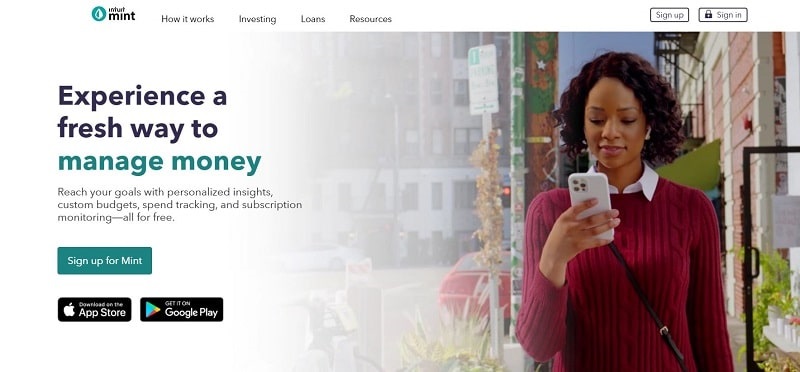
The Mint website grabs our interest with its headline that promises a fresh way of managing money — a task that some might find unexciting or intimidating.
Does your headline convey a clear message, evoke an emotion, or pique the user’s curiosity? It doesn’t have to do all three at once, but if it doesn’t check at least one box, you need to do more brainstorming.
Most headlines use power words to strengthen their messaging and leave a stronger influence on the target audience. Do be careful with overdoing it, though, to avoid ending up with a pile of strong words that look impressive but don’t send a coherent message. Remember the two I’s of good headlines: impress and inform. Don’t neglect the letter in favor of the former.
Once you have the visitor’s attention, the next step is to present the values your business can bring. Considering how short attention spans are nowadays, it’s best to do so as quickly and effectively as possible before you lose your grasp of the reader’s interest.
Purposeful copy introduces the business’s value proposition and competitive advantage to position the company as an authority in its respective field. Once this is accomplished, the homepage has succeeded at its job of getting the visitor interested in the business’s offer.
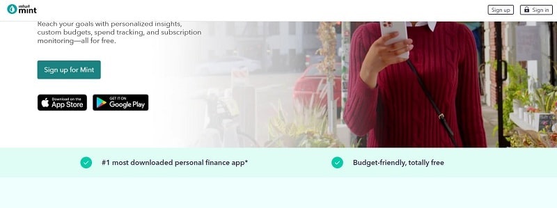
Let’s look at Mint’s homepage again. When you scroll down a bit, you’ll see how Mint proudly presents itself as the #1 downloaded personal finance app to prove its competitive advantage.
Always keep in mind that people expect to find relevant and easily digestible information on your homepage. They need quick and precise answers to who you are and how you can help to solve their problem. Think about the tone of voice that will best match your messaging and stick to it throughout your website.
Now you’ve established an initial bond with your visitor, so how to prompt them to act on the information they received? A compelling call to action is exactly what you need. You’ll see call-to-action (CTA) buttons sprinkled on almost every homepage, as they’re an integral part of homepage design.
When creating your CTA buttons, pay attention to two critical factors: the wording of the button and the placement. The most powerful CTAs are short and simple to immediately catch the eye. Long phrases and complex words will look unappealing and lessen the impact of the call to action.

CTA buttons are present at each critical point of interaction with the client. For example, you might have one displayed on the header to urge people to keep exploring your site. Another button might be placed after you introduce your products or services so users can check them out, and so on.
It’s best not to have too many calls to action that point in different directions. One primary and 1-2 secondary CTAs will be enough for most homepages. Anything more than that will add clutter to the design and confuse the user.

What else is required to create a solid homepage? Typography and color schemes are subtler but still very influential ingredients of homepage design. Go for fonts and colors that feel authentic to your brand and are aligned with your style guide. This will create a cohesive brand image online and offline.
Lastly, have a responsive website design that adapts to any screen it’s viewed on. You want users to be able to conveniently read the text whether they’re using a mobile phone or desktop.
If you’re ready to create a winning homepage for your brand but are unsure of where to start, online website builders are one of your best options. They’re especially useful for those who don’t have coding skills or large funds to dedicate to hiring a professional designer.
Website builders come with pre-designed templates that you can customize with ease to fit the requirements of your site. The process is easy and intuitive and usually takes no longer than an hour. If website builders sound like the tool you need, feel free to check out our library of customizable website templates.
 |
 |
 |
Let’s have a look at the best homepage examples to see how they’ve put the elements and best practices discussed above in action. Not only will this serve as a source of inspiration, but it’ll also reveal all the repetitive patterns and practices utilized by the best homepage designs.
PayPal’s homepage uses abundant white space to simplify the design and make the details that matter pop. As PayPal is a name that enjoys quite a bit of popularity, instead of introducing the company unlike Paypal alternatives, the website focuses on getting visitors to sign up. The bright CTA button strongly contacts with the neutral background, thus effortlessly drawing attention.

Dropbox stands out with its simple design, straightforward copy, and on-brand illustrations. The main call to action directs the web surfer to a landing page where they can select the Dropbox benefits they want and find a suitable plan. As Dropbox’s target audience can be very diverse — from individuals to enterprises — this serves to take each client to a page dedicated to their needs.

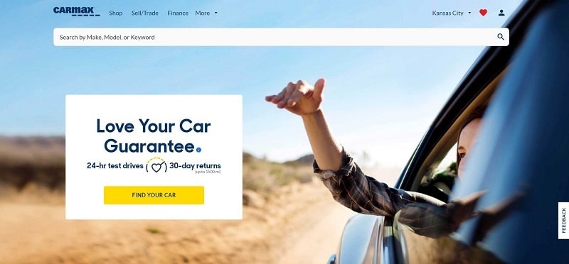
With its large hero image that speaks about the company without using words, the CarMax website arouses feelings of comfort, enjoyment, movement, and freedom — values that represent the company. The homepage also displays photos of happy customers as social proof, which elevates the page even more.
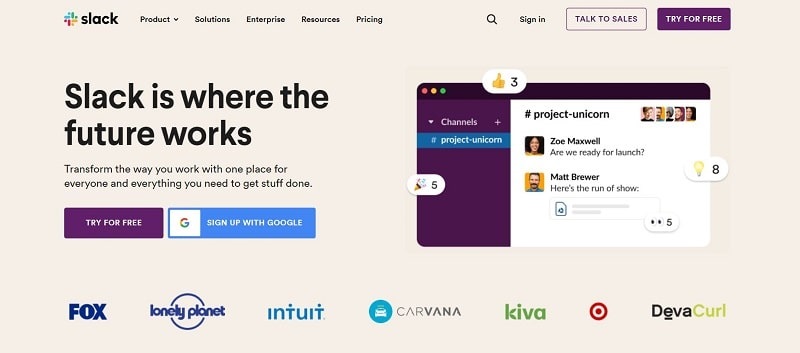
Slack welcomes visitors with an attention-grabbing headline that raises questions and leads the user to read the introductory description. The focal call to action on the page is the “Try for free” button that stands out with its deep violet color.
As an all-in-one branding platform that helps companies create branded assets, our beloved homepage introduces those assets with a concise description. The following sections are dedicated to each product Rendeforest offers, helping users quickly find the offer they need. The personalized illustrations paint a lovely picture of a forest — pertaining to the brand name.

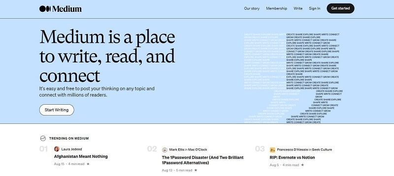
The opening line of the Medium homepage states, “Medium is a place to write, read, and connect.” And we doubt that there’s a simpler way to describe the platform. The call to action stands out against the background by way of contrast and shows users the sign-up options.
As there are three ways of signing up on Medium, they concealed all three options behind a single central CTA to save space.
Uber incorporates three big services — driving and delivery, ordering food, and booking a ride. All services are presented above the fold, so the user doesn’t have to scroll to find the desired service. Each service has its own unique copy, header image, and CTA button that can be viewed once the user clicks on the respective icon. It’s definitely a smart use of space that can benefit companies with various offer types.

Travel, adventure, and exploration of the unknown? Notice how perfectly the Airbnb header image conveys the company’s value proposition. The website allows guests to look for rentals or experiences right on the homepage to expedite the process of booking. Scrolling down, users will see different types of stays they can find through the platform — from outdoor getaways to studio apartments in the heart of any city.

Skillshare’s homepage is as creative as one would expect it to be. Displaying video clips instead of a stagnant image, the homepage header gives a glimpse of all the various skills learners can explore on this website — photography, painting, dancing, pottery, and more. The tagline “Explore your creativity” crowns the page, followed by a sign-up form for users to do just that: explore their creativity by teaching and learning.

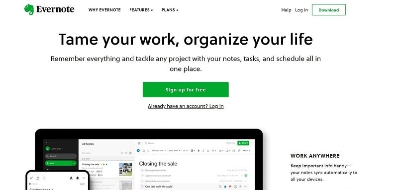
Helping its customers free up space and remove unnecessary clutter, Evernote did the same for its website. The homepage design feels immaculately clean thanks to the plentiful white space, minimal black text, and occasional green buttons and designs to liven up the page and guide the user.
The popular coffee shop is just as well known for its website design that is regularly updated to show the most prominent sale, drink, or offer at the time. But what’s consistent throughout all seasons is the use of vibrant, appetizing pictures of Starbucks drinks.
An important detail on this homepage is a small segment that talks about the company’s dedication to serving communities. Company websites often include such sections to show their investment in their local communities.

Dollar Shave Club took an unconventional approach to homepage design — a quiz instead of a product description. This technique works for two reasons: It’s playful and engaging (the user interacts instead of passively reading), and it feels more personal (each player gets their individual results). Further down, the homepage lays out the benefits customers will enjoy if they join the Club.

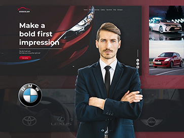
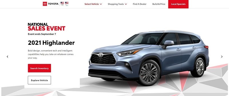
Here’s an example of a classic homepage design with a large hero image that’s balanced by text elements on the left. The trademark red and white of the car manufacturer decorate the entire homepage as well as the main CTA buttons. The red “Search Inventory” CTA immediately pops off the page, reminding the visitor of its importance.
With its cooler color palette and structured copy, Trello allows for a fluid, seamless interaction with its website. The custom illustrations introduce the platform to users while also giving more personality to the homepage. Trello shows social proof through client testimonials that highlight how the application has helped to enhance workflow.

To Wrap Up
A well-designed homepage is key to forming a positive first impression of your brand and encouraging visitors to explore your site. As you can see from the examples of best homepage designs listed above, homepages can be very diverse and industry-specific.
But when you study successful cases, you notice that every homepage has certain elements that are universally present. Such elements are an attractive header image/video, catchy headline, meaningful copy, and carefully selected calls to action.
Take your time to design a homepage that presents your business in the best possible light and leaves visitors eager to learn more about you!
Share this
Article by
Dive into our Forestblog of exclusive interviews, handy tutorials and interesting articles published every week!
Read all posts by Renderforest StaffCreate Professional
in Minutes without Technical Skills.


Create Professional
in Minutes without Technical Skills.
Sign Up Now. It’s Free!