AI
Your AI logo might look unique in the first preview. That does not mean it is one-of-one, legally safe, or strong enough to build a brand around.
AI can help you reach a logo idea quickly, but it cannot decide whether that idea is distinctive, memorable, ownable, or too close to something already in the market. That part still needs human judgment.
The first output is a draft. The real work starts when you remove clichés, customize the mark, search for similar logos, check usage rights, and choose one final version to use consistently.
So, will your AI logo be unique? Not automatically. It can become more original if you guide the process carefully.
This guide explains how to judge AI logo uniqueness visually, strategically, legally, and commercially. It is written for founders, small business owners, creators, marketers, and freelancers who want to use AI without ending up with a logo that feels generic or risky.
This article is U.S.-focused where it discusses trademark and copyright. It is for general education only, not legal advice. If your logo matters to your business, have a qualified trademark attorney review it before you launch, file, or invest heavily in the brand.
When people ask whether an AI logo will be unique, they usually mean more than one thing.
They may be asking:
Those questions are related, but they are not the same.
The realistic goal is not absolute uniqueness. It is a logo that is distinctive enough, searched enough, customized enough, and consistent enough to represent your brand with confidence.
The USPTO defines a trademark as a word, phrase, symbol, design, or combination that identifies goods or services and distinguishes them from others. That matters because logo uniqueness is not only about whether the image looks new. It is also about whether the logo can identify your brand in the marketplace. Source: USPTO: What is a trademark?
A logo can look different and still be a weak brand asset.
A logo can look original but still be too similar to another mark in the same industry. A logo can function as a trademark even if copyright protection in the artwork is uncertain. A logo can look polished and still feel generic if it uses the same roof, leaf, cup, shield, or brain-circuit symbol as everyone else in the category.
Here is the cleaner way to separate the issues.
The U.S. Copyright Office has said that copyright protection for AI-assisted work depends on human authorship, and that merely providing prompts is not enough by itself. Human-authored expressive inputs, creative arrangements, or modifications may matter depending on the facts. Source: U.S. Copyright Office NewsNet Issue 1060
For logo owners, the practical takeaway is simple: do not treat the first AI output as the final brand asset. Treat it as raw material.
AI logos often look similar because many people ask for the same thing.
A prompt like “minimalist coffee logo,” “luxury real estate logo,” “modern AI startup logo,” or “eco brand logo with a leaf” gives the system a predictable direction. The result may be clean, but clean is not the same as distinctive.
Common AI logo patterns include:
This does not mean you can never use a familiar symbol. It means you need to make it meaningfully yours.
A coffee brand can use a cup if the name, shape, typography, color system, and composition make it distinctive. A cybersecurity brand can use a shield if the final mark does not look like every other shield in the category. But if the logo is only “industry symbol plus clean font,” it is probably not unique enough.
The easiest way to improve an AI-generated logo is to move it up the originality ladder.
Most AI logo mistakes happen at Level 1 or Level 2. The founder likes the first clean output, adds it to a website, and moves on. That is fast, but it leaves too many questions unanswered.
A better process looks like this:
That is how a generated image becomes a real identity.
Before you use an AI-generated logo, run it through this test.
A logo becomes more memorable when it avoids the first idea everyone else would use.
If you run a coffee shop, the first idea is a cup. If you run a real estate company, the first idea is a roof. If you run a fitness brand, the first idea is a dumbbell. Those symbols are understandable, but they are not automatically ownable.
Ask:
A category-level logo says, “We are a coffee shop.”
A brand-level logo says, “We are this specific coffee shop.”
That difference matters.
A strong logo should be recognizable when it is small, black-and-white, or shown without effects.
Test the silhouette by removing:
If the logo becomes a generic blob, it needs more work.
A distinctive silhouette helps in real-world use: favicon, app icon, social avatar, product label, stamp, packaging, watermark, and video intro. If the logo only works in a glossy mockup, it is not ready.
Many AI logos fail because the symbol looks acceptable, but the typography feels like a placeholder.
Typography can make an AI-assisted logo more distinctive. It can also make it look like a template.
Check:
A unique wordmark can sometimes be more valuable than a clever symbol. For many small businesses, the brand name is the part people remember first.
Do not rely on memory. Search.
Use reverse image search tools, search engines, app stores, social platforms, marketplaces, domain results, and competitor websites. Look for similar shapes, not just exact duplicates.
Search for:
This is not the same as a full legal clearance search. It is a practical originality check. You are trying to answer: “Would a customer, investor, partner, or competitor think this looks familiar?”
A visual search is not enough if the brand matters.
Trademark clearance is more specific than “I Googled it.” The USPTO says a pre-application search helps determine whether a trademark may be available for particular goods or services and whether another trademark conflicts with it. Source: USPTO: Search our trademark database
For logos, search both:
The USPTO uses six-digit design search codes to identify and categorize trademark designs. Source: USPTO: Design search codes
This matters because visual similarity is not always captured by a text search. A name may be different, while the symbol, layout, or commercial impression is too close for comfort.
Your logo does not have to be identical to another logo to create risk.
The USPTO says an examining attorney will refuse registration if there is a likelihood of confusion between your mark for your goods or services and a registered mark for related goods or services. Source: USPTO: Likelihood of confusion
That means you need to consider:
For example, two abstract fox logos may be less risky if one is used for a children’s clothing brand and the other for a cybersecurity consultancy. They may be more risky if both are used for productivity apps.
Similarity depends on context.
A logo can look unique and still be risky if you do not understand the tool’s terms.
Before using an AI logo, check:
This is a practical business check, not just a legal one. A logo should be a stable asset you can build around.
Use this before you publish, file, print, or build a full brand around an AI-generated logo.
If you cannot answer most of these confidently, the logo is not ready yet. It may still be a good starting point, but it needs more work before it becomes a serious brand asset.
You do not make an AI logo unique by clicking “generate” one more time. You make it more unique by making better decisions after generation.
A distinctive name gives your logo more to work with.
If the brand name is generic, the logo has to work much harder. “Green Leaf Skincare” with a leaf icon will probably feel like many other skincare brands. A more distinctive name, paired with a less obvious symbol and custom type, gives you a stronger identity.
This does not mean every name must be strange or invented. It means the name should help people remember your brand, not only describe the category.
A weak prompt points AI toward the same symbols everyone else is using.
Weak prompts:
Stronger prompts:
The goal is not a longer prompt. The goal is a less predictable direction.
Do not stop at the first good-looking option.
Generate multiple logo directions:
Then compare them against your audience, category, and placements.
The best option may not be the most polished preview. It may be the one with the strongest concept after editing.
The icon is often where AI logos feel most generic.
Improve it by:
A small change is not always enough. If the icon still looks like a template, keep refining.
Typography is one of the easiest ways to make a logo feel less generic.
You can adjust:
A logo with a generic icon and a generic font will feel generic. A logo with a simple icon and a carefully customized wordmark can feel much stronger.
A unique logo is not only one mark. It should become a system.
Create:
If the logo falls apart when you create these versions, it is not ready.
AI makes it easy to generate endless versions. That is useful during exploration, but dangerous after launch.
If your logo keeps changing, people cannot learn it.
Choose one final version and use it consistently across:
Consistency builds recognition. Recognition is what makes a logo valuable over time.
Use this table to push away from generic AI outputs.
AI is good at producing polished category signals. Your job is to turn those signals into brand-specific choices.
A good search does not prove that the logo is legally safe. It helps you catch obvious problems before you go further.
Use several search layers.
Look for similarity in overall impression, not only exact copying.
A logo may be risky if it has:
If the logo matters to the business, a professional trademark search is safer than a casual online search.
Potentially, yes, if it functions as a trademark and meets normal trademark requirements.
The fact that AI helped create the logo is not the central trademark issue. The more important questions are whether the logo identifies your goods or services, whether it is distinctive, and whether it creates a likelihood of confusion with existing marks for related goods or services.
The USPTO explains that trademarks can include words, phrases, symbols, designs, or combinations that identify goods or services. Source: USPTO: Trademark basics
Before trying to trademark an AI-generated logo, ask:
A logo does not become trademark-ready just because it is attractive. It becomes stronger when it is distinctive, searched, documented, and used consistently.
Maybe, but do not assume so.
Copyright and trademark answer different questions. Trademark focuses on whether the logo identifies the source of goods or services. Copyright focuses on whether the artwork contains protectable human authorship.
The U.S. Copyright Office’s AI copyrightability report says copyright does not extend to purely AI-generated material or material where there is insufficient human control over the expressive elements. Source: U.S. Copyright Office: Copyright and Artificial Intelligence, Part 2
For logo owners, the practical takeaway is:
This is another reason to customize the logo after generation. Human decisions can make the brand asset stronger creatively, strategically, and practically.
Not automatically.
A logo maker can be a useful starting point, especially when you need to explore styles, layouts, and brand directions quickly. But any template-assisted or AI-generated logo still needs review.
The question is not simply, “Was this made with a logo maker?” The better question is: “Did we customize it enough, search it enough, and use it consistently enough to make it a real brand asset?”
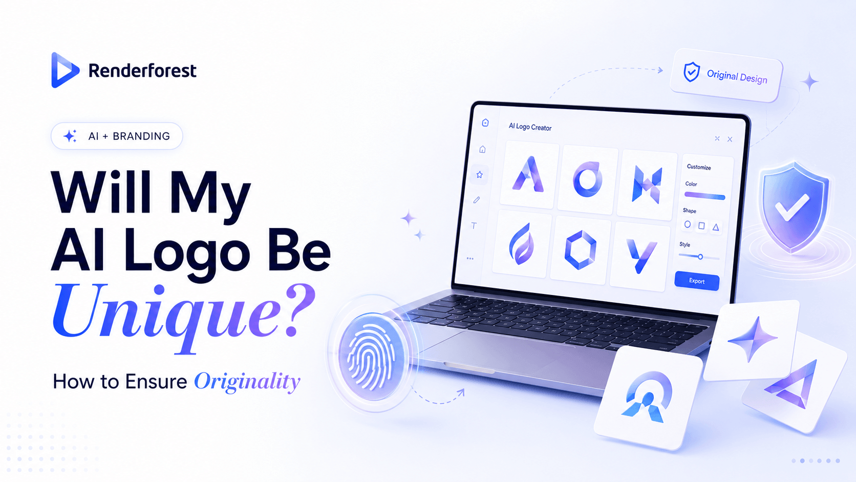
Renderforest’s Logo Maker lets users create and customize logos online. Use it to explore directions, compare layouts, and refine your brand identity. But do not stop at the first attractive result. Test the logo in real placements before committing.
If you want to explore AI-assisted options, Renderforest’s AI Logo Generator can help you generate logo ideas from a prompt and style direction. Use those outputs as starting points, then refine the concept, typography, color, shape, and usage system.
Renderforest can help with exploration, testing, and brand-building materials, but originality still depends on your decisions.
A practical workflow looks like this:
Renderforest’s Logo Maker can help you test logo directions and brand applications. Renderforest’s AI Image Generator can help create related visuals from text prompts and images. Keep the logo itself consistent, distinct, and reviewed before you build a full visual identity around it.
The first clean output is usually the most predictable. It may look professional, but it often follows the safest category pattern.
Generate more options before deciding.
A cup, roof, leaf, shield, dumbbell, crown, or brain-circuit icon may be easy to understand, but it is also easy to forget.
Use a symbol only if you can make it specific to your brand.
A generic font can make even a good symbol feel unfinished.
Customize the wordmark or choose typography that fits the brand’s personality and audience.
Do not assume the logo is original because you have not seen it before. Search similar names, icons, and competitors.
Generating a logo does not automatically solve copyright, license, or trademark questions. Review the terms and get legal help when the brand matters.
AI makes iteration easy, but a brand needs consistency. Once the logo is final, stop regenerating and start building recognition.
A logo may look great on a large presentation slide and fail on a favicon, app icon, product label, or social profile.
Test it in the places where customers will actually see it.
Not automatically. Similar prompts, templates, icons, fonts, and design patterns can produce similar-looking logos. Your AI logo becomes more unique when you customize it, avoid clichés, search similar designs, and use one final version consistently.
Possibly. It depends on the tool, model, prompt, templates, and platform terms. Even if another user does not generate the exact same file, they may generate a very similar symbol or layout.
Some AI-generated logos can feel original, especially after human refinement. But many outputs rely on familiar design patterns. Originality improves when you use a distinctive name, customize the mark, search similar designs, and avoid the most obvious symbols in your category.
Your logo may be too generic if it uses the most obvious symbol in your industry, looks like a stock icon, depends on a common font, or could easily fit five competitors. A coffee cup for a cafe, a roof for real estate, a shield for cybersecurity, or a leaf for sustainability can work, but only if the final design is meaningfully distinctive.
Yes. Reverse image search can help you find visually similar images or logos online. It is not a complete trademark clearance search, but it is a useful first step before launch.
Yes, if you are building a U.S. brand. Search the brand name and design elements. The USPTO’s trademark search page explains that a pre-application search can help identify possible conflicts, and its design search code guidance explains how design elements are categorized for search. Sources: USPTO trademark search, USPTO design search codes.
Potentially, if the logo functions as a trademark, is distinctive, does not create a likelihood of confusion with existing marks, and meets filing requirements. The fact that AI helped create it is not the main trademark test.
Maybe, but do not assume so. In the U.S., purely AI-generated material may not qualify for copyright protection without enough human authorship. Human edits, creative selection, arrangement, or modification may matter depending on the facts. Source: U.S. Copyright Office AI copyrightability report.
Start with a distinctive brand name, avoid obvious industry symbols, generate several directions, choose a less predictable concept, customize the icon and typography, search similar designs, and use one final version consistently.
Not automatically. Logo makers can be useful for exploration and customization, but template-assisted or generated designs should still be refined and searched. If the logo is important to your business, treat the first output as a draft, not a finished legal asset.
Your AI logo will not be unique just because AI generated it. It becomes more unique when you make deliberate decisions after generation.
Avoid the obvious symbol. Choose a distinctive brand name. Customize the mark. Search similar logos and trademarks. Review tool rights. Use the final version consistently.
AI can speed up logo creation, but originality still comes from strategy, editing, judgment, and follow-through. The best AI logo is not the one that looks impressive in the preview. It is the one customers can recognize, competitors do not already own, and your brand can use confidently over time.
Share this
Article by: Liana Ziroyan
Liana is a marketing professional with 11 years of experience in digital marketing, content, and product communication. She has a strong eye for visual storytelling and loves turning ideas into engaging campaigns that connect with audiences. With her experience across branding, creative content, and user-focused messaging, Liana enjoys finding simple, effective ways to make products feel clear, useful, and exciting.
Read all posts by Liana Ziroyan