Video Editing
Wordmark is one of the most common types of logos; but what exactly is it and why do so many successful brands favor it? A wordmark is a typographic representation of a brand name used as its logo. Unlike logomarks, wordmark logos only consist of words (as the name suggests) and no images.
Thanks to their versatility, wordmark logos can be found in every industry. With a single change of typeface, a chic and sleek fashion wordmark logo can transform into that of a reserved, professional real estate business.
Some household names that have opted for text-based logos are Coca-Cola, Google, IKEA, Forbes, Dior, and many others. Does this mean that a wordmark logo is only suitable for big corporations and luxury brands? Not at all.
This article will explore the difference between wordmarks and lettermarks, the use cases of wordmark logos, their main components, as well as classic examples of wordmark logos.
So if you’re ready to take a dive into the world of wordmarks, let’s get started!
Similar in many ways, wordmarks and lettermarks are just as different. The confusion between a wordmark and a lettermark is so common because both are text-based logos known as logotypes. The difference between the two is that a wordmark displays the full name of a business, while a lettermark only shows the initials.
LinkedIn, Canon, Nikon, eBay are examples of a wordmark logo design; whereas CNN, BBC, HBO, IBM, and Louis Vuitton have all chosen lettermark logos.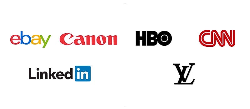
If you’re contemplating whether to go for a lettermark or wordmark logo, your business name is going to be the deciding factor. As long as your brand name is short enough to fit in a logo design without making it look super packed, feel free to use a wordmark. But if your company name is on the lengthier side, lettermarks are there to save the day.
Let’s discover in which cases wordmarks are a smart pick for business logos.
Text-only logos that feature the company name are popular among start-ups and small businesses for good reason. Linking the name of the business to its logo design, a wordmark tends to increase brand recognition faster. The reiteration of the brand name helps to ingrain it in the audience’s memory.
Wordmark logos are a perfect choice for companies with descriptive and distinctive names. Say, your business name perfectly describes what your brand is about and manages to convey your brand’s unique personality. In this case, a logo with your brand name is exactly what you need.
On the other hand, if your business name is rather generic, shows no character, and doesn’t communicate or imply what your company does, you might want to go for a logo with an icon. It’ll help to present your brand’s essence more effectively.
Last but not least, wordmarks are a suitable option for companies on a tight budget. Wordmark logos are typically less costly and easier to design without the help of a professional. Bear in mind, though, that they still require close attention to detail and critical typographic and stylistic choices. So, you’re not quite getting off the hook.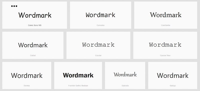
To design a simple yet appealing logo, you should understand the main elements that make up a wordmark. Certain components of a wordmark logo can quite literally make or break the design. So it’s best you properly acquaint yourself with those elements.
While designing a logotype, the principal components that will require your attention are the typeface, font, color, case (uppercase vs lowercase), spacing, and a few others. Let’s begin with unpacking typefaces and fonts.
Most people misuse the terms, mistaking typefaces for fonts. A typeface is a set of related lettering designs; while a font is the weight, size, and style of a typeface. Often when people say “font,” what they’re referring to is a typeface.
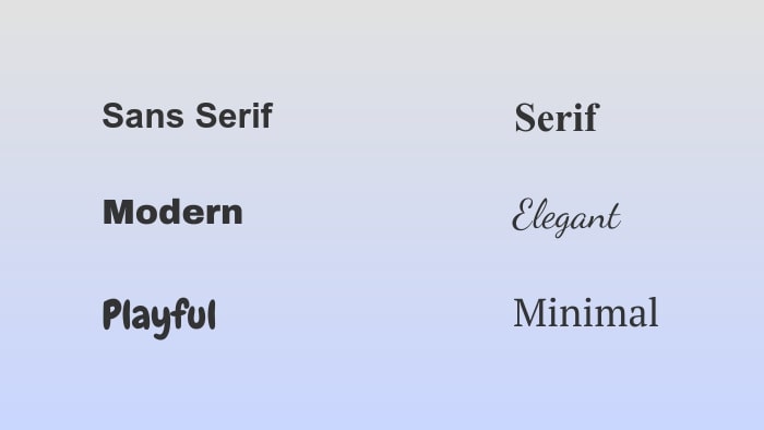
When choosing a typeface and a font for your wordmark, carefully consider what personality you want your wordmark logo to embody. A serif typeface, for example, will give your logo a more traditional, expensive look. But if your company stands for innovation and novelty, a more modern sans serif typeface is a better choice for you.
As to the fonts, pay attention to the weight (bold, regular, light) and the style (italic, roman, oblique) of your letters. Thick letters will ensure a robust, compelling look for your logotype; while a light italic text will feel elegant and airy.
Since a wordmark is entirely reliant on text, the readability of your logo is something you can’t neglect. Here’s where kerning enters the stage. Kerning is the spacing between the letters in your wordmark logo. Both too little and too much spacing can be equally detrimental to your wordmark design.
In case you’re dealing with more than one word for your wordmark, make sure you leave enough space between the words to maintain the logo’s legibility. As an alternative, you can break up your text into separate lines. Doing so will give a cleaner look to your wordmark.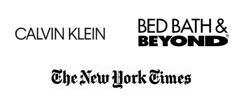
To avoid making their text-only logos look bland, brands often turn to color. While adding color to your wordmark is by no means a must, it can be a powerful way to vivify your logo, giving it a stronger appeal and character. The presence of the right color will intensify the impact of your wordmark logo and the associations it creates.
Having your company’s signature colors appear in your wordmark, you’ll get a better chance to show off your brand persona. It will allow your logo to stand out among thousands of others, even if they have the same or a similar typeface and font.
A fun trick we see brands use often is employing more than one hue to emphasize a specific letter or part of a word. Flickr, Mobil, HubSpot, and Subway have done a phenomenal job at this.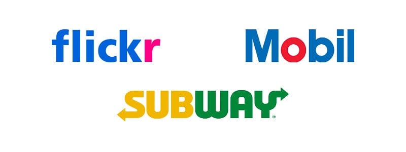
Want to get even more inventive with your wordmark design? Experiment with colored backgrounds and shapes. Take a look at the robust red background of the Marvel logo or the iconic blue square that encloses the “in” on the LinkedIn logo. These details not only add a pop of color to the wordmarks but also give them a touch of originality.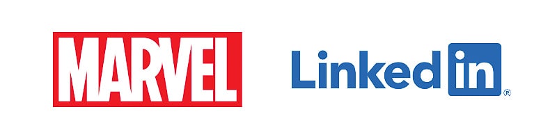
One of the most alluring advantages of a wordmark logo is that it ages well and, in most cases, doesn’t need too many alterations over its lifetime. For this reason, once a company succeeds in developing a strong logotype, the latter could very well become a timeless symbol. Now let’s explore some wordmark logos that have stood the test of time (some — with small modifications).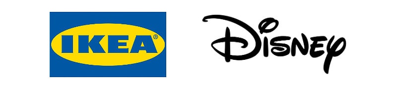
IKEA
With the Swedish national flag colors adorning its logo, the proud Swedish company takes advantage of the contrasting but powerful combination of blue and yellow. The lettering is just as bold and attention-grabbing. IKEA’s blue logo is quite simple, yet it communicates power and pulls the viewer’s attention with such strength.
Disney
Magic, childhood, playfulness — these are just a few associations that the famous Disney logo gives rise to. Resembling careless handwriting, the unique typography of the wordmark declares that the company is all about creativity and imagination. The lowercase “i” and “y” stand out from the rest of the letters, adding playfulness to the logo design.

Amazon
The smooth, modern-looking typography of the Amazon wordmark goes especially well with the orange accent. The bright-colored arrow not only offsets the black of the letters but also makes a clear statement that the platform sells everything (notice how the arrow points from A to Z). Something you might have overlooked is that the arrow also resembles a smile!
FedEx
FedEx’s logo is a perfect example of a wordmark that leaves no spaces between letters yet manages to remain clean and legible. The contrast of purple and orange immediately strikes the eye and works as a partition between the “d” and “E.” The true genius of this logo lies somewhere else, though — in the white space between the “E” and “x,” to be exact. Did you notice that the blank space has the shape of an arrow?
Wordmark is a very popular type of logo, mostly preferred by newer businesses and ones with distinctive, authoritative brand names. As the typographic depiction of a business name, a wordmark logo makes it easier for an audience to remember the name of the business. This makes wordmarks an excellent medium for boosting brand recognition.
Designing a strong wordmark logo can be quite a demanding task. You’ll have to carefully consider your choice of typeface, font, color, kerning, and other smaller details that can end up playing a bigger role than you imagined.
If you want to build a professional wordmark logo without hiring an expert, our logo maker is ready to assist you. Select your business industry and you’ll have dozens of ready-made logo designs to customize for your brand.
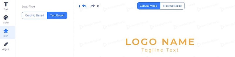
Found a design you like, but it has an icon as well? No worries, as our logo editor allows you to change your design from “Graphic Based” to “Text Based” in a single click.
Ready to create your logo? Try animated logo maker by Renderforest! Click the button below to get started now!
Share this
Article by: Renderforest Staff
Dive into our Forestblog of exclusive interviews, handy tutorials and interesting articles published every week!
Read all posts by Renderforest Staff