
AI
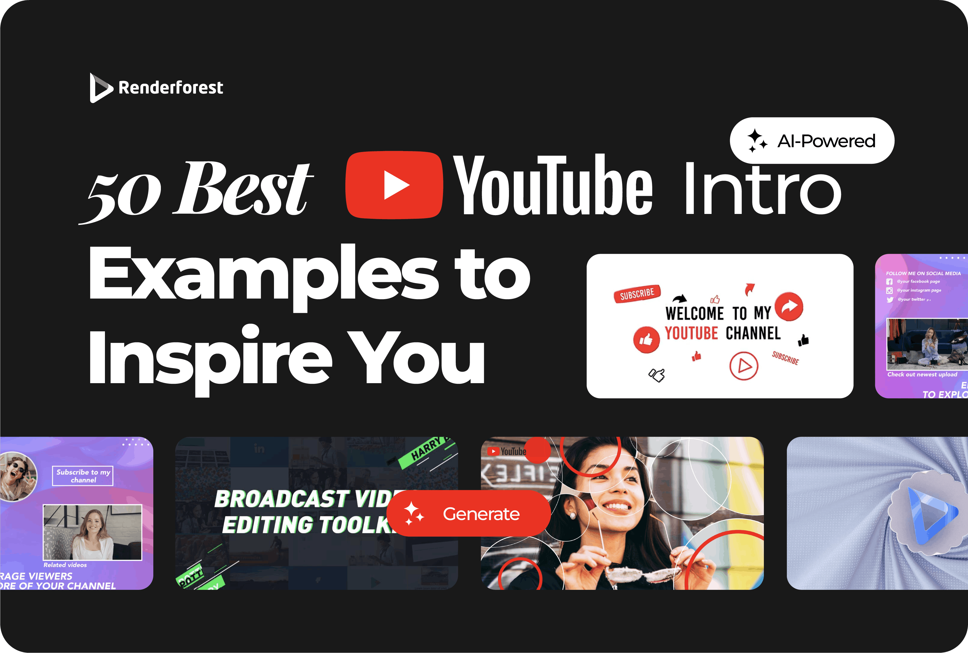
A strong YouTube intro does not need to be long, loud, or overdesigned. The best YouTube intro examples do one useful thing fast: they tell viewers they are in the right place and give them a reason to keep watching.
Some channels use a full animated sequence. Others use a one-second logo sting, a cold open, a recurring sound, a host greeting, a title card, or a fast montage. This guide breaks down 50 YouTube intro examples by style, with a source link for each one and a practical takeaway you can use for your own channel.
The best YouTube intros are short, recognizable, and matched to the channel format. Educational channels often use animated title sequences. Gaming channels use energetic stings or creator-led greetings. Review channels usually work best with a product-first hook and a short branded transition. Podcasts and recurring shows benefit from consistent title sequences. Vlogs and social-first videos often perform better with a cold open than a long logo reveal.
This article focuses on the opening seconds of real YouTube videos. Some examples use a traditional branded intro. Others use a cold open, series title, host greeting, or format setup. That is intentional: modern YouTube intros are not always logo animations. Often, the strongest intro is the first hook that moves the viewer from click to content.
For each example, study the intro concept, pacing, and transition. Do not copy the creator’s music, footage, logo, visual identity, editing sequence, or branded assets. Use the principle, not the copyrighted execution.
Source: Why Are You Alive – Life, Energy & ATP. Intro to study: 0:00–0:08.
Why it works: A full visual system appears immediately: bright colors, clean shapes, and fast but controlled animation.
What to learn: Education channels can make the intro feel like part of the explanation, not a separate decoration.
Use this idea: Use a consistent visual language across your series so viewers recognize the channel before the topic changes.
Source: How the food you eat affects your brain. Intro to study: 0:00–0:07.
Why it works: The opening turns a learning topic into a visual question, then moves quickly into the lesson.
What to learn: Animation works best when it makes the subject easier to understand.
Use this idea: Start with the concept, not the logo.
Source: Animation basics: Homemade special effects. Intro to study: 0:00–0:10.
Why it works: The intro matches the topic by using animation as both the subject and the format.
What to learn: A great intro can demonstrate the channel’s method before the teaching starts.
Use this idea: Let the opening show the skill the viewer came to learn.
Source: Why is biodiversity so important?. Intro to study: 0:00–0:08.
Why it works: The intro quickly frames a big question and uses illustration to lower the barrier to the topic.
What to learn: Educational intros should make a difficult topic feel approachable.
Use this idea: Lead with curiosity and keep the visual style consistent.
Source: How tsunamis work. Intro to study: 0:00–0:08.
Why it works: The opening uses subject-specific visuals immediately, so the viewer understands the lesson context fast.
What to learn: A topic-led intro is stronger than a generic logo opener.
Use this idea: Show the problem before showing the full explanation.
Source: Tides: Crash Course Astronomy #8. Intro to study: 0:00–0:10.
Why it works: The intro uses fast pacing and clear series identity, then moves into the lesson.
What to learn: Series-based education needs repeatable branding, but it should still get to the topic quickly.
Use this idea: Use the same intro system across episodes, then customize the first topic beat.
Source: Ecosystem Ecology: Links in the Chain. Intro to study: 0:00–0:10.
Why it works: The opening makes the video feel like one lesson inside a larger course.
What to learn: A recurring intro helps viewers trust the structure of the series.
Use this idea: Use consistent music, title treatment, and pacing for recurring educational formats.
Source: How Americans got stuck with endless drug ads. Intro to study: 0:00–0:10.
Why it works: The intro frames a specific question and uses editorial visuals instead of a long brand reveal.
What to learn: Explainer channels should use the first seconds to establish the argument.
Use this idea: Use visual evidence early, then let branding stay subtle.
Source: Vox Borders: Life at the edge of nations. Intro to study: 0:00–0:12.
Why it works: The opening feels like a documentary trailer, setting location, tone, and scope quickly.
What to learn: For documentary intros, atmosphere can do more than a logo sting.
Use this idea: Let the subject create the mood before the channel identity appears.
Source: I Spent 50 Hours Buried Alive. Intro to study: 0:00–0:06.
Why it works: The premise is immediate. The intro is the hook, not a separate title card.
What to learn: High-stakes videos often work better when the concept starts instantly.
Use this idea: Show the challenge or payoff before asking viewers to wait.
Source: Shane Gillis Pounds Milk While Eating Spicy Wings | Hot Ones. Intro to study: 0:00–0:12.
Why it works: The opener sells the repeatable format: guest, wings, heat, and escalating reactions.
What to learn: A show intro should make the format easy to understand even for new viewers.
Use this idea: Build the intro around the repeatable tension of the show.
Source: Gordon Ramsay Savagely Critiques Spicy Wings | Hot Ones. Intro to study: 0:00–0:12.
Why it works: The intro uses the guest’s personality and the show premise together.
What to learn: Guest-led series need a format intro plus a reason this episode is different.
Use this idea: Keep the show identity consistent while changing the guest hook.
Source: Idris Elba’s reaction to every wing on Hot Ones. Intro to study: 0:00–0:10.
Why it works: The opening quickly promises a compilation of the most entertaining moments.
What to learn: Compilation intros should establish what the viewer will get right away.
Use this idea: Use the funniest or most visual moment early, then brand lightly.
Source: Male Sex Symbols Throughout History. Intro to study: 0:00–0:10.
Why it works: The opening relies on personality, transformation, and a clear episode premise.
What to learn: Group channels can use the cast itself as the intro asset.
Use this idea: Show who is involved and what they are about to try.
Source: The Evolution Of Viral Video. Intro to study: 0:00–0:10.
Why it works: The intro uses a topic frame and creator presence to set up the discussion.
What to learn: Talk or panel videos need the topic to arrive before viewers lose patience.
Use this idea: Open with the reason the conversation matters.
Source: Happy Wheels – Part 34 | JACKSEPTICEYE RAP!. Intro to study: 0:00–0:08.
Why it works: The intro is driven by creator energy and audience familiarity.
What to learn: Personality channels often do not need complex graphics if the host signal is strong.
Use this idea: Let the greeting, voice, and pace do part of the branding.
Source: Bunker 16. Intro to study: 0:00–0:08.
Why it works: The opening establishes the creator’s tone before the gameplay takes over.
What to learn: For gaming channels, the intro should make the viewer feel like they are joining the creator.
Use this idea: Keep the host identity clear, then get into the game.
Source: Revenge – A Minecraft Parody. Intro to study: 0:00–0:12.
Why it works: The intro uses a full music-video setup instead of a quick logo opener.
What to learn: Entertainment channels can use a longer opening when the intro is part of the content.
Use this idea: Only go long when the intro itself delivers entertainment value.
Source: The LOST Mechanic of Super Smash Bros.. Intro to study: 0:00–0:10.
Why it works: The opening sets up a specific gaming curiosity with a strong promise.
What to learn: Analysis videos need the question or mystery before the branded elements.
Use this idea: Lead with the unusual discovery, then explain.
Source: Who can save Peach with only one move?. Intro to study: 0:00–0:08.
Why it works: The premise is simple and visual, so the viewer understands the challenge immediately.
What to learn: Challenge intros work when the rules are clear in seconds.
Use this idea: Make the game mechanic the hook.
Source: I’ve wanted this for years... Intro to study: 0:00–0:10.
Why it works: The opener uses curiosity and product context before moving into explanation.
What to learn: Tech intros should create a reason to care about the product fast.
Use this idea: Open with the problem or surprise, not just the specs.
Source: A Monitor with Wheels?. Intro to study: 0:00–0:10.
Why it works: The title and first visual do the heavy lifting: viewers instantly know the odd product angle.
What to learn: Review intros should make the product’s weirdest or most useful angle obvious.
Use this idea: Show the product immediately if that is why people clicked.
Source: John Mulaney & Nick Kroll Answer the Web’s Most Searched Questions. Intro to study: 0:00–0:10.
Why it works: The format is recognizable: title card, guests, and a repeated question structure.
What to learn: Series intros work when viewers understand the rules before the first answer.
Use this idea: Use a repeatable visual device if your channel has recurring formats.
Source: I Made A Custom Thing For Stop-Motion Animation. Intro to study: 0:00–0:10.
Why it works: The opening frames a build project and shows why the outcome matters.
What to learn: Maker channels should show the object or problem early.
Use this idea: Let the project become the intro.
Source: Brené Brown on Empathy. Intro to study: 0:00–0:10.
Why it works: The intro uses simple animation to prepare viewers for a human idea.
What to learn: Whiteboard and concept channels can use minimal graphics to make abstract ideas feel concrete.
Use this idea: Use visual metaphor instead of heavy production.
Source: Values vs Goals. Intro to study: 0:00–0:10.
Why it works: The opening uses accessible animation and a clear topic promise.
What to learn: Simple animation works when the concept matters more than cinematic style.
Use this idea: Keep the opening friendly and easy to process.
Source: The Secret History of Pizza. Intro to study: 0:00–0:10.
Why it works: The intro combines food, history, and animated storytelling.
What to learn: Food explainers can start with appetite or curiosity.
Use this idea: Use the food itself as the visual hook.
Source: 50 People Try to Juice a Lemon. Intro to study: 0:00–0:08.
Why it works: The recurring 50 People format is instantly clear and easy to repeat.
What to learn: A repeatable challenge format needs a clean title and fast setup.
Use this idea: Make the rules simple enough to understand immediately.
Source: 50 People Try to Cut a Watermelon. Intro to study: 0:00–0:08.
Why it works: The intro uses the simplicity of the task as the entertainment hook.
What to learn: Everyday-skill videos work when the premise feels relatable.
Use this idea: Use a familiar action, then turn it into a format.
Source: 3 Chefs Try to Make Mac & Cheese with No Recipe. Intro to study: 0:00–0:10.
Why it works: The opening explains the challenge and the cast structure quickly.
What to learn: Food competitions need clear stakes before the cooking starts.
Use this idea: Introduce the task and the constraint in the first seconds.
Source: Cheese Expert Guesses Cheap vs Expensive Cheeses. Intro to study: 0:00–0:10.
Why it works: The intro makes the format clear: expert, comparison, and reveal.
What to learn: Comparison videos should introduce the decision test right away.
Use this idea: Make the viewer want to guess along.
Source: Cheese Expert Guesses More Cheap vs Expensive Cheeses. Intro to study: 0:00–0:10.
Why it works: The intro benefits from a familiar series structure and expert framing.
What to learn: Repeated formats build recognition when the opening stays consistent.
Use this idea: Use a series label or title style to make episodes feel connected.
Source: 50 People Try to Make a Peanut Butter and Jelly Sandwich. Intro to study: 0:00–0:08.
Why it works: The intro turns a simple task into a watchable challenge.
What to learn: Simple ideas can work if the format is clear and fast.
Use this idea: Use the gap between easy and surprisingly hard as the hook.
Source: How to Make Herb Oil. Intro to study: 0:00–0:08.
Why it works: The opening gets directly to the technique and ingredient context.
What to learn: Recipe intros should not delay the cooking promise.
Use this idea: Show the technique early if the video is practical.
Source: Gordon Ramsay Challenges Amateur Cook to Keep Up with Him. Intro to study: 0:00–0:12.
Why it works: The opener creates tension through the expert-versus-amateur setup.
What to learn: Cooking challenge intros need the format and stakes upfront.
Use this idea: Introduce who is competing, what they must do, and why it is hard.
Source: Inside Kendall Jenner’s Cozy Mountain Home | Open Door. Intro to study: 0:00–0:12.
Why it works: The intro sells location, visual taste, and access.
What to learn: Lifestyle and design videos can use the space itself as the hook.
Use this idea: Let the first shot establish the world viewers are entering.
Source: Sarah Jessica Parker Answers 73 Questions. Intro to study: 0:00–0:10.
Why it works: The intro is simple because the format and subject carry the attention.
What to learn: Editorial intros often work best with restraint.
Use this idea: Let the guest and format do the branding.
Source: Morning Yoga for Beginners. Intro to study: 0:00–0:10.
Why it works: The opening is calm, welcoming, and aligned with viewer intent.
What to learn: Wellness intros should reduce friction rather than create hype.
Use this idea: Use tone and pacing that match the viewer’s desired state.
Source: Gentle Yoga – 25 Minute Morning Yoga Sequence. Intro to study: 0:00–0:10.
Why it works: The intro sets a low-pressure environment before the practice begins.
What to learn: For guided routines, the intro should make viewers feel safe to start.
Use this idea: Keep the opener clear, warm, and short.
Source: NYC’s Best Sicilian Slice, Explained | Food Skills. Intro to study: 0:00–0:10.
Why it works: The opener connects place, food, and expertise.
What to learn: Food travel intros work when they quickly show what makes the location worth watching.
Use this idea: Use one strong visual reason to keep watching.
Source: Seasoned pan fried flatfish. Intro to study: 0:00–0:10.
Why it works: The intro is practical and personality-led, moving into the recipe quickly.
What to learn: Cooking channels do not need long intros if the host is recognizable.
Use this idea: Let warmth and clarity replace heavy branding.
Source: Classic Lamb Shank Tagine. Intro to study: 0:00–0:10.
Why it works: The intro uses the chef’s authority and the final dish as the promise.
What to learn: Recipe intros need appetite and trust.
Use this idea: Show the dish or the expert early.
Source: D&D Animated: Strange Cravings. Intro to study: 0:00–0:05.
Why it works: The opening gets straight into the joke and format.
What to learn: Short-form intros should be almost invisible.
Use this idea: For Shorts, make the first frame the hook.
Source: Kitten Discipline feat Greg Norton. Intro to study: 0:00–0:05.
Why it works: The short begins with the situation instead of a title card.
What to learn: Social-first comedy should start with action or tension.
Use this idea: Skip the intro when the joke needs speed.
Source: The Ramune Marble Incident. Intro to study: 0:00–0:05.
Why it works: The opening uses a quick visual situation and voice to start the story.
What to learn: Animated story channels need immediate context.
Use this idea: Open with the problem, then let the story explain itself.
Source: THE BIRTH OF A FOREHEAD. Intro to study: 0:00–0:08.
Why it works: The opener uses performance and title energy to create a show-like entrance.
What to learn: Comedy intros can be strange if the tone is intentional.
Use this idea: Make the opening commit to the joke quickly.
Source: The T-shirt does NOT lie!. Intro to study: 0:00–0:08.
Why it works: The opening uses the record attempt as the reason to watch.
What to learn: Achievement-driven videos should show the challenge immediately.
Use this idea: Use the outcome or attempt as the hook before any branding.
Source: The TASTIEST Hot Honey Chicken Sliders. Intro to study: 0:00–0:05.
Why it works: The opening gets straight to the food result and keeps the pace fast.
What to learn: Food shorts need the payoff immediately because viewers decide quickly.
Use this idea: Show the finished dish or strongest visual first.
Source: How to Tenderize Pork Chop Like a Master CHEF!. Intro to study: 0:00–0:08.
Why it works: The intro promises a specific technique instead of a broad cooking topic.
What to learn: Tutorial intros work when the practical outcome is obvious.
Use this idea: Name the skill and show the result early.
Source: Nutritional Yeast Gravy. Intro to study: 0:00–0:08.
Why it works: The opening is direct and practical, which fits a simple recipe format.
What to learn: Not every intro needs animation; sometimes clarity is the brand.
Use this idea: Use plain structure when the viewer came for instructions.
There is no single perfect length. The right length depends on the channel format and how much value the intro adds before the actual video begins.
The practical rule is simple: the intro can be longer only when it adds value before the viewer gets impatient.
A weak intro usually fails for one of these reasons:
The goal is not to make the intro look expensive. The goal is to make it feel natural for the channel.
Start with the job of the intro, not the effect.
Once you know the role, the design becomes easier. If you want a polished opener without editing from scratch, Renderforest’s YouTube intro maker lets you start with templates, add your logo and text, customize the colors and music, and export an intro for your channel.
For wider intro styles beyond YouTube, Renderforest’s intro maker can help with logo reveals, cinematic intros, gaming intros, neon reveals, glitch intros, and presentation openers.
A YouTube intro is the opening part of a video that helps viewers understand the channel, format, topic, or tone. It can be a logo animation, title card, host greeting, cold open, montage, recurring show sequence, or quick product hook.
Most YouTube intros work best between one and five seconds. Shorts and fast social videos may need no intro at all. Podcasts, shows, and documentary-style channels can use longer intros if viewers expect the format.
Not always. A recurring show can benefit from a consistent intro. A review, vlog, tutorial, or challenge video may perform better with a custom hook that fits the specific topic.
A good intro confirms the topic, reinforces the channel identity, and moves into the video quickly. It should help viewers stay, not delay the reason they clicked.
Yes. A template can work well if you customize it with your logo, colors, music, pacing, and channel tone. Avoid using a template exactly as-is if it makes your intro look generic.
The best YouTube intro examples match the promise of the channel. Kurzgesagt uses animation because the channel explains ideas visually. Hot Ones uses a format-led intro because the show has a repeatable premise. MrBeast often starts with the challenge itself because the concept is the brand hook.
So do not start by asking which intro looks coolest. Ask what the viewer needs before the video begins. If they need clarity, use a title card. If they need energy, use a fast sting. If they need trust, show the host or result quickly. If they already know the channel, get to the content.
A strong intro should feel like the front door to the video, not a hallway viewers have to walk through.
Share this


Article by: Liana Ziroyan
Liana is a marketing professional with 11 years of experience in digital marketing, content, and product communication. She has a strong eye for visual storytelling and loves turning ideas into engaging campaigns that connect with audiences. With her experience across branding, creative content, and user-focused messaging, Liana enjoys finding simple, effective ways to make products feel clear, useful, and exciting.
Read all posts by Liana Ziroyan