AI
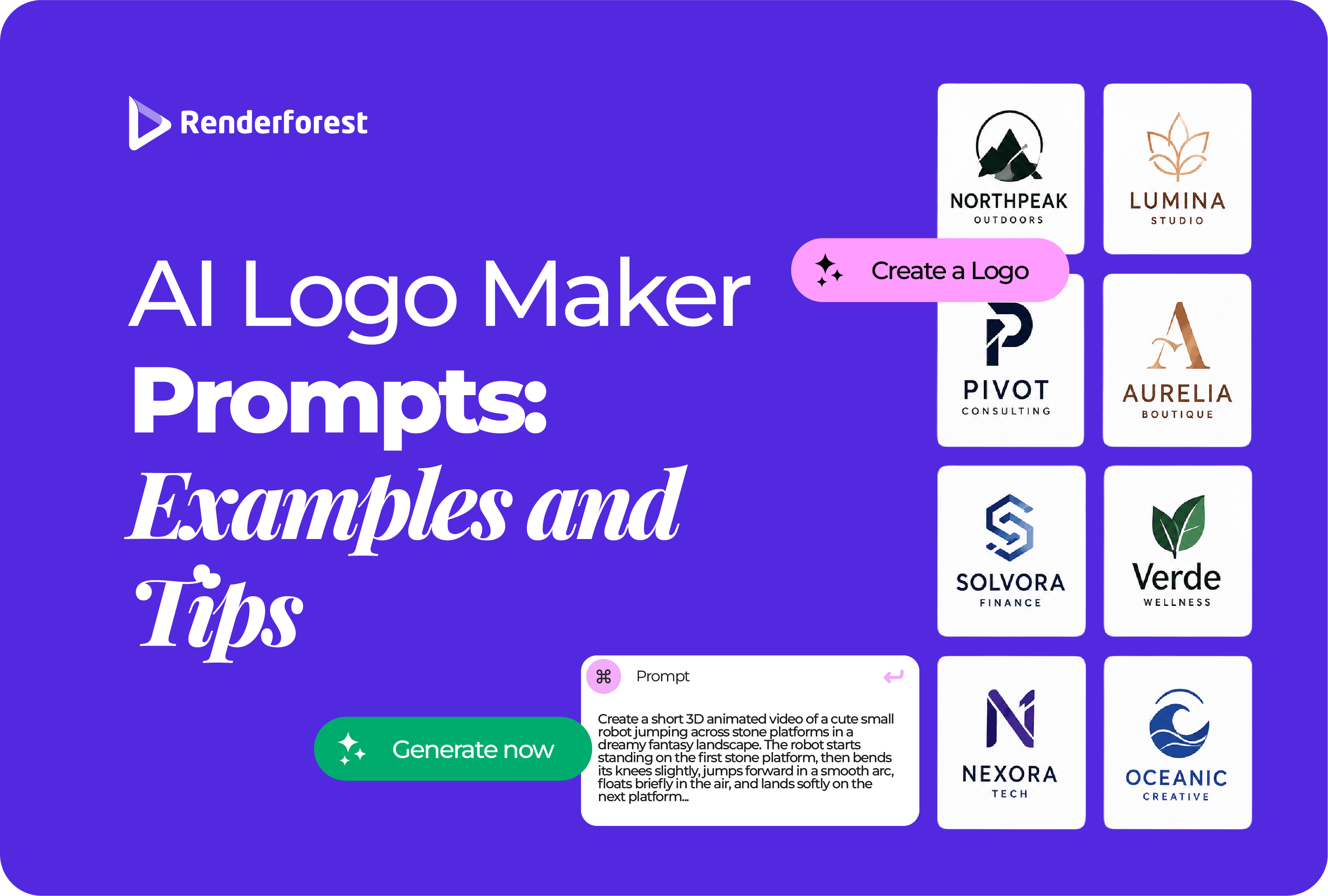
A good AI logo prompt works like a short creative brief. It tells the generator what the business is, who it serves, how the brand should feel, what kind of logo to explore, one visual idea to build around, where the logo needs to work, and what the design should avoid.
That is more useful than stacking adjectives such as “modern, professional, premium, unique.” Those words describe thousands of brands. A stronger prompt gives the AI an actual design problem to solve.
A reliable starting formula is:
Create a [logo type/style] logo for “[brand name],” a [business type] for [audience]. The brand should feel [2–4 traits]. Explore [one visual concept] using [color direction] and [typography direction]. It needs to work for [main uses]. Keep it [production constraints]. Avoid [clichés or unwanted elements].
For example:
Create a minimal combination logo for “Northline,” a walking navigation app for people exploring cities. The brand should feel useful, confident, and adventurous without looking outdoorsy. Explore a simple route line that subtly forms the letter N, using deep navy and bright blue with clean geometric typography. It needs to work as an app icon, website logo, and social avatar. Keep the mark flat, simple, and recognizable at small sizes. Avoid map-pin clichés, compass clip art, gradients, and 3D mockups.
That prompt gives you more than an attractive picture. It gives you criteria for judging the result. Does the route idea read clearly? Does the icon still work small? Does it feel like Northline rather than any navigation company?
This guide shows you how to build prompts that answer those questions, gives you 18 examples you can adapt, and explains what to change when the first result looks generic, busy, badly typeset, or impressive only because it is sitting inside a polished mockup.
A good AI logo prompt removes the right ambiguity without trying to control every pixel. It gives the generator enough brand context to make meaningful choices while leaving room to explore.
You do not need to turn every row into a sentence. The point is to think through the decisions before asking the generator to make them for you.
General image-generation guidance from OpenAI makes a similar point: effective prompts do not need to be long, and one to three clear sentences are often enough when they specify the purpose, subject, visual direction, and important constraints. Source: OpenAI Academy.
Most weak prompts handle only the first half of the job.
Creative direction tells the AI what the logo should communicate: the audience, personality, logo structure, color direction, and visual idea.
Production control tells it what the logo needs to survive: small sizes, one-color use, simple reproduction, flat presentation, clear silhouettes, and real brand applications.
Compare these instructions:
Create a beautiful premium skincare logo with a botanical feeling.
versus:
Create a restrained combination logo for “Olea Skin,” a botanical skincare brand for sensitive skin. Explore a single olive-inspired symbol using muted olive, ivory, and charcoal with elegant readable typography. Keep the mark flat, simple enough for a 30 mm product label, and recognizable in one color. Avoid faces, water droplets, ornate flowers, gold gradients, and packaging mockups.
The second prompt still gives the AI creative freedom. It simply makes that freedom useful.
Logo prompts often become crowded because people try to represent every service, value, and brand promise in the same mark.
A sustainable company asks for a leaf, globe, hands, tree, water drop, and recycling arrows. A technology company asks for an AI brain, circuit board, cloud, data nodes, robot, and lightning bolt.
More symbolism does not automatically create more meaning. It usually creates more visual noise.
Start with one symbol or one metaphor. If you want a more distinctive idea, combine two relevant concepts into one simple form:
The brand name can also become part of the idea. “Northline” suggests routes, horizons, direction, and linear forms. “Stillwater” suggests reflection, circles, calm movement, or negative space. That is more brand-specific than starting with the first icon associated with the industry.
“Minimal,” “luxury,” and “vintage” describe appearance. They do not tell the AI what the logo is made from.
Decide whether you want a wordmark, monogram, symbol, combination mark, emblem, mascot, or abstract mark. Then describe the style.
For example, “minimalist logo” is vague. “Minimal combination mark with one geometric symbol and a clean wordmark” is much easier to direct.
If you are not sure which structure suits the business, Renderforest’s guide to the different types of logos explains where wordmarks, monograms, symbols, combination marks, emblems, mascots, and abstract marks work best. This guide stays focused on how to prompt once you have chosen a direction.
These examples are designed to demonstrate different brand and logo problems rather than cover every possible industry. Replace the names, audience, concept, palette, and use cases with your own information.
Create a warm minimal combination logo for “Morning Window,” a neighborhood specialty coffee shop for remote workers and local residents. Explore a simple coffee cup whose rising steam forms a sunrise. Use espresso brown, warm cream, and muted terracotta with friendly rounded typography. The logo must work on cups, storefront signage, menus, and social profiles. Keep it flat and simple. Avoid generic coffee beans, ornate scripts, photorealistic cups, and vintage distress effects.
Create a refined combination logo for “Ember Table,” a wood-fired restaurant serving seasonal shared plates. Explore a minimal flame that also suggests a table centerpiece. Use charcoal, clay red, and warm ivory with understated serif typography. It should work on menus, signage, reservation pages, and matchbooks. Avoid aggressive fire graphics, fork-and-knife icons, realistic food illustrations, and metallic effects.
Create a trustworthy modern logo for “Northline Realty,” a boutique agency helping first-time homebuyers. Explore one continuous line that suggests both a roofline and direction without becoming a generic house icon. Use deep navy, warm gray, and white with clear sans serif typography. It should work on yard signs, listing presentations, social profiles, and business cards. Avoid keys, skyscrapers, house clip art, and gold luxury effects.
Create a strong geometric logo for “ForgeFit,” a strength coaching brand for busy professionals. Explore a simple forge flame that subtly creates the letter F through negative space. Use charcoal and deep orange with bold sans serif typography. The identity should feel disciplined and focused rather than aggressive. It must work on training plans, clothing, app icons, and signage. Avoid dumbbells, flexing arms, skulls, and lightning bolts.
Create a calm organic logo for “Stillwater,” a beginner-friendly yoga and breathwork studio for stressed professionals. Explore a simple water ripple with open negative space to suggest breath and calm. Use sage green, muted blue, and warm cream with readable understated typography. It should work on studio signage, schedules, digital profiles, and merchandise. Avoid lotus flowers, yoga poses, mystical symbols, and excessively thin lines.
Create an understated premium logo for “Olea Skin,” a botanical skincare brand for sensitive skin. Explore a simplified olive-inspired mark using ivory, muted olive, and charcoal with elegant serif typography that remains readable on small labels. The brand should feel natural, clinical, and calm. Avoid faces, water drops, ornate flowers, script fonts, metallic gold, and 3D packaging mockups.
Create a clean modern combination logo for “FlowPilot,” a SaaS product that automates project handoffs for small teams. Explore an abstract route built from connected modules to suggest smooth movement between stages. Use deep blue, white, and one cyan accent with friendly geometric typography. The symbol must also work independently as an app icon. Avoid robot heads, circuit boards, generic arrows, glowing AI effects, and complicated node networks.
Create a distinctive abstract logo for “BrightLayer AI,” a consultancy helping small companies build practical AI workflows. Use two or three layered geometric forms to suggest clarity emerging from complexity. Use midnight blue, soft violet, and white. The identity should feel intelligent, grounded, and useful rather than futuristic for its own sake. Avoid brains, robots, neural-network diagrams, sparkles, circuit boards, and sci-fi neon styling.
Create a calm modern combination logo for “Cedar Ledger,” a bookkeeping and cash-flow service for independent businesses. Explore a simplified cedar branch intersected by one horizontal accounting line. Use forest green, navy, and warm cream with dependable typography. The mark should work on invoices, reports, dashboards, and social profiles. Avoid dollar signs, coins, bar charts, bank columns, upward arrows, and glossy fintech gradients.
Create a precise modern logo for “VaultSignal,” a cybersecurity service for small businesses. Explore a simple signal-wave shape contained by an abstract geometric boundary rather than a literal padlock or shield. Use dark navy, cool gray, and electric blue with strong geometric typography. The symbol must remain recognizable at small digital sizes and in one color. Avoid hooded hackers, binary code, neon green, locks, and checkmark shields.
Create a hopeful but serious logo for “Open Table Fund,” a nonprofit supporting local food-access programs. Explore a simple table shape formed by open circular elements to suggest participation and community. Use deep green, warm orange, and cream with clear sans serif typography. It should work on donation pages, reports, event signage, volunteer shirts, and social media. Avoid helping hands, hearts around globes, and generic charity figures.
Create a clean personal brand identity for “Maya Hart,” a productivity educator creating practical resources for freelancers. Explore an MH monogram with one subtle structural detail inspired by organization or planning. Use warm gray, off-white, and muted green with modern sans serif typography. It must work on newsletters, YouTube, digital products, templates, and social profiles. Avoid cursive influencer-style lettering, sparkles, and generic checkmark icons.
Create a typography-led wordmark for “Studio Maren,” an independent creative studio for thoughtful consumer brands. Use refined contemporary letterforms, confident spacing, and one subtle customized letter detail rather than a separate icon. Use black, ivory, and muted clay. The wordmark must remain clear in website headers and proposal covers. Avoid decorative scripts, ultra-thin strokes, mockups, and extra symbols.
Create a monogram for “Vale & Co.” using the letters V and C. Explore one clever overlap or negative-space relationship while keeping both letters identifiable. Use a restrained serif construction in black and warm ivory. The monogram should work inside a circle or square for social profiles and also reproduce cleanly in one color. Avoid crowns, ornamental flourishes, illegible letter overlaps, and luxury mockups.
Create an icon-only logo for “TaskNest,” a mobile app that helps freelancers organize client work. Explore three rounded shapes forming a subtle nest or organized stack. Use navy, white, and muted green with high contrast. The icon needs a strong silhouette that remains recognizable at very small sizes. Do not include the brand name inside the icon. Avoid checkmark clichés, detailed calendars, gradients, tiny lines, and 3D app mockups.
Create a minimalist [logo type] for “[brand name],” a [business type] serving [audience]. Build the identity around one simple geometric symbol inspired by [concept], with generous negative space and a limited palette of [colors]. Pair it with highly readable typography. The core mark must work at small sizes and in one color. Avoid gradients, shadows, 3D presentation, extra text, decorative lines, and stock-style icons.
Create a restrained premium identity for “[brand name],” a [business type] for [audience]. Use either a refined wordmark or simple monogram, generous spacing, controlled proportions, and a palette of [colors]. The design should feel confident, quiet, and enduring rather than decorative. It must remain readable on small packaging and digital placements. Avoid crowns, diamonds, ornate crests, metallic gradients, and excessive script lettering.
Create an abstract combination logo for “[brand name],” a [business type] helping [audience] achieve [result]. Use two or three simple geometric forms to express [clarity, connection, progress, balance, or transformation] without using a literal industry icon. Use [colors] with a clear wordmark. The symbol should remain recognizable by itself and in one color. Avoid meaningless swooshes, generic tech shapes, gradients, and concepts that require a long explanation.
One of the least useful AI logo workflows is generating the same prompt again and again until a random variation happens to look better.
Instead, create three intentionally different creative territories before polishing anything.
Direction 1: familiar but refined. Use a category cue people will recognize, but simplify or reinterpret it.
Direction 2: brand-specific. Build the concept from the company name, customer problem, product experience, or a less obvious metaphor.
Direction 3: typography-led. Ask whether the brand would be more distinctive with a wordmark or monogram instead of another industry icon.
For Morning Window café, that could mean:
Now you are comparing ideas rather than random variations of the same idea. Choose the strongest concept first. Refine colors, proportions, typography, and details second.
The first generation is evidence. Instead of starting over immediately, diagnose what failed and change that variable.
Once a concept starts working, refine one major variable at a time. If you simultaneously change the icon, typography, palette, composition, and style, you will not know which change improved the design—or which one broke it.
A dramatic office wall, embossed business card, glass storefront, or luxury package can make an average logo look expensive. Those scenes are useful later, when you want to visualize the identity in context. They are a poor way to decide whether the actual mark is strong.
Before choosing a direction, ask to see it flat and test the fundamentals:
Two tests expose weak logos quickly: shrink the design and remove the effects. If the identity stops working when it is small, black, and flat, more polish is unlikely to fix the underlying concept.
The same prompting logic works across many AI tools, but the best wording depends on the workflow.
A dedicated AI logo generator may handle the business name, logo style, fonts, or customization separately. In that case, use the written prompt mainly to direct the symbol, personality, visual metaphor, and production constraints.
A general AI image generator usually benefits from more explicit instructions about the logo structure, flat presentation, background, text, number of visual elements, and what not to include.
Modern image models are better at rendering text than earlier systems, but exact brand typography still deserves careful review. OpenAI’s current image prompting guidance recommends putting required text in quotation marks, keeping it short, specifying placement and style clearly, and polishing dense text layouts when needed. Source: OpenAI Academy.
For a real wordmark, “almost correct” is incorrect. The final spelling, font choice, kerning, spacing, and repeatability matter more than whether the first generated image happened to render attractive letters.
Renderforest’s AI Logo Generator lets you describe a logo idea, choose a visual style, generate several options, and continue refining the direction. That makes it useful for the exploration stage, when the goal is to compare concepts rather than commit to the first attractive output.
A practical workflow is:
If you prefer to work from designer-made starting points and customize the layout, icon, colors, and typography directly, Renderforest’s Logo Maker provides a more template-led workflow.
The important point is that the AI generation is an ideation stage, not the finish line. A serious identity still needs decisions about typography, proportions, simplification, consistency, and real-world usage.
A generated logo is not automatically unique, legally available, or protected simply because an AI system created it. Before investing heavily in packaging, signage, advertising, merchandise, or an app identity, check the name and visual direction against the market.
The USPTO explains that stronger trademarks tend to be distinctive rather than generic or merely descriptive, and it recommends considering confusingly similar marks when evaluating availability. Source: USPTO — Strong Trademarks.
WIPO’s Global Brand Database also supports name and image-similarity searches across international and participating national or regional trademark collections. A database search is useful screening, but it is not the same as professional trademark clearance.
Copyright is a separate issue. The U.S. Copyright Office has concluded that generative AI outputs may qualify for copyright protection where sufficient human-authored expressive elements are present, while the mere provision of prompts is not by itself enough to establish authorship over purely AI-generated material. Source: U.S. Copyright Office — Copyright and Artificial Intelligence.
For a deeper treatment of originality, see Renderforest’s guide to whether an AI logo will be unique. If your main concern is brand registration and legal protection, the separate guide on trademarking an AI-generated logo covers that question in more detail.
Write the brand name, what the business does, who it serves, two to four personality traits, the logo type, one visual idea, the color and typography direction, where the logo must work, and the most important things to avoid. Think of the prompt as a short design brief rather than a list of style keywords.
A useful formula is: “Create a [logo type/style] logo for [brand], a [business] for [audience]. It should feel [traits]. Explore [visual idea] using [colors] and [typography]. It must work for [uses]. Keep it [constraints]. Avoid [unwanted elements].” Adapt the formula rather than copying it mechanically.
Usually one focused paragraph is enough. Prompt length is less important than clarity. If the instruction keeps growing, separate the work into stages: generate the concept first, then refine the symbol, colors, typography, and format in follow-up prompts.
Yes when you want the name to influence the concept, wordmark, or monogram. For symbol exploration, it can also be effective to generate the icon separately and add the exact business name afterward. Whatever workflow you use, verify spelling, typography, spacing, and repeatability before treating the result as a final logo.
Move away from the first symbol associated with the category. Connect the concept to the brand name, customer problem, product experience, or a simple visual metaphor. A finance brand does not automatically need a dollar sign, and an AI company does not automatically need a brain or robot.
The underlying creative-brief structure is broadly transferable, but each tool interprets prompts and settings differently. General image generators may need more explicit instructions about text, background, flat presentation, and exclusions, while dedicated logo tools may handle fonts, business names, styles, or layout through separate controls. Adapt the brief to the interface instead of assuming the exact same wording will behave identically everywhere.
AI can be useful for developing a real logo, but generation alone does not guarantee originality, trademark availability, copyright protection, correct typography, or production quality. Review the terms of the tool you use, customize the result, check potentially conflicting marks, and make the human design decisions required to turn a generated concept into a consistent brand asset.
The strongest AI logo prompts are not impressive because they use more adjectives. They are useful because they make the important decisions clear.
Define the business. Know the audience. Choose the logo structure. Give the AI one visual idea worth exploring. Add the production constraints a real logo has to survive. Then generate several genuinely different directions instead of asking for the same concept again and again.
Most importantly, treat the first output as a direction—not a finished identity. A polished logo still depends on human judgment: what to remove, what to refine, what feels distinctive, how the typography should behave, and whether the mark still works when the mockup disappears.
AI can make the blank-page stage much faster. The brand decisions are still yours.
Share this


Article by: Liana Ziroyan
Liana is a marketing professional with 11 years of experience in digital marketing, content, and product communication. She has a strong eye for visual storytelling and loves turning ideas into engaging campaigns that connect with audiences. With her experience across branding, creative content, and user-focused messaging, Liana enjoys finding simple, effective ways to make products feel clear, useful, and exciting.
Read all posts by Liana Ziroyan