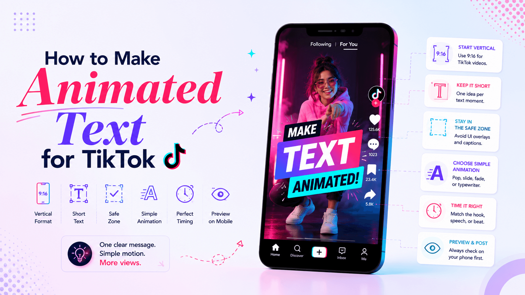
Animation Tips
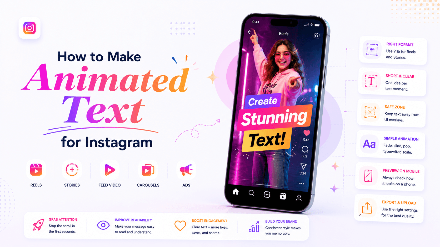
To make animated text for Instagram, start with the format: Reel, Story, feed video, carousel-style post, or ad. Then write one short message, place it where Instagram’s interface will not cover it, choose simple motion, check that it reads clearly on a phone, and export in the right size.
A good Instagram text animation should help someone understand the post faster. If the animation makes the message harder to read, it is doing the wrong job.
The animation effect is not the hard part. The hard part is making the text survive the Instagram feed: small screens, fast scrolling, captions, stickers, buttons, usernames, and vertical layouts.
This guide shows you how to create animated text for Instagram that works in real posts, not only inside the editor.
Animated text for Instagram should be designed for where it will appear. A Reel, Story, feed video, carousel-style post, and ad do not behave the same way.
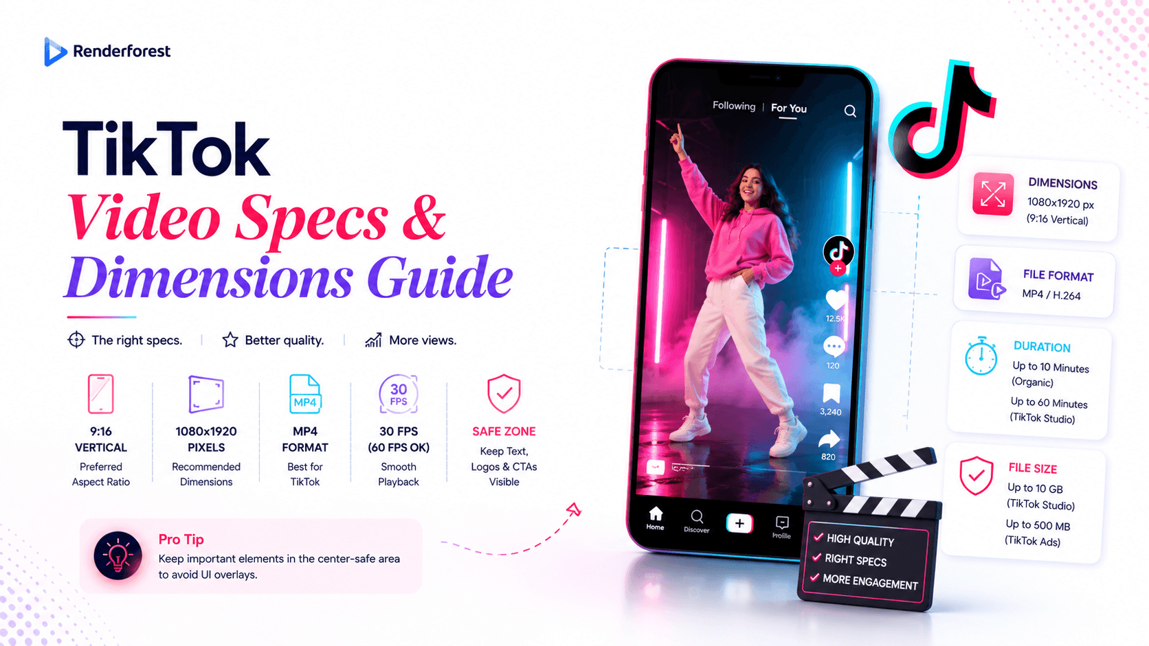
For most Instagram video content, vertical design is the safest starting point. Reels and Stories are built for phone-first viewing, and Instagram has continued expanding vertical-friendly behavior, including longer Reels and support for 3:4 photos, according to recent reporting on updates from Instagram head Adam Mosseri. Sources: The Verge on 3-minute Reels and The Verge on Instagram’s 3:4 update.
For vertical Reels and Stories, use 1080×1920 as a practical working size. Renderforest’s Instagram Video Maker is built around Instagram video templates and vertical formats, which makes it a natural option when you want animated text inside a polished Instagram video workflow.
Most Instagram text fails because it tries to do too much. Before choosing a font, color, or animation, decide the text’s job.
The question is not, “Which effect looks cool?”
The better question is, “What does this text need to make clear?”
A hook can move fast. A caption should not. A CTA needs enough time to read. A product benefit should be short enough to understand in one glance.
A useful rule: the more important the information is, the less decorative the motion should be.
Kinetic typography can be expressive, but it still needs to be readable. A 2024 research paper on kinetic typography identifies three core requirements for effective kinetic typography: aesthetic appearance, motion effects, and readable letters. Source: Kinetic Typography Diffusion Model.
Animated text for Instagram should be short. Not because short is trendy, but because the viewer is usually scrolling, watching on a small screen, or listening with sound off.
Use this rule of thumb:
Instead of:
“Here are three simple ways to improve your Instagram content so people stop scrolling and actually pay attention.”
Use:
“3 ways to stop the scroll”
Instead of:
“Our new collection is now available online with limited-time pricing for this week only.”
Use:
“New collection is live”
“Limited-time offer”
“Shop this week”
Animated text works best when each screen has one idea. When you have three ideas, use three text moments.
Reels are usually the most important format for animated text because they compete in a fast, vertical feed. Your text needs to do its job immediately.
The first text moment should tell viewers why they should keep watching.
Good Reel hooks:
Avoid vague hooks like “Watch this” or “You need to know this.” They do not give enough reason to stay.
For Reels, avoid placing important text too close to:
Place the main hook near the upper-middle or center-left area when possible. If the background is busy, add a subtle shadow, gradient, or semi-transparent text box.
Reels can handle faster motion than feed videos, but readability still matters.
Use:
Do not animate every word with a different effect. One consistent animation style usually looks cleaner.
If your Reel has voiceover or talking-head footage, use captions and animated text differently.
Captions show what is being said. Animated text highlights the takeaway.
Example:
Caption: “Most people make their text too small for Reels.”
Animated text: “Design for phone size.”
That second line gives the viewer the lesson, not just the transcript.
Your CTA should stay visible long enough to understand.
Examples:
For Reels, a CTA that appears only in the final half-second is too late. Give it a few seconds.
If you want to create a Reel from a short idea, script, or product message, Renderforest’s AI Reel Generator is the most specific Renderforest product for this use case. It is useful when you want AI help turning a concept into a short vertical video before refining the text, pacing, and visuals.
Stories are more direct than Reels. People often use them for announcements, offers, updates, behind-the-scenes posts, links, polls, countdowns, and quick brand moments.
Stories often include stickers, links, polls, replies, countdowns, and profile controls. Leave room for them.
Do not place important animated text where a link sticker, poll, or reply field will cover it. If the Story has a CTA, place the text and sticker so they work together.
Example:
Text: “New templates are live”
Sticker or link area: “Browse now”
Stories disappear quickly. Viewers tap through them quickly, too.
A good Story text sequence might be:
Frame 1: “New launch”
Frame 2: “Instagram video templates”
Frame 3: “Create yours today”
That works better than one crowded screen with all three messages at once.
Stories should feel quick, but not chaotic. If you use stickers, GIFs, and animated text at the same time, keep one element dominant.
Renderforest’s Instagram video templates include Instagram Stories Pack and other portrait-style templates that can help when you need Story-style motion without building every text scene from scratch.
Feed posts and feed videos need a slightly different approach. They are not always consumed full-screen, so the text needs to make sense in preview mode.
If the video appears in the feed before someone opens it, the first frame should still communicate something.
Use a readable title or short text overlay:
Do not start with a blank scene and wait three seconds for the text to appear. People may scroll before the message starts.
Feed videos can feel more polished and less frantic. Use clean slides, fades, title reveals, or subtle movement.
For educational feed content, make the text steady enough to read and save.
If your post has a cover frame, design it like a thumbnail. The animated text can start after the cover, but the cover still needs a clear headline.
A strong cover frame helps people understand the post before pressing play.
Renderforest is useful when you want animated text to look like part of a finished Instagram video, not just a text layer placed on top of footage. This is especially helpful for Reels, Stories, promos, sale announcements, event videos, product reveals, and branded social posts.
Renderforest’s Instagram Video Maker lets users create Instagram videos with templates, custom visuals, messages, music, and brand styling. It is the most natural Renderforest product link for this article because the reader’s main job is creating Instagram-ready videos with animated text.
If the post is specifically a Reel, Renderforest’s Reel Maker is also relevant. It is useful when you want to create short, vertical content with a clear brand message, instead of only adding basic text inside Instagram’s native editor.
For AI-assisted Reels, Renderforest’s AI Reel Generator can help turn text, images, or scripts into short videos. This is useful when the animated text is part of a larger AI-generated Reel workflow.
For text-led clips, title sequences, quote animations, and typography-focused posts, Renderforest’s Animated Text Generator is the more specific product link. Use it when the words are the main visual element, not just supporting captions.
For broader video workflows, Renderforest’s AI Video Generator can help when the Instagram post is part of a larger campaign and you want to generate a video from a prompt, script, images, or uploaded media before editing the final text and pacing.
Start with a template that matches the goal.
Use:
Renderforest’s broader video templates library includes Typography, Instagram Reels, Social Media Videos, Video Titles, Animated Promotions, and other useful categories for text-driven Instagram content.
Do not paste a full caption into the animated text field. Write for the screen.
Example for a business Reel:
Scene 1: “Launch your promo faster”
Scene 2: “Pick a template”
Scene 3: “Add your message”
Scene 4: “Share on Instagram”
Each scene has one job. That is easier to read and easier to animate.
Keep the design vertical when creating Reels and Stories. Use large text, strong contrast, and enough spacing around the words.
For branded posts, keep fonts and colors consistent. If the template already has strong motion, avoid adding too many extra design elements.
Watch the full video and check:
Then export and upload to Instagram.
Instagram’s built-in editor can work well for fast Stories and simple Reels. It is best when you do not need advanced brand control.
A simple workflow:
Use Instagram’s editor when speed matters more than polished motion. Use an external editor when you need stronger typography, templates, timing control, reusable brand style, or cleaner export workflows.
This article is a how-to guide, not a full tool comparison. Still, the tool matters because Instagram content can be created in several ways.
Use Instagram’s editor for quick native content. Use CapCut for social-first edits. Use Canva for animated graphics. Use VEED for captions and talking-head content. Use Renderforest when the Instagram post needs to feel like a finished brand video.
Canva’s text animation page includes effects such as pop, fade, flicker, pan, and tumble across images or videos. CapCut’s add text to video tool supports text styles, fonts, colors, spacing, transparency, alignment, and animation effects. VEED describes text overlays, animation presets, dynamic captions, and safe-zone previews on its add text to video page. Adobe Express also has TikTok video templates, which are useful for short vertical content that may be adapted for Instagram Reels.
Use animated text to make the reason to watch obvious.
Examples:
Best motion: pop, quick slide, or word-by-word reveal.
Use animated text to make the update easy to understand.
Examples:
Best motion: clean fade, slide, or simple scale.
Use animated text to sell the benefit, not only the feature.
Instead of:
“AI-powered video template workflow”
Use:
“Create product videos faster”
Support it with:
“Templates, text, branding, and export”
Best motion: strong entrance for the benefit, slower reveal for supporting text.
Use animated text for steps and key reminders.
Examples:
Best motion: simple appear/disappear or slide up.
Use animated text to highlight the strongest phrase.
Examples:
Best motion: slow reveal, fade, or phrase-by-phrase entrance.
Use animated text for the key information.
Examples:
Best motion: clean title reveal and longer CTA hold.
The goal is not to keep text on screen forever. The goal is to keep it on screen long enough for a normal viewer to read it once without rewinding.
If the viewer has to pause, shorten the sentence or hold the text longer.
Text that looks large in the editor often feels normal on a phone. Start bigger, then reduce only if the layout feels crowded.
White text over a light background fails. Thin text over moving footage fails. Bright text over a busy scene often fails.
Use contrast tools:
Readable text is not just a design detail. It affects who can use the content comfortably. TikTok’s own accessibility update highlights increased color contrast and bold text support as features that make on-screen text and interface elements easier to see, and the same readability principle applies when designing animated text for Instagram. Source: TikTok newsroom on accessible and inclusive design.
Long lines are harder to read on vertical video.
Better:
“Create better Reels”
“Start with the hook”
“Keep text readable”
Worse:
“Here’s how to create better Reels by starting with a stronger hook and keeping your text readable”
Do not cover what the viewer came to see. If the video shows a product, hands, face, app screen, or logo, place the text in empty space.
Many viewers watch Instagram content without sound at first. Your animated text should make the idea understandable even if the audio is muted.
A flashy effect cannot save unclear wording. Write the message first. Animate second.
Small text is one of the fastest ways to lose viewers. Design for phone size, not desktop preview size.
If text sits too close to the bottom or right edge, buttons, captions, usernames, and other interface elements may cover it.
If every word moves, the viewer does not know where to look. Animate the hook, keyword, or CTA. Keep supporting text calmer.
One or two fonts are enough. Too many typefaces make the post look improvised.
For Reels and feed videos, the cover can influence whether someone opens the post. Make the cover readable and connected to the animated text inside.
Stories, Reels, and feed posts have different viewing contexts. Resize, reposition, and retime your text for each format.
Use this checklist before uploading:
If one answer is no, fix it before publishing. Small text problems become bigger once the post is live.
Animated text for Instagram should make the post easier to understand, not just more decorated.
Start with the format. Reels need fast hooks and mobile-safe placement. Stories need clear announcements and room for interaction. Feed videos need readable first frames and cleaner pacing. Then write short text, choose simple motion, keep the design readable, and preview everything on your phone.
For quick posts, Instagram’s editor may be enough. For short-form edits and captions, CapCut or VEED can work well. For animated graphics, Canva is useful. For branded Instagram Reels, Stories, promos, and typography-led videos, Renderforest gives you a stronger template-based workflow through its Instagram Video Maker, Reel Maker, AI Reel Generator, Animated Text Generator, and AI Video Generator.
Choose whether you are making a Reel, Story, feed video, carousel-style post, or ad. Add a short text message, place it in a safe area, choose a simple animation, preview it on your phone, then export or publish.
For vertical Reels and Stories, work in a 1080×1920 vertical format. Make the text large enough to read on a phone and keep important words away from the bottom and right-side interface areas.
Yes. Instagram’s built-in editor lets you add text to Reels and Stories. It is useful for quick native posts, but external tools give more control over timing, brand fonts, templates, captions, and export options.
For Reels, simple motion usually works best: pop, slide, fade, typewriter, or word-by-word reveal. Use stronger motion for hooks and calmer motion for captions or supporting text.
A hook can stay on screen for 1.5–3 seconds. A CTA should usually stay visible for 3–5 seconds. Captions should match the speech, and tutorial labels should stay visible while the action is happening.
Create or upload a Story, add a short text message, choose a font and color, apply a simple motion or text animation if available, leave room for stickers or links, then preview before posting.
Use captions when someone is speaking. Use animated text for hooks, CTAs, labels, product benefits, quotes, and visual emphasis. Many Reels need both: captions for speech and animated text for the main takeaway.
Use Renderforest’s Instagram Video Maker for Instagram-ready template videos, Reel Maker for short vertical Reels, AI Reel Generator for AI-assisted Reels, Animated Text Generator for typography-led clips, and AI Video Generator for broader AI-made video workflows.
Use large type, short lines, high contrast, simple motion, and enough screen time. Avoid placing text over faces, products, logos, or busy backgrounds. Always preview on a phone.
You can use Instagram’s built-in editor, Renderforest, Canva, CapCut, VEED, Adobe Express, or similar video editors. Choose based on the job: quick Story, captioned Reel, branded promo, animated graphic, or template-based video.
Animated text can help if it makes the post clearer, faster to understand, or easier to watch without sound. It will not fix weak content, but it can make a strong idea easier to notice and follow.
Share this
Article by: Liana Ziroyan
Liana is a marketing professional with 11 years of experience in digital marketing, content, and product communication. She has a strong eye for visual storytelling and loves turning ideas into engaging campaigns that connect with audiences. With her experience across branding, creative content, and user-focused messaging, Liana enjoys finding simple, effective ways to make products feel clear, useful, and exciting.
Read all posts by Liana Ziroyan