


Video Editing
Imagine if you were to switch your old iPhone for a new one with a bigger, brighter screen only to find out that every website you visit is still adjusted to the small screen. It would be frustrating, wouldn’t it? Luckily this doesn’t happen thanks to a concept known as responsive website design.
People access the internet from all kinds of devices — be it mobile, laptop, desktop, tablet, or Kindle. Static websites no longer work as they don’t allow users the versatility to change devices and still have an enjoyable user experience.
Considering the significant weight of a responsive website in modern web design, this article is going to explore what a responsive web design is, why it is important, and how to make your website responsive.
We’ll also show you some of the most impressive responsive websites to inspire you on your journey of starting a website. Stick till the end of the article to find a bonus tool for creating a responsive site.
Now, if you’re ready to get geeky about web design, let’s jump right into it!

Responsive web design uses code that automatically adjusts the design to different screens based on their sizes and resolutions. It’s what allows users to have a smooth experience of a web page regardless of whether they’re viewing it on a wide desktop monitor or small mobile screen.
A large website header, for example, that consists of a few columns will be separated into several blocks stacked vertically on a mobile device to make it easy for the visitor to read the text and view the graphics.

In contrast to this, if the website design were static, it would maintain the structure of the web page where all columns of the header would remain next to each other horizontally.
Responsive web design accommodates not only existing devices but also any new gadgets that will be released as technology continues to progress. It also takes into consideration the location of the user to direct them to the correct version of the website, depending on where they’re accessing it from.
Recommended Reading
So why exactly is having a responsive web design important? It sure requires a more complicated development process and affects the web design cost, but will the return be worth the effort? The answer is a definite yes unless you’re targeting one specific device with your website.
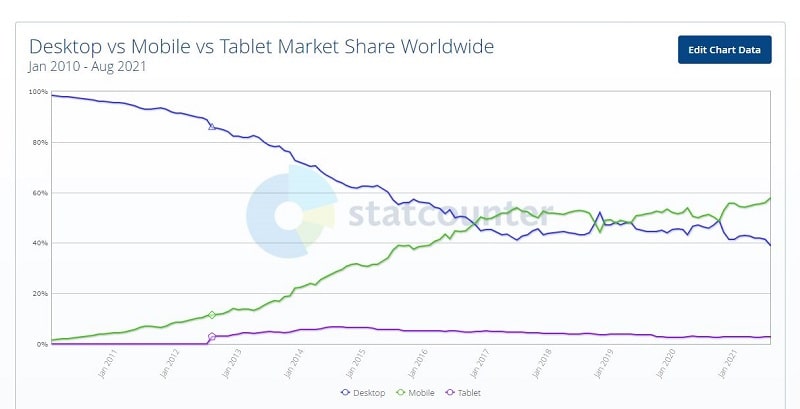
Most online searches come from mobile phones, but 41.5% of users still use desktops, and 2.7% use tablets to browse online. Putting all focus on just one of the gadgets and ignoring the rest would mean you’re passing up on a large segment of web traffic.
A responsive web design makes sure your site is equally practical on all types of devices and doesn’t lose its usability when a new hot gadget is introduced to the market. It ensures you’re prepared for future technology, helping you avoid going through a redesign process every time the hierarchy of devices changes.
In addition to this, a responsive web design makes it easier for bots to crawl a website through a single URL rather than crawling through multiple versions of the same web content. This helps Google properly index the web page, giving the letter a better chance of ranking high.
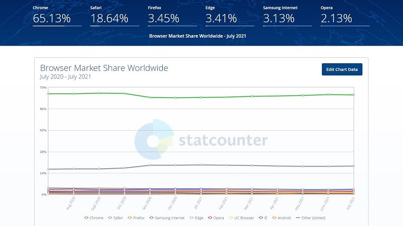
Aside from device types, there are also varying web browsers to account for when building a truly responsive website. It’s helpful to know which browser your target audience likes to use, and if there’s a split between browser preferences, you’ll need to make sure your website is compatible with all used browsers.
There are three main screen widths, also known as breakpoints, you should keep in mind when designing your website. Let’s quickly run through them to ensure your website is responsive across the three major fixed layouts.
Note that the dimensions will slightly change with specific mobile and computer models.
The term “responsive website design” was coined by Ethan Marcotte in an article published on A List Apart in 2010. Marcotte defines three foundational elements that create a responsive website: media queries, flexible images, and fluid grids. Here’s a breakdown of each.
A media query is a feature of CSS 3 that allows displaying web content according to screen size, orientation, and resolution. It checks the screen’s width before rendering the content to make sure the latter is appropriate for the screen. For example, if the screen layout is small, certain blocks can be rearranged to adapt the design to the display.
Media queries have two components: media type (phone, tablet, TV, etc.) and media feature (screen orientation, min-width, max-width).
Flexible visuals are another key feature of a responsive design. They’re achieved by the use of responsive containers that automatically resize based on screen dimensions, scaling the image as well. When the max-width of an image is set to 100%, the percentage decreases as the website layout shrinks, thus scaling down the image. This also prevents the image from growing too large on extra broad displays and becoming pixelated as a result.

Following the same principle of adopting percentage values instead of fixed pixels, fluid grids adjust web content in proportion to the browser window. It’s because of fluid grids that horizontally lined up columns can be stacked vertically when the user switches from a wider to a narrower screen. This is just one simple example of rearranging components; there are many other ways of working with flexible grids.
Recommended Reading
Having covered the basics of responsive web design, now we can get to the how-to part and discuss the best practices for a responsive website. A well-built site is flexible, functional across different devices, and pleasant to interact with. Here’s how to achieve it.
Typography is one of the cornerstones of web design and, as such, can make the website impractical when ignored. Adjusting typography to several screen layouts is essential to end up with text that’s legible and organized.

Set a base value for your font size and scale it to fit each major breakpoint. The standard width for text columns on desktops is 70-80 characters per line and even shorter on mobile, so be mindful of line lengths. Pay close attention to your site’s headings to make sure they are properly sized on large and small displays.
A big part of user experience is website navigation — how easy, intuitive, and enjoyable is your site to browse through? If a large 24-inch desktop screen has the capacity to incorporate a hefty navigation menu, sideboards, and other bulky elements, things get a lot more complicated on a small mobile screen.
There are numerous techniques to shrink larger components into fingertip-sized icons, such as a hamburger menu (shown in the image below), expandable lists, etc. Be sure to plan the navigation flow of your website to guide users seamlessly from one page to the next.

When creating the blueprint for your website, design around the content of your site, not around the most popular gadget in the market. Technology changes quickly, and the coolest, newest device will surely go out of style at some point.
It’s crucial to prioritize the essence of your website in the design process — the content. What is the most important piece you want visitors to take away from your website? Portray it right at the top of your page and distance it from distractions or secondary information to stress its importance.
For example, a short introductory passage that conveys the purpose of your website should be placed near the top — in most cases, closely followed by a call-to-action (CTA) button. Make your CTA text large enough to read effortlessly and the button easy to click on.

It hardly makes any difference how beautiful or informative your website is if it’s uncomfortable to use. Take the time to understand your users’ needs, technical abilities, and preferences. Keeping those insights top of mind, design a site that enables pleasant interactions with users.
In general, mobile users expect short and straightforward experiences with a website, while personal computer users might be willing to dedicate a bit more time. Take visitor expectations into account to create a site they’ll want to interact with.
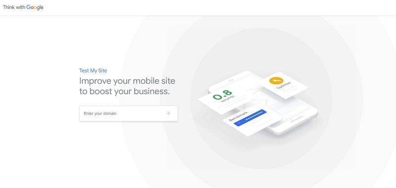
There are a ton of online tools available to quickly check how responsive your website is, and we recommend you take full advantage of them! Tools like Test My Site, Mobile-Friendly Test, and many others allow you to test your site by just inserting the URL link and get suggestions on how to improve its performance.
Once you get the test results, pay attention to how well your site adapts to different screens, how clear the text is, how large the images are, and how fast your site loads.
Time to get inspired by websites that have successfully passed the responsive design test. It’s important to learn from the successes and failures of others to cut your losses.
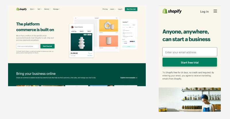
Shopify allows users to have a similar experience with its website regardless of the device in use. The text columns get narrower, as does the screen, and the images are well resized for each device type. Another noticeable difference involves the main call-to-action button: it gets wider on mobile to make it easy for the guest to click.
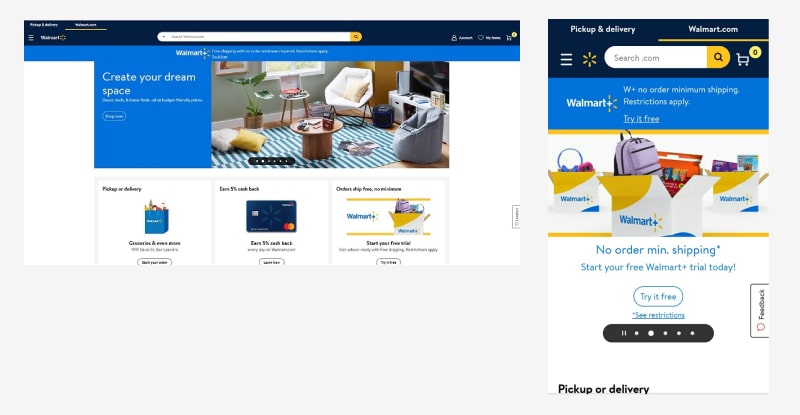
Walmart’s website easily adjusts to any display with properly sized images and copy. Notice how each section is clean, minimal, and takes up very little space — even on desktop — to avoid making the site overwhelming on smaller gadgets. Walmart also uses a carousel design, which is an effective technique to save space without sacrificing information.
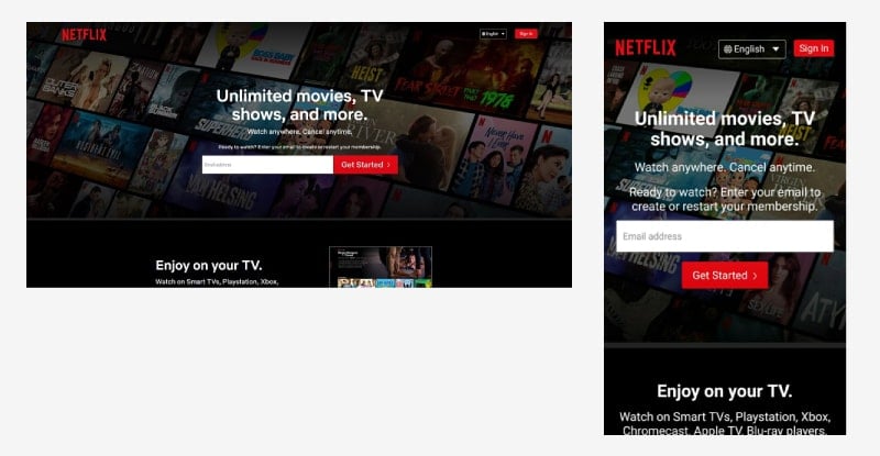
The Netflix website fluidly adapts its headlines, paragraphs, and background image to fit the width of any screen without distorting the overall design. The desktop version comes with a large email address field and a CTA button right next to it. The arrangement changes on the mobile version, where the button moves underneath the email field.
Netflix was intentional with its compact FAQ section that expands and collapses to show the visitor the precise answer they need. It’s a smart technique to encourage guests to interact with their website.
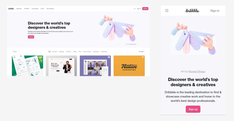
Dribbble uses a flexible grid to contract its multi-column layout into one with 1-2 columns on phones and tablets. The main menu bar is replaced by a hamburger menu, and several secondary elements such as views and likes are hidden to minimize the design for smaller screens. The flexible background image has also been neatly tailored to avoid awkward crops.
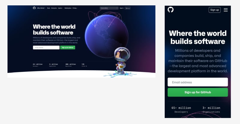
GitHub demonstrates another great example of a fluid grid that stacks blocks on top of each other in a single column on smaller devices. The search field and top navigation bar hide behind the hamburger menu icon, and the text elements take precedence over illustrations to form a logical content hierarchy.
There’s a lot more to be learned from studying existing responsive web designs, which is why we’re going to give you an extra tool — responsive website templates. These templates are created by professional designers with the best practices of web design and SEO in mind.

You can customize the content of any template as you wish to set up your site in less than an hour. If you already have a website, you can benefit from the templates by studying how their design changes from one device to the next.

Click on a design to preview it and switch the device type from the top bar to see how the website transforms for each layout. The templates are free to try, so experiment as much as you wish!
Responsive web design implements a number of techniques to adjust the website layout to different screen sizes, allowing guests to use the site comfortably on any type of device. This flexibility is achieved through media queries, flexible images, and fluid grids.
Gadgets change very fast, and if you want to maintain your website’s usability in the long run, you’ll need a responsive web design.
Find an entire library of responsive website templates on our platform and create your website with ease. Click the button below to try!
Share this
Article by
Dive into our Forestblog of exclusive interviews, handy tutorials and interesting articles published every week!
Read all posts by Renderforest StaffCreate Professional
in Minutes without Technical Skills.


Create Professional
in Minutes without Technical Skills.
Sign Up Now. It’s Free!